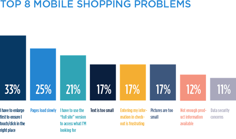
As shoppers move farther away from their desktops to make more and more purchases online, it is imperative that retailers understand (and address the frustrations many users have with their mobile retail experience. Bizrate Insights conducted a mobile study of over 100,000 online shoppers and uncovered their biggest complaints about shopping on mobile devices. Which of these pain points are driving your shoppers away?”
Too much pinching, zooming and mis-clicks
The number one mobile pain point that one-third of all online shoppers cited was the need to constantly enlarge their screen in order to click the right thing.
Mobile experiences that require a lot of zooming not only frustrate people, they tend to cause a lot of “misclicks” which send the user to a new page unintentionally. This can lead to a frustrating experience, wasted loading time and a higher bounce rate.
Tips:
- Image padding: If a button or an image acts as a link, consider placing a few pixels of “padding” before the link becomes effective. This helps reduce stray clicks (from people tapping the edge of an image accidentally).
- Respect the scroll: Mobile shoppers tend to scroll significantly more than they click. Make sure your experience supports scrolling, and you give shoppers enough space to scroll without hitting too many accidental links along the way.
Slow load time
The only thing slower than mobile load times is the e-commerce response to the problem; “slow mobile loading” is bemoaned so often that some brands accept it as inevitable.
Slow mobile load time may be unavoidable in some cases, but there are also some simple steps you can take to reduce it. As a reward you’ll probably see a drop in abandonment, almost instantly.
Tips:
- Reduce image file sizes: Reduce image sizes to exact size needed to fit the page (be sure they also support the zoom feature, if available).
- Code lean: Combine common pieces of code and reduce the number of plugins on your site.
- Minimize dependency requests: Speak with your CTO or developer about this, since excessive dependency requests can slow load time significantly.
Inconsistent Product Availability
The mobile and desktop shopping experience are bound to look different on the surface, but shoppers hate it when they are fundamentally different. Completely changing your navigation or product availability on mobile can lead to frustration for omni-channel shoppers.
Tips:
- Improve discoverability: Sometimes your products are available in mobile, but harder to find. Make sure that your navigation is consistent, and your “smart search” suggests products with similar keywords to help them find the product quickly.
- Support omni-channel shoppers: if a product is only available in-store, help them locate the nearest store that has the item in stock.
Text is too small to read
This problem is widely known, but it remains a persistent complaint by mobile shoppers… clearly there is a gap between what retailers assume is “readable,” and what shoppers can tolerate.
If the text seems a little on the small side, a little too light, or not contrasted enough with the background, just change it. It’s never worth the risk of losing customers just because they’re tired of squinting.
Tips:
- Larger text = less text: Always ask, “how can we say this in fewer words?” Then ask that question again. And again.
- Focus more on headline: Be sure to “frontload” your content on mobile, since people are even less likely to get past the headline or the first few sentences.
Don’t make me type!
Screens have gotten larger, but mobile shoppers still don’t like typing on their mobile phones—and let’s be honest, they probably never will.
Tips:
- Offer smart search: “Smart search” auto-suggests common searches based on what the user has started to type, which reduces unnecessary typing to complete their thought.
- Solutions like PayPal reduce checkout time: Google Wallet, PayPal and more save customers from entering their credit card and address information.
Images are too small
Great mobile shopping experiences require a delicate balance; space is extremely limited, but content must be large enough to read.
E-tailers must be more thoughtful in their mobile content prioritization, and the number one priority on their list should always be images. Product images are the bread and butter of an e-Commerce business, and in mobile they are even more crucial. Mobile shoppers don’t want to type and click, they want to seamlessly browse through visuals and inspiration.
Tips:
- Up the image ratio: Unlike on the desktop experience, your mobile interface should be heavily stilted towards images; ideally imagery will represent at least 50% of your screen space, and be the central focus of your mobile pages.
- Make sure they can zoom: Especially for product images, make sure users can zoom by pinching and/or double-tapping the image.
- 4-6 product thumbnails on category pages: While a retail category page on desktop could have as many as 16 products on a single page, you obviously need to decrease total thumbnails on mobile. Aim for a sweet spot of 4-6 images on the screen at once, otherwise the images may be too small.
Limited product information
While cutting copy on your homepage and category pages can free up precious space on your mobile screen, never sacrifice your product copy. Mobile shoppers who are seriously considering a purchase want the same amount of product info as they would on desktop. Never eliminate or reduce product details to save space, instead get smart about how you display it.
Tips:
- Let shoppers click for more: If you’re working with limited real estate on your product page, offer a teaser then a “click for more” option.
- Keep tabs: Consider dividing your product description into tabs (description, details, return policy, etc.)
Data security concerns
In the wake of so many public data breaches, consumer concerns over data security remain alive and well. Bizrate Insights found that nearly 2/3 of American shoppers don’t trust retailers with their payment and personal information.
Tips:
- Always offer mobile shoppers alternative payment systems: Solutions like PayPal, Google Wallet and Visa Checkout don’t require shoppers to enter their personal, and many shoppers Bizrate Insights surveyed explicitly mentioned that they preferred PayPal for security reasons.
- Consistently remind shoppers that their information is safe: Use terminology such as “enter secure checkout” throughout your mobile site, and offer further information about your security measures for those who want to learn more.
Hayley Silver is VP of Bizrate Insight, a division of Connexity