KayakProShop.com sells everything you need to enjoy kayaking, from paddles and boats to apparel and fishing gear. Critiquers Amy Africa, president of Web consultancy Eight by Eight, and Stephan Spencer, founder/president of SEO agency Netconcepts, gave KayakProShop.com a thorough review. Africa looked at content and functionality, and Spencer tested search capability. Read on to learn whether they encountered smooth sailing or rough water when navigating this site.
Amy Africa
My brother is a hardcore kayaker. Me? Not so much. Don’t get me wrong, I love being on the water — but, well, have you ever been? It’s a hell of a lot of work.
Pushing and pulling — hard — is what it takes to make any e-commerce business work. Most companies get more than enough traffic, they just don’t know how to convert it.
On the Web, if you want the order, you have to ask for it. Over and over and over and over. The more you ask for it, the more likely you are to get it.
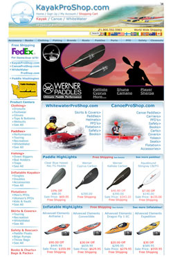
This is, by far, KayakProShop.com‘s biggest challenge. Granted, the company may not have the most aesthetically pleasing site in the entire world, but it does a lot of things right. It has a three-column site; it employs a carousel on the main entry page; and it frequently has a free offer (although it would probably be more successful with a deadline).
The place the site really misses the mark — outside of the things we’ve talked about ad infinitum in previous articles (perpetual carts, for example) — is the category and product pages.
First off, the KayakProShop.com category pages run the gamut: Some have one product, some have many, and others are built like an additional entry page. Some of them sell, some of them don’t. It’s a completely mixed bag.
Unfortunately, Web shoppers like consistency. They like things to be “safe,” which from a user’s perspective means a method to the madness: a logical, consistent flow.
If you have a choice of one product, take the user directly to that product. Don’t waste his or her time with a one-item listing on a big, white category page. Users don’t like unnecessary clicks. Period.
As for category pages with multiple products, you need to make them sell and sell hard. The best category pages are often those that look similar to entry pages — a carousel at the top, some refinement dropdowns, and then a list of the 9 or 12 bestselling products to give the user an idea of what’s in your store.
Each product should have a short headline, a price and more info/buy now buttons. Sell a product with size and color decisions? You still need “buy now” buttons.
Why? It’s an action directive — it tells users what they are supposed to do, and it’s fantastic for tracking as well. Check out www.ssww.com for a good example of a category page that works.
Next, let’s look at the product pages. One of the most important things to remember when you are developing your product pages is that users view each screen as a view. Therefore, every time you scroll, you see a new view, thus a new page in the user’s mind.
The user needs to be told what to do on every single view. Big, red, in-your-face action directives telling the user either to “add to cart” or “buy now” really work. No, they don’t look pretty — but you’re not entering a beauty contest, you’re trying to make money.
Another thing to remember is that users don’t tend to use tabs all that effectively. Designers like tabs because they make the pages look neat and tidy. Users don’t like tabs because they get “trapped” in them — yes, it sounds ridiculous but it is what is.
KayakProShop should consider using multiple visuals — one of the few things on a product level that almost always increase adoption to cart. Why?
Easy. Search engines read text. Users see things in pictures. So the more pictures the better. Be careful, though, as more pictures doesn’t necessarily mean one of those fancy-schmancy viewers to show things in 360 degrees. It means using silo shots, lifestyle pictures, spilled tiers and more. Both www.gardeners.com and www.ebags.com do a good job with the pictures. (Gardener’s Supply does an especially good job with lifestyle-type shots, whereas eBags does a good job with alternate views.)
This site should also consider really working its user reviews. If you are using reviews, and you probably should be, make sure that evidence of the reviews is in more than one place. That means add the star rating and “click here to see customer reviews” at the top — in the first view — and then spill out the reviews at the bottom.
KayakProShop says “Read all reviews” at the top, but since it has a star system, it should promote that instead. Like the shopping cart icon, it’s a known. Amazon does the best job at reviews, mostly because it’s developed a system that moves the three most helpful reviews up to the top of each item.
It’s also important that the user sees availability messaging somewhere in the first view. KayakProShop does list shipping times, but it doesn’t say whether or not the item is in stock. Users need that one-two punch in terms of availability/shipping messaging to really cement the deal.
Another thing that users favor is listing the savings. If you are using was/now pricing, you should definitely list the savings as either a dollar amount or a percentage (whichever is bigger).
Yes, users can figure it out on their own, but do you really want them to? No. It’s better for you to hit them over the head with it and then smack them again with a big action directive.
What other major improvement should be made on the KayakProShop’s product page? The copy. It needs a lot of work.
Even though users tend to neglect long, drawn-out, War and Peace style verbiage, there is a place for good copy online. Users read headlines, subheads, captions on pictures and quick facts — none of which KayakProShop uses.
Next Page: Stephan Spencer
Previous Page: KayakProShop.com
If you want your site to sell, you need to have solid, telegraphic selling copy. (See www.greatgardenplants.com for an example of solid, in-your-face copy.)
You simply cannot just leave it up to a couple logos and bursts at the top and some sparse body copy on the bottom. It’s not enough.
STEPHAN SPENCER
When it comes to SEO, KayakProShop.com is a real fixer-upper
On the home page, there’s almost no content — surprisingly, everything that appears to be text is actually graphical.
If you use the SEO browser tool (http://seo-browser.com/index.php?address=www.kayakproshop.com&action=Parse+URL) or turn off image loading in your Web browser and reload the page, you’ll see what I mean. So for this important page, there are no text links to provide search engines with contextual clues on what the linked-to pages are about. And there isn’t any copy so that the engines can ascertain the home page’s keyword focus.
The one strong text-based “signal” on the page that the home page is sending to the search engines is the title tag “Kayak Pro Shop from Kayakproshop.com.” But that’s a pretty weak title (and somewhat nonsensical too), as the company’s money term, “kayaks,” doesn’t even feature in it.
Looking at the HTML source of the home page, I found a meta keywords tag that was way too long and thus looks keyword-stuffed at 83 words and 692 characters. Contained within that long list were keywords that made no sense to target, like Christmas, Hanukkah, Kwanzaa, giving, product, accessory, sale, new, used, clearance, trip, free demo, fun, manufacturer, seminar and news. Huh?
Coming in from http://kayakproshop.com/ instead of http://www.kayakproshop.com gets me to the home page. But it does so without redirecting, which is bad: In essence, a duplicate copy of the home page resides at the non-www URL.
Specifically, a 200 status code is returned by the site’s server instead of a 301. The latter would pass the link authority (PageRank) of the non-www duplicate version to the “canonical” home page URL at www. Duplicate content is the bane of the existence of us SEO folks. (See http://www.google.com/support/webmasters/bin/answer.py?answer=139394 for more on this.)
Speaking of URLs, underscores are used across the site in the URLs to separate keywords. But Google does not interpret underscores as word separators. So although keywords in a URL are a signal for Google, there are no actual keywords present in most KayakProShop.com URLs.
For example, a URL like www.kayakproshop.com/columbia_timber_ridge.html is not seen as containing three words, but one — columbia_timber_ridge — that is unlikely ever to be searched for. Hyphens should be used instead of underscores.
Looking at the page indexation in Google using Google’s “site:” query operator reveals 621 pages indexed (http://www.google.com/search?q=site:kayakproshop.com&start=990&filter=0). Hopefully, this represents the majority of pages. I have a feeling it doesn’t, though. Yahoo Site Explorer shows over 2,200 pages in Yahoo’s index (http://siteexplorer.search.yahoo.com/search?p=kayakproshop.com).
Scanning over the site’s Google listings (http://www.google.com/search?q=site:kayakproshop.com&num=100), I found that product pages are well-represented, with keyword-rich and readable titles. But the snippets, when based on the meta description, are simply a repeat of the page title (like on http://www.kayakproshop.com/Kok_TempestJkt.html) or gibberish (like on http://www.kayakproshop.com/PALM_AleutianDrysuit.html).
There is good body copy on the product pages too, although it’s all vendor-supplied and thus a duplicate of what appears on many other sites on the Web. Body copy on category pages (like http://www.kayakproshop.com/Thule.html) is nonexistent. The category pages have no intro copy present, which would help convey the keyword theme.
In fact, most text on the category pages are links — which tell the engines what the linked pages are about more than what the page on which the links appear is about. What you’re left with when you take out the link text is a bunch of “sale price’s” and “item number’s” — not exactly a desirable keyword theme. Oh, and there are no heading tags (H1, H2 etc.) present on these pages or on the site as a whole.
KayakProShop.com needs to leverage its customer-contributed product reviews. A snippet of the review is present in the HTML of the product pages — which is good, as this doesn’t happen with third-party-hosted customer review systems that rely on JavaScript.
But it’s only a small part of the review with a “More” link leading to the full review on a standalone HTML page. These standalone review pages are getting indexed (as can be seen at http://www.google.com/search?q=site:kayakproshop.com/reviews), which is in actuality not a good thing, since they have no navigation or branding on them. Thus they are dead ends that will inevitably result in the searcher hitting the back button and moving on to a competitor.
Finally, the home page PageRank shows as 4 — not bad. (PageRank scores run from 0 to 10 on a logarithmic scale, so a 5 is not middle-of-the-road, it’s rather low.) PageRank drops quickly once you go beyond the home page, which indicates a problem. Many pages have a PageRank of 0 or 1.
In short, some link building is in order for KayakProShop.com. This will lift the site’s rankings across all its pages. The first priority will be to fix the SEO issues inherent in the site’s architecture. It won’t be an easy fix, but it will pay big dividends once completed.