SPECIALTYSTORESERVICES.COM
SpecialtyStoreServices.com targets retailers, selling products such as store fixtures, showcases, panels and displays. But does this store-centric seller know anything about ecommerce?
Our experts Amy Africa, president of web consultancy Eight by Eight, and Brian R. Brown, senior manager, SEO at search consultancy agency Covario, took the Specialty Store Services site for a spin. Africa looked at content and functionality and Brown tested search capability. Here’s what they had to say.
AMY AFRICA
One of the biggest mistakes ecommerce companies make is underestimating the significance of the first view. First views (meaning the first screen users see when they visit) are important for every website — from blogs to social networking sites), but they are especially critical for companies that are trying to sell online.
Why? That’s easy: The brain that buys is the same brain that we share with a crocodile. Language was invented about 40,000 years ago. Written language came into play approximately 10,000 years ago. Crocodiles have been around for millions of years. They’re older than (okay, as old as) dirt.
What on earth does that mean? Put simply, it means the pictures, visuals and graphics on your site are key. Even more important? Your action directives.
You’ve got to tell users what you want from them and how you want them to do it — and you’ve got to do it quickly. Sounds basic?
It is. Sadly, many companies still screw it up.
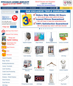
Take SpecialtyStoreServices.com, for example. The site does a lot of things right. It puts the email sign-up in a prominent place and offers a nice incentive to subscribe immediately. It lists its toll-free number in the header, along with a security logo, reminding users that it’s a safe haven in which to transact business.
The site features a carousel in the middle column of the entry page with “click here” buttons. And so on.
Despite all the things Specialty Store Services does correctly, you don’t see products and buy now/add to cart buttons on the first view, and there’s not enough emphasis on the perpetual cart — two of the most important things in a selling site. Crocodile. Needs. Food.
These days, conversion consultants are a dime a dozen. Everyone says they can increase your conversion overnight. Some even claim they can do it without busting your budget. But these promises are somewhat of a joke, because anyone can increase a site’s conversion. All you need to do is separate the garbage traffic — and your conversion, as a percentage, goes up overnight. Unfortunately, that does not mean your sales will improve even one iota.
Abandoned cart programs were all the rage five years ago (and really, if you don’t have one in 2010, you should be publicly executed). These days, the magic formula for success is adoption to cart. (If you’re in a lead business, it’s the same thing — you just want adoption to cart for inquiries, not necessarily sales.)
The key to getting a stellar adoption to cart? Cater to the crocodile. Make sure the users know what food (aka products) are available on the first view and make it clear that they are supposed to purchase. It’s as simple as that.
Just listing apparel supplies, bags and boxes, building maintenance, candy and gumballs, etc. is not enough. Show the breadth of your product line (in other words, how many of each thing you have) and ask the users to add it to their carts immediately.
Even though they’re not in the same category, look at the difference between S&S Worldwide (www.ssww.com) and Specialty Store Services (www.specialtystoreservices.com). S&S has a separate and unique perpetual cart (the upper-right-hand corner is just the right place for it), buy now buttons, solid navigation, an aggressive right-hand “Save” column, pictures of people, and more. It looks like the company really wants your order.
What else could Specialty Store Services do to improve? Here are eight simple things, many of which will apply to your site.
-
Simply the left-hand navigation. The C-navigation (top, left and bottom navigation) is typically the one place on your site that does not need a bunch of graphical elements. It’s good to have pictures in the top header, but you don’t really need them in the top, left or bottom nav bars.
The purpose of the C-nav is to offer the user an easy-to-use, comprehensive index to your store. The more compact it is, the more the users will see in a view, which is important when you are looking for something.
-
Fix the catalog quick order. First, the catalog quick order on this site is something of a trainwreck. There are all sorts of things popping up and slowing things down — and too many choices that need to be made. It’s not at all a good user experience — especially compared to the sites on which ordering from a catalog is a breeze.
-
Add visual elements to all the category pages — carousels and right-hand banners would be a good start. Pictures of all the listed categories would be helpful too.
Specialty Store Services has an amazing amount of good things to look at from a user’s perspective — in fact, it is definitely among the best (and most aggressive!) out there with its new items, deal of the day, blowout and sale categories. But users don’t see things in text, only in pictures, so if the site keeps with its line-listings, it won’t be as valuable.
-
Look at the nomenclature. A lot of what works in the offline world (catalogs, for example) isn’t telegraphic enough for online. For example, if you are looking for a T-shirt, you are not looking for “apparel,” you are looking for a T-shirt.
If your navigation is useful and relevant, it will also help reduce the number of clicks it takes to get to any one place on your site. Streamlining your user path is important.
-
Use the refined search only where necessary. If you click on “new products” and then “media specialties,” you will be presented with one item. There’s no need for this one item to have any sort of search refinements — sorting by ascending or descending price, for instance, is an exercise in futility.
Advanced (or refined) search is a good thing — if it is used properly. If it’s not, it just results in user confusion and frustration.
-
Add an email box to the email sign-up box on the first page. Doing so will allow the user to “do” something immediately, and it will result in increased conversion.
Also, really work the email sign-up page. Make the headline bigger. Include a picture of sample emails to show users (in pictures) why they simply must sign up NOW.
Eliminate or move all the irrelevant text and try to get the form part to the first view. Add a picture of a friendly customer service representative to that page — along with a phone number — in case shoppers prefer to call.
-
Make sure never to dead-end. A dead-end is a page without pictures or without navigation. If you click on the email sign-up on the Specialty Store Services site, you come to a page where there are no pictures and all the navigation is eliminated.
From a user’s perspective, it’s not good when the navigation disappears. The reptilian brain perceives it as “unsafe.” Unsafe equals flight or fight mode. Emphasis on flight.
-
Be careful with social media icons. If you have 20 followers on Twitter, it may not be the best idea to start driving your qualified traffic there and away from your site.
BRIAN R. BROWN
Specialty Store Services could use a little service itself when it comes to SEO and determining what is good and valuable and what isn’t.
Our first indicator that someone has made an effort to implement what he or she may have assumed was good SEO is the copy on the homepage. But when we look at the copy under the “About SpecialtyStoreServices.com” head, toward the bottom of the page, we see six paragraphs of text. One doesn’t have any links, but the other five range from four to 15 links per paragraph.
At least the site has tried to make it somewhat readable, but is that really the purpose? Not likely. Rather, it is most likely a tactic to include keyword-rich links from the homepage deeper into the website.
Wait! Isn’t this exactly what we want to do for SEO? Therein lies the challenge — SEO isn’t just about following a checklist and applying a set of tactics.
The key to SEO is understanding how and when to apply tactics. In this case, less is more. Trying to hit every major keyword on your homepage, even when they are placed within body copy, right out in the open for bots and humans alike, is not likely to bring about the desired results.
Think about the average web surfer. Will he or she click on those links? Probably not.
Google may invest a lot in its algorithms and perfecting how its bots operate, but the search giant also spends a lot of resources trying to understand the human side as well. See the discussion of Google’s “Reasonable Surfer” patent at http://searchengineland.com/seo-implications-of-googles-reasonable-surfer-patent-44222 to understand why these links might carry less weight than you might have thought.
Another interesting sign of an attempt at SEO is the link at the very bottom of the page to the site’s XML sitemap. Don’t get me wrong, I love XML sitemaps and encourage clients to use them all the time. I even like to encourage what I’d consider more advanced usage, such as using an XML index sitemap with several segmented sitemaps, then using Google Webmaster Central’s (http://www.google.com/webmasters/) sitemap reporting to help identify indexing and quality issues.
Continue on Page 2
So what’s wrong here?
The thing is, Specialty Store Services doesn’t need to include an on-page link to an XML sitemap — especially when the site has already used the auto-discovery feature within its robots.txt file, this link serves no real purpose.
We come up against the issue of canonicalization again and again. I’ll admit, there can be some complex challenges and solutions around canonicalization, but by and large, most instances are just basic. So again, canonicalization is essentially about having “one source” of information (or “one destination” for that source).
In the eyes of the search engines, Specialty Store Services actually has more than one website:
All three of these “variations” are indexed, although in differing amounts, and are competing with one another. You might think, Who cares if they are competing against one another as long as one of them wins out over my competition?
If only it worked that way. Actually, these variations diminish the overall strength of the site, diluting the clear, strong signal that we want to send to the engines. The company may even be diminishing linking efforts by having links going to the different variations.
Server-side header redirection should address this issue, sending all requests to one canonical version; in this case I’d select the “www” variation as the canonical. We aren’t done, however.
When you go to any of those variations above, you land on the homepage. But at the moment, that destination has a file name of “default3.aspx.” There is also a “default2.aspx” version that I could manually enter and that is indexed. And there is a “default.htm” version as well.
Even more troubling is that the general URL pattern is “www.specialtystoreservices.com/default3.aspx?” and following that question mark are the URL parameters needed for each specific page of the website. What this means is that the site has multiple duplication issues and is overly bloated.
This probably won’t result in any penalties, but it may be making it harder for the search engines to identify canonical URLs on their own, and the site may not be performing as well as it could.
Not surprising, we also run into content duplication issues due to categorization. For instance, a specific product might appear under the regular category and subcategory section it lives in, while also appearing under the special new products, sale or blowouts sections.
That is actually okay. The problem is that the actual product URL will be different based on what section of the site it is being navigated from.
Speaking of URL challenges, the site has some great opportunities for improvement in URLs as well. Keyword URLs would be helpful for bots and humans, but not critical.
Most important: minimizing or eliminating parameters within the URLs. Search engines have become much better at handling parameter-based URLs, but I still continue to see mixed results when the parameter count gets above three.
And you really want to avoid having empty parameters like this URL from the left-side navigation for gumball machines: http://www.specialtystoreservices.com/product.aspx?category=3232&link=.
Even more so when the main content area on the homepage also has a link for gumball machines: http://www.specialtystoreservices.com/product.aspx?category=3232 but without the additional “&link=” parameter.
So, drop the unnecessary parameter and don’t link to the same page using different URLs. Ultimately, I’d like to see a URL like this: www.specialtystoreservices.com/gumball-machines.htm or www.specialtystoreservices.com/gumball-vending-machines.htm.
I was happy to see that pagination, which is often a huge challenge for ecommerce sites, was handled fairly well. With JavaScript off, which is how the search engines will normally see the page, the product listing at the category and subcategory levels defaults to all products being shown.
This presents the search engines with a single URL that leads to the related products, rather than requiring them to crawl through several pages of six or 12 products each that may even appear like duplications.
Best of all, Specialty Store Services has done a pretty good job on one of the most important SEO elements — page titles. Titles are clean, with little to no duplication, and keyword-rich.
I would, however, recommend appending the brand or website name to the end of the title tag. The company’s tagline is “Service is in our name!” Now it just needs to make sure its name is in its title tag.