ORTHO TECHNOLOGY
While wearing braces is a drag for most adolescents, selling orthodontia products to dental professionals via catalog is fraught with its own complexities. Orthodontic supplies mailer Ortho Technology submitted its 2009 product catalog for a creative checkup. Here’s what our critiquers — Sarah Fletcher, creative director of Providence, RI-based Catalog Design Studios, and Glenda Shasho Jones, president of New York-based catalog consulting firm Shasho Jones Direct — had to say about it.
SARAH FLETCHER
When I looked through the Ortho Technology catalog, I had a hard time putting my finger on exactly what was not working. Beautiful photography, great products, but something was off. When I went back to the strategic information provided by the company, I realized that the problem was the strategy itself.
For instance, Ortho Technology describes its target market as “Orthodontists worldwide.” What’s the problem?
Targeted marketing only works with an actual target, and every orthodontist worldwide is just too broad. Within that universe there are subsets that are more, or less, likely to make a purchase. The company should narrow the focus to appeal to those who are the most likely to buy, and its sales will increase.
The cataloger believes its merchandise niche is that it stocks more than 11,000 prewelded band and tube assemblies available for same-day shipment, and that it is recognized for offering products that complete a merchandise category.
These are actually competitive advantages; Ortho Technology’s merchandise niche, based on what I can see, is high-end, innovative and aesthetically pleasing orthodontic supplies and accessories.
The company’s list of competitive advantages could also include its assemblies in stock, as well as a complete assortment of matching accessories, a wide selection and in-stock position, honest pricing and its established loyalty program.
So why am I focusing on this information rather than the design? Because that is where the magic happens.
The goal of great catalog design is not to have a pretty catalog. It is to create a catalog that showcases the company’s strengths, and a clear vision, and has a razor sharp focus on conveying that vision to the customer.
Without that clarity of direction, it’s all just stuff on a page.
Assuming that my assessment of Ortho Technology’s target market, merchandise niche and competitive advantage is correct, the three things it should convey in every catalog are: 1) Its innovative products, 2) That it’s the leader in aesthetics and 3) its honest pricing.
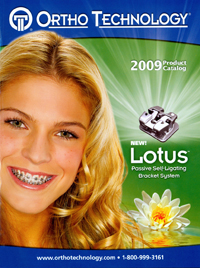
How does it do at this? Well, none of the three key factors are on the cover, although showing a new product does speak to innovation.
I would add a positioning statement to the logo, such as “Leading the way in innovation and aesthetics.” And I would call out the number of new products as well as the number of exclusives.
Exclusive is huge in direct mail, so don’t be shy — shout this out! All exclusive items in the catalog should have an special icon.
The back cover is a complete throw away. For readers who are not familiar with the function of a spider screw, the orthodontist screws it into the patient’s jaw (insert cringe here) and uses it to anchor various orthodontics.
Terrifying as that is, there is more to say than, “The key advantages of the Spider Screw System are it’s versatility and unique design,” which is the caption for the product.
By reading the copy inside (and then breathing into a paper bag for several minutes), I was able to determine that the key benefit is actually that it reduces treatment time. The key advantage is that it does not require patient cooperation, such as headgear.
A better headline would be, “Our exclusive Spider Screw reduces treatment time by up to 20%!” This is an exclusive product that Ortho Technology can get really excited about. It’s impossible to effectively sell anything without having copy to explain the benefits. No matter how big you make the screws, or how pretty the picture is, just showing them will never outsell a benefit-driven headline and strong sales copy.
Inside the catalog, the page 2-3 spread looks like two ads from other vendors and not a strong cohesive spread promoting the competitive advantages. This is the place to tell customers what sets Ortho Technologies apart from the competition.
It is where you talk about exclusive products and competitive advantage. Tell customers about the honest pricing. Showcase new technologies.
In fact, I thought pages 8/9 were the opening spread that was pushed back to accommodate a new products spread till I read it. There is a headline, “Ortho Technology The Logical Alternative,” and logically I thought it was going to be followed by a brand positioning statement.
So imagine my surprise when it said, “Shipping: Most orders ship the same day…” This boilerplate information about shipping, terms and conditions, etc., should go with the order form.
Which brings me to the fact that there is no order form. Business-to-business catalogs, especially from a company that promotes faxing as the number-two way to place an order, really need an order form.
My best advice to Ortho Technologies is discipline. Take the time to really nail down what you are offering and make sure that you are conveying this in a clear and consistent way.
You have already done a good job at making the catalog pretty, now work on making it sell.
GLENDA SHASHO JONES
This catalog does a lot of things right. The overall design is organized and the page layouts make it easy to shop for and understand the products.
But in spending more time with the Ortho Technology catalog, I saw clearly that the biggest opportunity for improvement is strategic in nature. More work on building a uniquely positioned and strongly branded catalog would give the business more strength, leading to loyalty and increased sales.
On the plus side, it’s refreshing to see a front cover that does so many things right — especially the basics! Here are some things that should be on everyone’s checklist of what to do:
- Treat the logo like a masthead, at the top of the page.
- Make sure the contact information is clear and readable, on the bottom of the page, where the customer expects to find it.
- Be sure the subject of the catalog — orthodontics — is clear from the visual presentation (in this case, primarily from the photograph).
- Use a model who is pretty, approachable and believable, and who makes eye contact.
- Highlight key products.
- Make it clear that this is the 2009 catalog.
What can the cataloger do better? There are two areas we typically want to look at: improving performance and strengthening branding. From a performance point of view, the goal is to get more recipients excited about the catalog, so that more of them hold on to it or want to get into it right away.
There are several ways that this cataloger uses meaningful information to improve overall performance. Some suggestions to consider:
- Call out the number of new or total products.
- Emphasize same-day shipment for all in-stock items.
- Include inset boxes showing main product categories (this is more important for prospects, who have not ordered before). Write the category names in the boxes.
- Highlight the “Ortho Rewards” program shown, which allows the buyer to earn gifts. List the page numbers that describe the program in full.
- For featured products, refer the reader to the page numbers on which the products are sold.
- Consider using a tag line that reflects the unique positioning of this catalog.
The back cover puts a lot of emphasis on the company’s Spider Screw anchorage system. It’s apparent that this catalog is allocating some superior real estate to what looks like advertising rather than using the space to strengthen its own positioning.
For example, the opening page and the closing inside cover look like advertisements for product within. The second spread (pages 4-5) promotes new products, but refers the reader inside to buy them.
And in case you felt that you still hadn’t waited long enough to find out about Ortho Technology itself, pages 6-7 feature the Ortho Rewards program. With dozens of logos and type all over the place, you really have to study the spread to understand what it’s all about and how easy it might be to enroll.
There’s a real opportunity to warm up the spread with more clear benefit visuals, whether they be lifestyle, certificates, gifts, etc. This spread needs to go back to the drawing board.
Finally, we get to what should have been the opening spread — on pages 8-9. The ordering information in the left-hand column is good, but because it’s in reverse type, it’s hard to read.
The emphasis on the “user friendly” Website is anything but friendly, with images of a Website, a dentist, logos and patients overlapping.
Then the cataloger provides information and restrictions in a sea of copy. This information should be distilled so that it is welcoming and reflective of positioning and benefits. The restrictions should move to the interior of the catalog.
Inside, this catalog does a good job with overall organization of product and presentation of information. It makes a strong effort to keep products in a balanced grid throughout.
It allocates more space for featured products and keeps the secondary products in similarly-sized spaces. Clean rule lines complete the separation of products and form the foundation for the grid presentation.
In most cases, the catalog’s product shots are front and center — which they should be — and copy supports the merchandise, as opposed to being overwhelming or nonexistent. The photography is good. Complicated products have callouts. Performance products feature “before, during and after” shots. The company really seems to understand its merchandise.
Ortho Technology presents information in a visual hierarchy. The subheads are product names, and they are larger than anything else on the page and in color.
The catalog’s featured products may get some “selling copy” in sentence form, but it is usually short and sweet and to the point. (For example, “Provides control of upper first molars that require stabilization, rotation, torquing, or expansion.”)
Much of the other information is handled as bulleted copy, and the SKUs, product sizes and prices are lined up with attention to detail. This is important, since the amount of information needed could easily look overwhelming and sloppy in presentation.
It’s worth noting that Ortho Technology has done a superior job with the easy-to-read-and-use index found at the end of the catalog, on the interior closing spread. It is organized alphabetically and by section.
The only improvement I might suggest would be putting a matching color bar next to the section name to visually relate to the section in the catalog.
Creating an easy-to-shop catalog is always an objective for b-to-b “source” catalogs with more than 100 pages. Any catalog that relies heavily on an annual catalog, particularly with this many SKUs, wants to make sure finding products or categories is easy.
Ortho Technology does well with using color coordinated navigation tabs on the upper right and left corners of the catalog and a vertical matching tab that further calls out the sections of the catalog.
Unfortunately, the weakness is that the table of contents — something the reader would expect on the opening spread — doesn’t show up until page 9, which is too late in the game to make it truly effective.
It’s worth noting that the TOC is correctly positioned on the right-hand side of the right-hand page, and it is color coded to match the section colors.
Could the table of contents and navigation tabs be even more effective? Yes.
I would suggest developing small, easy-to-understand-at-a-glance illustrations representative of the section. The goal would be to create an immediate visual link to the section, without having to go to the trouble of reading.
Now that we’ve spent all this time with the catalog aesthetics, let’s talk strategically about positioning and brand. Here are some questions for Ortho Technology to consider.
What makes this catalog different from the competition and, at the same time, meaningful to the customer? In what areas does it have authority?
If your positioning is what you stand for and it’s your promise to the customer, then it needs to be differentiated and relevant to the customer to be effective. So what does Ortho Technology stand for?
Is it the merchandise assortment? The customer service? Detailed information?
Is the company a source of high-quality, unique and innovative products, as the Website seems to suggest? If so, the print catalog can do a much better job of demonstrating this. There’s a big opportunity to develop a clear, differentiated and meaningful positioning here.
Most important, a comprehensive positioning is the foundation for building a sturdy brand. Only when positioning is clearly defined can you develop the thoughtful creative imagery, cohesive signals and meaningful icons that build a strong personality.
Bottom line, you want a brand that has relevant and recognizable characteristics; one that has authority, creates desired perceptions and generates loyalty.
The Ortho Technology catalog can get there, but it still has a way to go.