Journeyworks Publishing specializes in multicultural health education and health promotion materials. It sells via catalog primarily to public health departments, schools, hospitals, clinics and private companies.

Is its catalog the picture of health, or could it use a new fitness regime for its creative? Our critiquers this month, Cheryl Stolis, senior account executive at Lorel Marketing Group, and Mike Wychocki, senior vice president of SolutionSet (formerly Haggin Marketing) reviewed Journeyworks’ 2011 Promote Health catalog. Here are their diagnoses and prescriptions.
CHERYL STOLIS
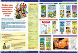
Why Animals Don’t Smoke and 6 Good Ways to Lower Your Risk of Diabetes are some of the titles on the eye-catching cover of Journeyworks Publishing’s Promote Health catalog. The catalog provides educational information to community agencies and organizations for health and wellness campaigns.
These pamphlets, brochures, and activity books serve to educate readers on how to make good decisions and stay healthy. The topics range from tobacco and secondhand smoke to chronic disease and violence prevention, just to name a few.
The bright orange front cover captures the reader’s attention, prominently displays the company’s products, and quickly communicates its contents. The title, Promote Health, is clear and succinct, and the tagline, Health Promotion and Health Education Publishing, accurately states the purpose of the catalog.
On the back cover, most of the space highlights new and best-selling titles as well as those available in Spanish, with page numbers for easy reference. Visual icons use the same color palette as the artwork in the brochures, however, and tend to get lost.
I would suggest using contrasting colors, consistent sizes and a different font for the icons, so that the messaging is distinct and will have more impact.
Page two presents strong messages, but it is primarily text and nothing stands out. The reasons to use Journeyworks for your program are important and create a strong branding message. But the typeface is monochromatic for each benefit, and it loses impact. I recommend more of a callout: Why is Journeyworks special?
The testimonials, while powerful, get lost because they are clumped together at the bottom of page two. I would spread these testimonials throughout the book in strategic locations to correspond to specific products on the page.
Overall, the palette used for the color bars works well with the colors used for the illustrations in the brochures. These colors accomplish the purpose of distinguishing each of the section breaker pages; however, this organization should carry through to the table of contents.
The subjects included in the table of contents are easy to find in alphabetical order, but the list is long and not visually inspiring. I recommend combining the subject material into several larger subgroups and introducing a tabbed navigation with specific colors to represent each grouping. For example:
- Staying Healthy
- Dating and Relationships
- Community and Environmental Health
- Alcohol and Drugs
- Smoking and Tobacco
Each of the particular subjects for the breaker pages could then be listed under each subgroup, and paginated together for easy access.
Page three of the Journeyworks catalog showcases new titles and bestsellers, and it is organized by product category. Phone and web callouts appear prominently at the bottom of the interior pages.
The imagery used for each product reflects an accurate representation of the brochures. But the same illustrated style is also used for the editorial imagery. I would consider using stock photography of community gardens, farmers’ markets, and so on to capture the intended feeling on page four in a more realistic way.
The catalog conveys customization information on page four in a bubble with the phone information. This format gets lost, but the message is executed beautifully on page 17, as well as on the order form, where there is ample space to explain how this special service works.
The breaker pages have colored backgrounds (at least on the top half) to distinguish them from the other pages, and they usually promote the sets sold for that section. This provides a consistent look and feel for the section openers. There is a callout at the footer letting the reader know how many pages are in that section.
The catalog uses only one headline, “Save money and time when you order in sets!” It offers the reader the opportunity to order multiple brochures packaged together in a set, with tiered pricing for additional savings. I would add more benefit-driven headlines throughout the catalog.
The sign-up for email updates is done well, but the first time the reader sees this message is on page 22. Journeyworks should consider moving this up earlier in the book or repeating it in a more prominent place.
The copy is on point and clearly conveys the purpose for each communication piece. Occasionally, captions appear under the brochure images in a black bold text. I recommend using the blue color and font from the check-mark copy to make this stand out more.
The tiered pricing is stacked nicely and is clearly legible. Style numbers are highlighted — in blue for English and in gold for Spanish — so that they can be easily identified.
The layouts are organized neatly against a white background, but the small dots separating each item tend to look busy. Listing the name of the brochure stacked vertically next to it is repetitive.
The cataloger should design the brochures across the top of the page, with a key to direct the reader to all of the copy placed at the bottom. This will create a more visually appealing layout where the names on the brochures can speak for themselves.
I would also suggest replacing the dotted lines with solid lines separating the titles, but if the copy is moved to the bottom of the page, separation lines may not be needed.
Very few of the layouts have hero images, although sometimes the inside of a brochure is depicted next to its cover, which gives more detailed information as to what is contained inside. This creates a focus for the reader and identifies it as a key item.
Overall, the catalog does a good job of communicating its message. With some improvements, Journeyworks will soon be ready to move to the head of the class.
Continue on Page 2
MIKE WYCHOCKI
I truly enjoy the challenge of deconstructing business-to-business, wholesale, industrial and educational catalogs. That’s because I feel that most unnecessarily default to repetitive product displays with just a minimal amount of clever and thoughtful marketing communications.
It seems that for most, far too little effort goes into connecting with the reader. And the Journeyworks 2011 Catalog follows this pattern.
I would assume that most of the target audience who view this catalog are familiar with, or active customers of, Journeyworks. Unless you have a specific need and know what you are searching for, the catalog is not engaging or fun, and it doesn’t invite readership. And while it looks on par with many educational material catalogs, there is no reason not to try to make this work, and read, much better.
On the cover, the relationship of the brand mark and the title seems backward and confusing. I am not certain why “Promote Health” upstages the brand. Especially if this is an annual and/or solo communication, I would recommend elevating the brand and slogan rightfully to the premier position and using the descriptor line at the second tier in the hierarchy of communications.
As with most of the visuals in this book, many of the image elements on the main pages are the same size, without the contrasting, dynamic sizing needed to create interest. And when that’s combined with drab main colors and few offers or calls-to-action, this book is not arresting and becomes hard to care about.
I understand this is a yearlong read, and therefore needs a somewhat quieter cover, but the catalog plays it too safe.
The motivators needed to encourage readership and inspire action are not nearly as prominent as they should be. And Journeyworks misses many opportunities to promote the critical elements of new titles, best sellers, free online samples, bulk buys and customization imprints.
There are a few customer testimonials, but more should be sprinkled throughout. Also needed are suggested usage, pairing and add-on, cross-sell and upsell areas. These serve not only to better inform the buyer, they also help via endorsement and ultimately increase average order size as well.
And to that last point, the pamphlet “sets” should be promoted much harder, as this seems a critical opportunity for the catalog’s success. The book also needs to try harder at promoting and communicating the benefits of the sets, etc., beyond price breaks.
While most spreads have at least one slightly more prominent product presentation unit, the book needs larger “features” on best sellers in each category, as well as more variation to the basic four- to five-column grid. This is one of those catalogs that are hard to browse as you feel like it’s Groundhog Day and that you have seen all this before.
In general, any urgency or calls-to-act are subtle, as I am sure Journeyworks feels it goes against the annual “reference guide” approach. But at a minimum, the “Log-on for FREE Samples” should be much more prominent throughout.
As mentioned earlier, the cover is bland, brand-confused and, unfortunately, somewhat dismissible. It takes a while to figure out what we are supposed to think, feel and do, and this is a big miss. The good news, though, is that this could be straightened out fairly quickly.
The line-up of “wooden soldier” product-displays originates on the back cover. And while there is an attempt to use promotional language with “MANY NEW TITLES INSIDE,” it is vague and without proper pay-off.
Also, I would not combine the web address and the free samples; even though they are related, they cancel each other out when started in that order.
The opening spread has a less-than-exciting design, but it does properly include important information, like standard promotional panel and table of contents, as well as customer quotes and best-sellers. I would expand this spread to two spreads and then really explain each — this is where the critical marketing is lacking. Why Journeyworks? Why Our Customers Love Us! What’s New and Best Selling? And How to Find Yours! All good and all need to be played out more.
I would also dedicate a little more real estate to each of these section breakers to better denote that we are changing topics, and what’s new and important within. This would give visual and content relief from repetitiveness and in general renew interest as the catalog experience unfolds. The first three are good, but then the dedicated full-page “breakers” dwindle to a third-of-a-page.
But true to the rest of the catalog’s design, the overly gridded graphics make these pages hard to discern as breakers, and they appear cluttered and hard to read and absorb.
I am not a fan of the lesser paper-grade order forms. Plus, the important marketing and product content on these pages gets almost completely overlooked (Spanish versions, custom imprints and versioning, customer service, etc.).
I would bring this important information to life on additional pages of standard size and paper grade. And I’d make these more positive influencers/market advantages; they shouldn’t be relegated to the “check-out information” and qualification realm.
Step up the sophistication
Overall, there is much room for improvement with the Journeyworks catalog. The graphics are slightly amateurish, with too many colors and bold and colorful typefaces. There’s not enough white space, and the heavily colored horizontal, information bars and the dotted line borders are overused.
But the good news is that this catalog is fixable. A cleaner, more sophisticated catalog design would improve brand image, readership, purchase consideration and, ultimately, response rates and sales.
The products seem solid, so the creative and communications and how Journeyworks promotes and explains them should be as well.