Ratings and reviews as are important to you as they are to your customers. Online, you encourage customers to contribute a review and rate the experience for the product they purchased. The reason you do this is because your customers’ words are authentic and their endorsement is more influential than any headline your copywriter constructs.
You want that same experience to happen on the pages of your catalog by placing a rating and review near the product that you’re showcasing. Perhaps you introduced a new product online to excellent ratings and reviews and now it’s time for its debut in the catalog.
When you design the pages, you’ll include ratings and reviews to reveal a 5-star product and provide evidence that customers love the product. This technique works whether you’re introducing a product or a showcasing one you’ve been selling for years.
Here’s a look at how five multichannel merchants – L.L. Bean, See’s Candies, Miles Kimball, One Step Ahead and Gardener’s Supply – are showcasing ratings and reviews in their catalogs, and how well they are using them.
L.L.Bean

The best headlines originate with your customers own words, and L.L.Bean has done an exceptional job of utilizing the strategy. Using quotation marks, including the gold 5-star treatment, identifying the city/state and indicating there are more reviews online suggests confidence, reliability and authenticity. Bean is consistent with their presentation so readers immediately recognize a headline that is in the customer’s voice.
And Bean does not over-use the treatment. The strategy appears selective and purposeful. An interesting note: instead of including the customer’s name, Bean chooses to use the phrase, “llbean.com customer” and then city/state. From a psychological standpoint, the focus is on the statement, not on who said it, which perhaps removes any doubt this is an actual customer (not a fan or advocate) and omitting any issues a particular name connotes.
L.L. Bean | See’s Candies | Miles Kimball | One Step Ahead | Gardener’s Supply
See’s Candies

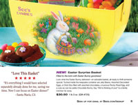
See’s Candies uses ratings and reviews similar to a testimonial. Consistently presented throughout the catalog, the call-out of a few key words above the 5 stars along with review complements the product shown.
The entire treatment is differentiated by using a serif typeface whereas body copy is a sans serif. The red stars call attention to the Ratings and Review without overpowering the product presentation.
L.L. Bean | See’s Candies | Miles Kimball | One Step Ahead | Gardener’s Supply
Miles Kimball

The catalog featuring Christmas cards showcased 5-star ratings in a box with a gold color perimeter and five gold stars center atop the box. Under the five stars is the wording, “Five-Star Customer Review” also in the gold color.
The typeface is an easy to read script font, and is set apart from the selling copy. Centering copy is usually difficult to visually process, but this seems to work because there are only a few lines of copy and not a large paragraph of text.
L.L. Bean | See’s Candies | Miles Kimball | One Step Ahead | Gardener’s Supply
One Step Ahead

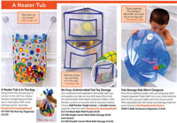
Many products feature a short one-sentence review endorsing the product. The narrative is always in a color-shaded box with color perimeter to match the product section of the catalog (which is also color-coded.) While there are no stars to communicate a rating, with so many products featuring this call-out box, the feeling is customers have a lot to say about the products.
No customer name is given within the review box, instead their city and state is included. Visually I had the impression of someone whispering a secret advantage about the product. Their presentation with minimal space devoted to the call-outs combined with the volume of call-outs, achieves an over-arching affect of product popularity.
L.L. Bean | See’s Candies | Miles Kimball | One Step Ahead | Gardener’s Supply
Gardener’s Supply

Surprisingly plenty of space devoted to the rating and review, and these are peppered throughout the catalog to interrupt purposefully. The five-stars are white reversed out of a golden box and always featured in the upper left corner of the perimeter.
On the same line with the stars is a headline treatment with key words featured larger. The narrative is consistently in a purple font and periodically includes the customer’s screen name such as “obsessed gardener” providing a bit of whimsy as well as reinforcing authenticity.
L.L. Bean | See’s Candies | Miles Kimball | One Step Ahead | Gardener’s Supply