Right from the cover, you get the sense that it’s good to be Patrick James–or at least, it’s good to buy your clothes from the Patrick James catalog. The men’s apparel mailer is a “West Coast Classic,” according to its cover, and its Holiday 2009 edition is a 2010 Silver winner in the Apparel with Sales Under $20 million category.
Why it won a Silver:
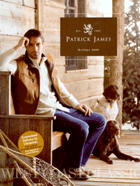
The beautiful and engaging cover photo of a handsome chap lounging on a bench outside a rustic cabin with his equally handsome dogs a wowed the judges. “The front cover not only shows product, it demonstrates a clear brand and lifestyle,” said one member of the panel.
The copy has a consistent voice and sells the product appropriately, said one judge. Into copy at the top of some pages, such as “Celebrate the season of comfort and joy by giving yourself a much deserved reward…the unabashed, unparalleled luxury that is fine cashmere…” is interesting and a nice touch. One panelist felt this copy could be even more beneficial if designed with the reader in mind—it’s a little hard to see.
Then there’s the merchandising. The assortment of product is terrific, a judge said, “and the copy indicates the quality of the fabric and construction.” Patrick James could take this a step further by informing and selling customers on the different brand names throughout the book, the judge said.
Overall, this edition is a strong multichannel initiative “with strong results to prove it,” a judge said. “Smaller catalogers do not have to sacrifice excellent design and quality photography in order to be profitable!”
Why it didn’t win a Gold:
For such expensive merchandise and affluent lifestyle, “there is a design disconnect” in the catalog, a judge said. For instance, there weren’t enough on-figure product shots, and there should have been more lifestyle photos. “Reducing density on some pages to showcase important items would help align the merchandising with the brand,” the judge noted.