VeryVera
VeryVera sells all sorts of foods, from hors d’oeuvres and salads to casseroles and quiches. But its real bread and butter is cake — double chocolate cake, red velvet cake, Georgia Brandied Peach cake and many more.
But is its catalog design as tantalizing as its product line? Critiquers Mark Lee, principal of consultancy The Mark Lee Group in Charlottes-ville, VA, and Lori McFadden, a Laguna Beach, CA-based creative consultant, reviewed VeryVera’s Holiday 2009 edition. Here’s what they had to say.
MARK LEE
Along the lines of “boxers or briefs?” and “Ginger or Mary Ann?” one could divide food lovers into “sweet or savory.” I happen to fall squarely into the latter category, so I didn’t think I would find much to love in the VeryVera catalog. The company’s reputation is centered on its line of gourmet cakes but, as I discovered, it also carries a variety of delicious-looking casseroles and entrees.
Here are some basics: The book is printed with heavy ink coverage on heavy matte paper inside a cover that’s almost as thick as shoe-box cardboard.
At just 20 pages, it weighs a full 1.6 oz. — substantial, but still well within the size, weight and aspect ratio limits for a tabbed, letter-rate piece. Large mailers might cringe, but this is a reasonable printing strategy for a relatively small circulation book that wants to emphasize quality.
VeryVera founder Vera Stewart is clearly conscious of branding opportunities. She devotes the entire opening spread to her story — her small-town Georgia upbringing, and the grandmother who taught her to bake.
The image that’s projected feels authentic, which may contribute to her success in publicizing the company (a coup was being featured on Oprah Winfrey’s “O-List” last year). I’m convinced, without tasting a bite, that the product is top quality and shipped in a way that preserves its beauty and flavor.
The catalog’s design is another story. The cover isn’t bad — it’s very “designy,” but I think it succeeds in its ostensible goal of feeling like an update of a small-town 1950s look.
VeryVera’s cover introduces an odd, dotted-line motif (like the lines around a coupon) that runs throughout the book. It’s also the first taste of a creative stance that places design elements well above product photography and copy in importance.
For example, page four sells layer cakes. Despite the inherent beauty and aesthetic appeal of the products pictured on the page, each is shown in only a tiny, 1.25-inch diameter circle. In fact, of the available area on the page, only six out of 24 square inches are devoted to actual product images.
The rest of the page? There’s not much copy — mostly just busy background.
Page 5 does have a “hero” shot for the category. But that shot takes up only seven or so of the available 24 square inches.
I give the company credit for using a kind of pacing to break up the flow as you flip through the book. Each of these has a theme but, for my taste, there’s a bit of a disconnect among them.
One spread has been designed to look like the menu from a 1950s diner, but again, the product shots measure less than 1.25 inches.
The book is well printed, but with such tiny images on matte-finish paper, you’re denied a large, mouth-watering image of any item.
Much of the copy is set either in black type overwriting a dark, busy background, or in reverse type over a busy background that’s not at all dark enough. When you dare people to read your copy, they are likely to give up.
When it comes to the product descriptions, as the saying goes, good copy sells the sizzle — not the steak. VeryVera understands this — but perhaps the cataloger takes it to an extreme, since important information is sometimes lacking (how big/how many ounces, etc.).
The copy describing the core products (layer cakes, for example) is highly personal. There are wonderful anecdotes, many evoking childhood memories for the reader. On the other hand, when you get beyond the core baked products, many items are not “romanced,” but merely line-listed. Product density is high in these pages, and copy reflects this.
And given the high standard of proofreading and editing prevalent in today’s catalogs, it was a bit jarring to see several errors in spelling and grammar.
As for the merchandise, I’ll have to assume that the assortment is wonderful. There’s a cake-of-the-month option, if you’re really into the category. It’s great because it allows substitutions and you can use some months’ selections as gifts, while keeping others for yourself.
It seems cakes and bakery items were VeryVera’s original products, but as a regional caterer, it was routinely making hors d’oeuvres, dips and casseroles. So the merchant probably decided to add these to the offering.
Packaging would seem to be a challenge, but in countering this concern, VeryVera devotes a full page to the tins it uses, complete with straps to hold the goodies in place.
The catalog incorporates several themes, including “Happy Hour” (an assortment for $50), and “Breakfast” (a pricey $80). Perhaps my favorite concept is “Everything But the Turkey,” which encourages customers to “Let Vera handle the cooking and spend your time with the kids.”
A concern: It took me way too long to figure out that these were assortments of items described elsewhere. As a result, I had no idea how much product was in each assortment.
My recommendations? I’d advise VeryVera to consider the following:
- Bigger photos
The food is exquisitely photogenic, and it’s a shame not to show it off.
- More readable type
I may be a bit of a fossil on this point, but the more work it is to read copy, the fewer people who will read it.
- Less “busyness.”
I would consider reducing the number of competing design elements throughout the book.
And finally, the cataloger should make it easier to understand what the customer gets. It would be nice to have weights, counts, and so on shown for each product, including assortments.
LORI MCFADDEN
Right from its cover, the VeryVera catalog is off to a tasty start. The book’s digest size seems keenly appropriate: good things, small packages.
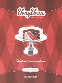
Retro-style graphics enshrine the classic Red Velvet Cake — the image looks almost hand-colored atop a shiny pedestal. While the deep burgundy background is a tad dark on the heavy matte stock, the VeryVera masthead is friendly and bright.
Messaging is minimal: 25 years, holiday 2009 and the company’s Website address. It’s a clean and rich-looking cover promising nostalgic, homespun quality.
Continue to Page 2
The opening spread does a terrific job of introducing the founder, Vera Stewart, with a current hearthside photo and two small shots of little Vera, one with a big birthday cake.
The product shot is overly ambitious, trying to squeeze too many cakes into one poorly lit shot. And Vera’s story in reverse type might be too hard to read.
But the overwhelming element is the background color. Of all the yummy colors in the world, this spread gets the darkest green, almost black as it sinks into the page.
Then we get to the cakes. The first selling spread is done in glowing rosy shades to complement the Strawberry Layer Cake that commands a full page. “As seen in Oprah magazine,” the only callout in the book, is not just a shameless appeal to our celebrity-crazed culture; it’s the best testimonial anyone can get.
Five flavors share the left-hand page with the dotted lines and twisted-ribbon pattern that so charmed me on the cover. But now I just want to see the cakes! The little round photos seem almost inconsequential, buried under layers of graphics.
Giant headlines look like logos, taking up premium space but saying little. Product descriptions are folksy and evocative, but difficult to read over the rich color and pattern. This catalog has been hijacked by design.
The interesting thing is that it is good, strong, clean design. It’s organized and consistent and in keeping with the brand character. It’s just not doing the product any favors.
VeryVera is not shy about devoting space to its history or service. This is refreshing, since most catalogers don’t spend enough time and space developing and communicating the impossible-to-measure value of their brands.
But if you want the book to perform, you need to let the product shine, too.
At 20 pages, there is not a lot of room to spare. One spread of savory items consists of single-line listings under the “Gourmet to Go” headline.
Nearly half of those items are repeated on the following spread as “Featured Menu Items,” with persuasive, homespun copy and more postage-stamp-size images. A “New Packages” corner snipe introduces the next section with large, heavily propped lifestyle photos.
“Packages for any Occasion” is the most intriguing merchandising concept in the book. It’s selling good ol’ Southern hospitality. Dwarfed by the “Everything but the Turkey” package, the home-cooked menus are titled by event: Christmas Morning, New Arrival, Feel Better and Southern Comfort. This concept deserves more attention.
VeryVera understands the value of selling its service, breaking down barriers to buy. A full page, just before the closing spread, describes its packaging secret that gets a perfect cake delivered looking like it was just picked up at a local bakery.
Good to know. But this message could have shared space with the ordering info on the next page very effectively.
I don’t know how successful this mailing was. But I know that it could do better. Here’s how:
-
Address space allocation issues. Not every hero demands a full page. If a product or category does not merit adequate space to sell it here, refer your customer to the Website for more selection. Consolidate service and history messages to make more room for product.
-
Tone down the design to highlight the product. Sell the items along with the brand.
-
Improve the product photography. Adjust the lighting and color separations for better reproduction on uncoated stock. Use light propping to differentiate the cakes and to avoid overpowering the package shots.
-
Use those flashy graphics to call out endorsements from Oprah and Gourmet magazines, or to draw attention to the brand messages.
-
Lose the redundant headlines (“Layer Cakes, Layer upon Layer”) and lure me in with that neighborly voice so well developed elsewhere.
-
Sell your best product on the opening spread. (Where can I find that Red Velvet number from the cover?) But keep Vera’s story — always.
-
Play up concepts that emphasize the positioning and make this brand unique, like “Cake of the Month” and hospitality packages. And consider calling out these defining offers on the cover.
-
Decide where to put the URL and leave it there. It bounces around from spread to spread with varying importance. You want to make this easy.
VeryVera’s Holiday 2009 catalog packs a lot of punch into its 20 pages. As an image piece, the book is very appealing. As a catalog, it could work harder to increase sales.
Now, who wants cake?