Title MMA specializes in mixed martial arts equipment, fight apparel and casual clothing. The merchant gamely offered up its site as a contender for a critique for Amy Africa, president of Web consultancy Eight by Eight, and Brian R. Brown, lead consultant with SEO agency Netconcepts, to take on. Africa looked at content and functionality and Brown tested search capability. Here’s what they had to say.
AMY AFRICA
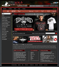
The majority of sports apparel sites look exactly alike. Title MMA is no different: It does a lot of things well (nice balance of action shots vs. silos, for example), but there is also a lot of room for improvement.
Title MMA employs a nice, big carousel (the rotational banner in the middle column) on the entry page. This is a fantastic trick to improve average active user session time and to increase drills (actions the user takes on the site), and it’s one almost every e-business should implement.
With that said, Title MMA uses 12 carousel rotations. Using more than five or six can affect overall conversion to action, so unless you’ve thoroughly tested adding more rotations (one-by-one), it’s best to stick to four to five. (One of the main influences of carousel success is the speed, and Title MMA has that nailed — not too fast, not too slow.)
Each carousel rotation should have a call to action in it. Title MMA has some excellent photography on the site and several of the rotations have solid visuals. But carousels don’t serve their purpose well unless they tell the user what they’re supposed to do — click and/or buy.
Each frame (rotation) should be a mini-commercial with a provocative message and solid action directives that instruct the user to drill deeper into the site — for example, “add to cart” or “buy now.” It’s not enough just to have a pretty picture and a category heading.
Above the carousel, Title MMA has a slammer, a ticker-tape-like banner that displays the logos of the different brands it sells. A lot of sports sites like these — they typically don’t work, but they’re sexy, so folks use them anyway.
This would be okay for Title MMA if the site did not use a carousel, but since it does, it’s a bit of an issue. The eye can’t follow both patterns (one is faster than the other), which will stimulate the emotional brain to get involved to protect the user from danger.
This, of course, will result in additional abandons and/or staggered exits. If the site wants to include the logos, it should pick the top sellers and eliminate the rotation.
What else could Title MMA do to improve the site? Here are some quick and easy steps.
- The perpetual cart needs to be more contained
The cart information and the credit cards, along with a shopping cart icon and a statement that addresses security (“100% secure shopping guaranteed,” for example) should be in the upper-right-hand corner.
The login and my account information can go underneath it. Perpetual carts work better if all the cart stuff is in one place and not spread out.
- “Specials” needs to stand out more
Dumping it on the right-hand side in the color green is not enough.
If this is something you want the user to click on, it needs to stand out more. (It’s important to note that there are weird gaps in the header and in the action bar on this site. Because the gaps are in the center column, this may negatively impact eyepath.)
- The search function is weak and draws a dead end
(Meaning that if your search is not successful, there are no generic recommendations for no-finds on the page.)
This is something to be carefully monitored. Even if you can’t afford a fancy-schmancy search package, you should be able to handle simple misspellings with a dictionary or thesaurus.
And even if you can’t do that, you should have a robust page for no-finds. Tested (with vector), your presentation in the search — whether the user is successful or not — is almost as important in your choices.
- Use a headline that calls out one of your benefits (exclusive products, for example) and a call-to-action button
Remember, on an e-commerce site users need to get the message that they are supposed to buy, not just browse, on the first — and every — view of your site.
Even if users need to select a size or a color (in other words, even if they need to go to the product page to make their selection), you can add “buy now” or “add to cart” buttons every place you see a product. These are tiny embedded commands, and they go a long way toward helping overall conversion.
- Add some numbers
It sounds simplistic, but it works. Tell the users the number of choices they have — if you have 13 large bags and 12 small ones, tell them.
This gives them an idea of the breadth of your product line and, tested, it makes the process look and seem easier. “View all” should always be an option for the user.
- Highlight the savings more
Some of the savings on this site are really impressive, but they’re not called out as much as they could be, especially on the individual product pages, where they really tend to get lost in all that black and gray.
- Move the user-review stars into the first view
There are plenty of good review packages to choose from now, and many of them are really inexpensive. Some are even free, so there’s just no excuse not to use one (unless, of course, your product or service stinks across the board). Title MMA does use a reviews program, but a lot of the products don’t seem to have reviews.
- Consider sending out an e-mail soliciting reviews from past buyers of the product
This is also a great order generator as well. You don’t need to show the user reviews (the verbiage) themselves on the first view, but you should include the number of stars the product has near the title.
Also near the title, you should promote stock messages and delivery options. This has become increasingly important with e-commerce sites.
Do you have the product and when can I get it? If it’s in stock, make sure to say it on the first view. (As an aside, Title MMA should consider eliminating the blank item number, stock, and price listing block on the product page — it’s confusing.)
The product pages have great visuals, but the visuals take up the entire first view so it looks like there is nothing to buy. This is an issue with many e-commerce sites, and one that can be easily remedied by making your product and category windows and plugs — both non-animated banners — more aggressive.
BRIAN R. BROWN
SEO is about more than just best practices and using the right techniques. SEO is also about understanding your strengths and weaknesses and, just as important, sizing up your opponent. If you can’t do that, you are going to find yourself on the losing end of many battles.
Next Page: Canonicalization
CANONICALIZATION
One of the first things on the SEO checklist is canonicalization. At first glance, Title MMA is looking pretty good: Typing in titlemma.com or, more important, links to titlemma.com, 301 redirects over to www.titlemma.com.
But don’t stop there. Try pulling up an interior URL without the “www” and you get a far less friendly interaction: “Server Error in ‘/’ Application,” which returns a hard 404 response. While the root domain is the most important concern here, it’s only the first round. But any links created to any interior URLs that don’t include the “www” in this case will be wasted.
Human visitors may not realize what has happened and may just back out and go somewhere else; and search engines won’t be able to crawl the site from those links and won’t associate any real value to those links. Note that we don’t want both versions to exist; in this instance, we want the “non-www” versions to 301 redirect to their “www” canonical versions.
DUPLICATION
This isn’t the only canonical issue. The other one is often simply referred to as site duplication. Site (and content) duplication has been a big focus of the search engines, and it’s an extremely common challenge to e-commerce Websites.
Title MMA is experiencing categorization duplication. Due to products being placed within different categories and sections of the site, whole subcategories of products and the products themselves are being duplicated across different URLs.
Timers for fights exist within both the Accessories category (http://www.titlemma.com/sf_76/c_9.aspx) and the Cages, Rings & Mats category (http://www.titlemma.com/sf_591/c_10.aspx).
But product level duplication is worse. Take the Everlast Pro Round Timer. You can find this product duplicated across at least four URLs:
-
Accessories category: http://www.titlemma.com/sf_76/c_9/p_EVDGT.aspx
-
Cages, Rings & Mats category: http://www.titlemma.com/sf_591/c_10/p_EVDGT.aspx
-
New product listings: http://www.titlemma.com/sf_555/c_303/p_EVDGT.aspx
-
Everlast brand section: http://www.titlemma.com/sf_267/c_11/p_EVDGT.aspx
And I have to imagine that some products might also be further duplicated within the “Sale” or “Specials” sections. Unfortunately, a search in Google for “everlast pro round timer” brings Title MMA in at the number 10 spot, but not for any of these URLs.
Instead, the “Write a Review” page shows up (http://www.titlemma.com/ProductReview.aspx?pID=EVDGT). Perhaps that isn’t so surprising, since the review page is linked to from all of these duplicated versions, which might be making Google think that it is the more authoritative page.
The review page isn’t that strong, though, aside from these links pointing to it. However, if the product page duplicates are consolidated to a single URL, that product page will not only probably be returned for searches instead of the review page, it will probably rank higher as well. It’s okay for the products to exist in different categories, but don’t create new URLs for them.
If that wasn’t enough duplication already, Title MMA is also experiencing presentational duplication. This refers to anything used to affect the presentation of the page contents.
Most commonly, this refers to sorting functionality, such as sorting by price, brand, ratings, color, size or some other characteristic. Title MMA is actually okay in this instance, as the Sort By functionality is JavaScript powered. Even the Refine Your Search and Items Per Page functionalities don’t create new URLs, that’s okay too.
So where’s the issue? Pagination. The pagination issue here is unique.
Pagination typically creates issues when combined with these other presentational functions when additional URLs are created, or simply leads to lower value pages that appear too similar to each other. But in this case, the pagination issue occurs at the product page level due to the page reference being added into the URL.
For instance, if the product above were to appear on the second page, it would have a “/pg_2/” injected between the “sf_76” and the “c_9.” Not only is this creating yet another URL duplication (potentially more, though, due to sorting functionality pushing products to different paginated pages), it is moving the product down an additional directory level.
LANDING THE WINNING BLOW
Like a fighter, a Website needs to be proficient in many areas. Just as no fight is won with a single move, no Web page wins in search results from a single move. But when it comes to critical strengths, the title tag is still one of the most powerful.
Unfortunately, Title MMA is a bit mixed in this arena. Forget optimal keyword phrasing at this point; in many cases, the subcategory sections simply duplicate the parent category titles.
The title tag is one of the strongest signals that any page can send to the search engines, and having duplicate title tags is like fighting with your hands tied behind your back — it isn’t pretty.
If you could do only one thing, then making sure duplication of title tags is eliminated or at least greatly minimized would be it. (Okay, making sure the site is crawlable might be slightly more important, but the two really go hand in hand, or is that hand in glove?)
Otherwise, we send the initial signal to search engines that all of the pages with duplicate title tags are themselves duplicates. Then we rely on there being enough difference within the pages for the search engines to realize that they are in fact not duplicates. Still, we greatly reduce the pages’ ability to rank competitively.
Title MMA carries many great brands and products that are very specific to its niche. But many of the keyword fights they are waging are way too broad and hyper competitive.
The site may be fighting a losing battle trying to go after broad brand and product terms like Adidas, Nike, apparel, footwear and gloves. Even fight related brands like Tapout, Throwdown and Everlast may be too much at this point in time.
Too broad a focus and hyper-competitive targets are all too common, though. Rather, Title MMA should turn to keyword research to identify more targeted, more relevant, and possibly less competitive variations that it could use to win.
Or if it’s already winning for the keywords, Title MMA could possibly greatly improve its rankings for those terms. The company should take the existing terms and look for relevant modifiers, such as training gear, fight gear, martial arts gear, MMA clothing, and so on.