A successful retailer is one who has engineered the shopping experience to the habits and needs of the customer. Ecommerce sites have access to a wealth of data on the shopper – what website did they come from, what categories did they browse, what products did they click on, when do they abandon a page, and what purchases were ultimately completed.
This information along with a variety of other metrics provides a powerful perspective into “what” the shopper did on an ecommerce site, but the “why” behind shopper behavior cannot be gleaned from these online analytics alone.
Eye tracking is widely used in both brick-and-mortar stores and online retail sites to study how shoppers engage with the environment and to understand what products, promotions and features capture the eye. The reason that eye tracking is well-suited to research in these areas is that our eyes are the primary way that we interact with the marketplace, whether it is an online auction site or a big box superstore.
Measuring visual behavior is the only objective way to examine what catches our attention, holds our interest, drives us toward a given product, and influences our decision-to-purchase. Obviously, this data is extremely valuable to ecommerce retailers interested in improving the user-experience and maximizing the only web analytic that really matters: sales.
Eyes on the Prize
So what can eye tracking reveal about online shoppers? Here are seven general insights learned through eye tracking that can improve the ecommerce experience:
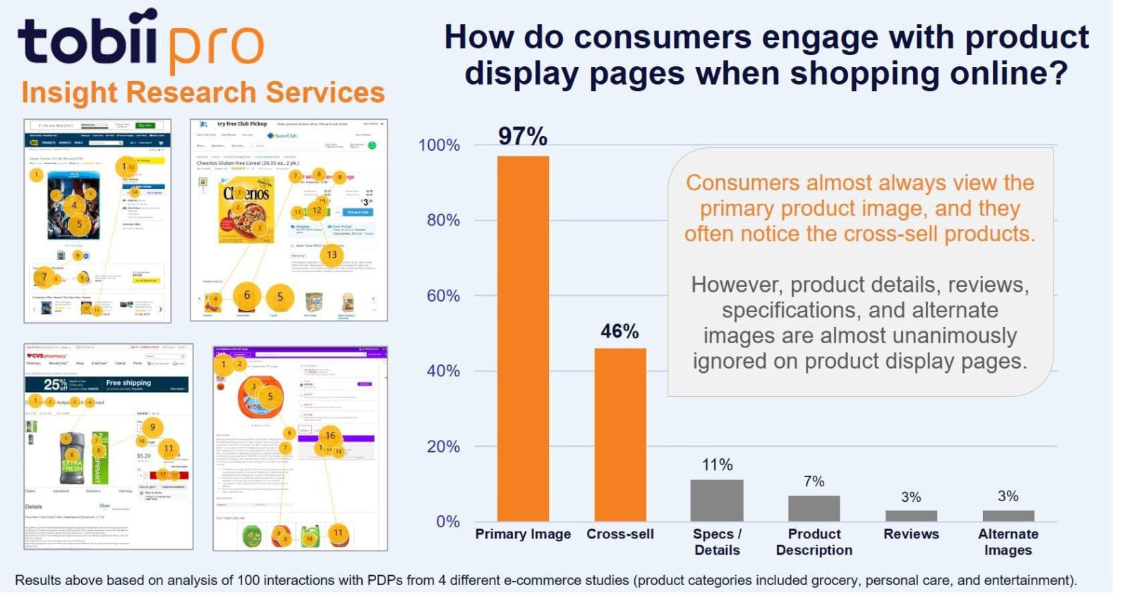
Product Visuals are Attention Grabbers – The Tobii Pro Insight Research Services group recently conducted a meta-analysis of the attention paid to product display pages across several grocery, personal care and household sites. It discovered that the content on these pages (reviews, ratings, product information, alternate images and specifications) was being completely ignored by the vast majority of shoppers. The only elements of the product display page that were regularly noticed were the primary product image (noticed by 97%) and the cross-selling offers (noticed by 46%). These results suggest that for these product categories, the product display page interaction is brief and focused. Shoppers confirm that they have selected the appropriate product and then briefly consider other products offered. It is important to keep this in mind when determining which content belongs on this page.
Content Matters When the Products Matter – We make intuitive, impulsive decisions when shopping for disposable, household items. That changes depends on the price and the sophistication of the product. A high-end sound system for your TV will likely garner more thoughtful reflection because it is more expensive with specifications that matter than say a can of deodorant or a bottle of mouth wash. If you are a retailer of high-end products, then content should be a prominent section on the product display page. If you are selling fast-moving consumer goods (FMCG), stick to just product image and price.
Your Web Layouts Should Match the Decision-Making Process of the Shopper – Eye tracking can identify the decision-making process customers are using on your site, enabling you to tailor the site to those specifications and optimize the interface to increase conversation rates. For example, KLM Royal Dutch Airlines revamped its online booking site so that price and scheduling information (the two most important variables to their customers) were given prominence among other flight information. The redesigned ticket-buying tool significantly increased customer conversions with a 30% boost in users moving on from searching for flights to actually booking tickets.
Build out the Search Capabilities of Your Site – Retailers used to emphasize the main home page of their sites wanting to make a big initial impression on visitors. Through eye tracking we now know that most shoppers are spending just a few seconds on the home page, zeroing in on the search features instead. Retailers should make the search option prominent on their sites and build in extra capabilities there as that is the dominant form of navigation. Direct paths to products should be evident and easily accessible.
Place the Checkout /Buy Button on the Top Right of the Page – The buy button or checkout button is the most important input on a retail site so place it in a location where shoppers naturally gravitate to. On websites, eye tracking points to the right-hand corner of the page, particularly in Western culture where we read left to right. The buy button makes sense there since it is the natural conclusion of the first phase of the online shopping engagement.
Maintain Brand Uniformity– For retailers operating multiple channels, make sure that all your storefronts both online and offline use the same look and feel of the established brand. These are recognizable cues that grab attention, spur long-term recognition and lend credibility to the retailer.
Use Vertical Layouts for Mobile Sites – In mobile shopping it is very important to properly layout visuals that makes them easier to scan on smaller touchscreens. Speed and efficiency are key for holding onto a mobile shopper. Eye tracking research reveals that a vertical product layout, a medium zoom feature for viewing, size-specific call out of products, and consistency with image location and font type all help smooth the surfing experience and reduce the amount of shopping errors committed by the user.
With mobile shopping rapidly becoming a dominant mode for ecommerce, eye tracking’s value cannot be overstated. Eye tracking provides Web designers with a blueprint for shaping the best ecommerce experience for the shopper. It provides a clear glimpse into the shopper’s mind that no other methodology can match.
Mike Bartels, Research Director, Tobii Pro Insight Research Services, North America.