We’re now in the second decade of the 21st century. Attention spans shrink more every year. Competition is omnipresent. Emphasizing benefit generates a buying impulse; emphasizing structure and/or materials is support-wording, less effective in stopping, grabbing and convincing a prospective catalog customer than a “What will this do for me” reaction.
Loyalties are fragile, and the ability to grab, shake and convince is valuable enough to warrant listing here as one of the top five.
Okay, ready for an argument? Here are this year’s choices.
Best, no. 1
THE VERMONT COUNTRY STORE
Who writes the copy for this catalog? Some of the descriptions are almost poetic, and yet both clarity and uniqueness shine.
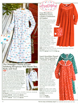
Where else will you see a heading such as, “The Nostalgic Charm of Lanz Salzburg Sleepwear Will Warm You, Body and Soul”? (I’m so impressed I’m overlooking the initial caps.)
Or a description for a flannel gown that begins:
“The Austrian skating and skiing scenes of Lanz’s Salzburg pattern will remind you of winters long ago, while the durable 100% cotton flannel will keep you toasty for many years to come ….”
Best, no. 2
NATIONAL GEOGRAPHIC
If you haven’t seen this catalog, you still believe that being able to educate and sell in the same copy-blocks is a lost art.
National Geographic seems to have found and restored that capability. An Alpaca Snowflake Cardigan includes this, in the middle of the description: “Artisans in La Paz create this soft Alpaca sweater with patterns adapted from the snowflake-like designs on the ceiling of the San Javier mission in the eastern Chitiquitania region, now a UNESCO World Heritage site.”
“Silk Road Bracelets” gain sales-worthiness from the description, which begins, “European art during the Renaissance was highly influenced by the goods coming from China along the Silk Road. Natural motifs of flowers and leaves decorated exquisite Chinese porcelain and began showing up in European furniture and jewelry designs. These silver-colored metal bangles ….”
Note that National Geographic copy is careful not to exaggerate. The “sell” is built into the verisimilitude.
Best, no. 3
ACORN
You might think a catalog that touts “FREE Episodes of Poldark and Lady Chatterley” and “Leatherbound Pocket-Size US Constitution” on its back cover is somewhat hifalutin. If that thought scares you off, you’ll miss some surprisingly motivational intellectualized copy.
A challenge for any journeyman copywriter: How would you have handled an assignment to write a sales-worthy description of a Money Water Lilies Tee, or a Frank Lloyd Wright Skylight Window Table Runner, or “Poirot: The Classic Collection”?
Here’s the “grabber” copy for “Poirot”:
“He’s the most-watched sleuth in the history of PBS’s Mystery! David Suchet stars as the dapper, diminutive Belgian who solves the most serpentine cases with the sharpest of minds and the driest of wits. Set in the Art Deco elegance of 1930s England, each mysterious adventure is a treat for the eyes and the intellect.”
Not to worry, Acorn. You won my heart by not sticking an apostrophe into “1930s.”
Best, no. 4
DR. LEONARD’S
In print or online, Dr. Leonard’s delivers what it promises. Nothing fancy, nothing that promises what the company might not deliver. The result is a consumer reaction all too rare in the year 2011: trust.
Rather than devote the home page to blather and chest-thumping, this online catalog strikes for the jugular vein immediately. Even as I was checking out my original reaction, the key item on the home page changed from compression socks at $3.99 to a quilted coat for $39.99.
The key item isn’t the only heavyweight on the home page. Links to “Clearance Outlet” and teasers for best-sellers keep the visitor from wandering, just in case the lead item doesn’t grab.
Best, no. 5
GOLD VIOLIN
The subhead on the print catalog cover is “Helpful Products for Independent Living.” Gold Violin excels on two levels: clarity and benefit.
Here’s a “Reclining Bath Lift. Note the quiet promise of the first sentence: “Enjoy a soothing, warm bath knowing you can get in and out of the tub safely and comfortably. This battery-operated lift gently lowers you into the bath ….”
Here’s the opening of the description for “Dress Myself Belt”: “If you can only use one hand while dressing, then this is the belt for you. It looks like any handsome brown dress belt….” And the beginning of “Shock-Absorbing Insoles”: “Twelve support springs absorb shock and disperse impact for all-day comfort ….”
Clarity and benefit. That should be a mantra for more catalogs.
Enough Mr. Nice Guy. Let’s move on to some catalogs that might (in my opinion) have had more octane in their copy.
Worst, no. 1
BE BEAUTIFUL
Inclusion in negative territory doesn’t result entirely from unprofessional copywriting. In this catalog, copy is, yes, professional. But it’s repetitive.
Too many copy-blocks begin with the word “These,” and “These” is a weak word to use as a starter. Other descriptions are so Spartan they’re puzzling. An example:
“NEW! A closer connection: A blend of certified organic extracts causes tissue to temporarily contract creating tightness and warmth without the use of dehydrating alum.”
That’s the total description. The code line calls it “Intimate Organics Embrace.” Would you order based on this wording?
Worst, no. 2
EDDIE BAUER
Do you see a deficiency in this description? I do.
“Fair Isle Cardigan: Our cozier-than-ever cardigan in a quintessential holiday pattern. Specially embroidered and beaded by hand. Finished with shiny metallic buttons. Lambs’ wool/nylon. Machine wash. Imported. Charcoal.”
Fair Isle? Huh? Quintessential? How? Holiday pattern, in charcoal? Hmmm.
Worst, no. 3
TALBOTS

I’m looking at a catalog on whose cover is the declared theme, Cole Porter’s “Night and day, you are the one.” Inside the front cover is a two-page full-color, full-bleed spread with a president’s letter, a tribute to the composer’s classic tune that blends into a tribute to the marketer:
“Clearly, it’s inspired our designers here too, where a few key pieces are given a multifaceted point of view.” That’s a “Huh?” … and it’s the end of any poetic creativity.
The very first item — again, full-page bleed, with the typical sullen model — has this as the total description of a jacket:
“FRINGED TWEED JACKET
“TALBOTS GRACE FIT
“Three-quarter sleeves. Fully lined. Back length: M22”; P21-1/2”; W24-1/2”; WP23”. Wool/nylon/polyester. Dry clean. Imported.”
And that’s it. They didn’t need Cole Porter as an inspiration. The clerk at Filene’s Basement could have done just as well.
Worst, no. 4
GAIAM.COM
Here’s a catalog whose print version rides serenely in the middle of the pack.
Descriptions in the printed catalog are clear and pointed. Then, a visit to the website is an exercise in frustration.
The first “page” I encountered is headed, “Request a Gaiam Catalog.” Then there’s the too-usual demand for information, loaded with asterisks as “Indicates a required field.” Let me out of here.
Okay, I’m out and at “Gaiam Life RSS Feeds.” Uhhh … first I’m warned, “Learn More About RSS Feeds and how to use the buttons below.” Under “Main Feeds” are two possibilities: “Gaiam Life Feed” and “Gaiam Blog Feed.” So I click on “Gaiam Life Feed.” Nope. It isn’t a link to anything.
The word “Learn” was a negative indicator, so when I’m in and down and clicking and still haven’t seen a single product, I’m outta here.
Worst, no. 5
CROW’S NEST TRADING CO.
If your intention is to be “different,” explain that intention. Otherwise, an unwitting recipient of your catalog may ask, “What the %$#@ is this?”
Here we have a catalog dedicated to the unusual. As a positioning ploy, it’s a success. Judged as an understandable description, it has problems.
Typical of the descriptions in this catalog is “Turquoise-Studded Cutting Spurs.” Here’s the total description:
“Show time. Handsome home decorations, but functional too. Wear them out-and-about. Rustic steel with German silver conchos and Kingman turquoise.”
That’s as peculiar as I’ve come across in quite a while. I can’t envision a fashion-conscious girl tripping across the dance floor while wearing spurs … and who can parse “Handsome home decorations, but functional too” … and “rustic” isn’t an apt adjective for steel.
And that’s it for this season. The web has brought the confusion factor into full focus. Everybody’s attention span, and its accompanying danger to effective marketing, patience is foreshortened.
If I overlooked your spectacular catalog that grabs and holds attention and then sells with exceptional words and clarity, my apologies.
If I missed your confusing catalog with descriptions and words your typical prospective customer doesn’t understand, be glad.
Herschell Gordon Lewis is the principal of Lewis Enterprises in Pompano Beach, FL, and author of 31 books.
These came close
World Wildlife Fund

If you’re a veteran catalog-browser, you expect dullness when you encounter a catalog issued by a not-for-profit organization. You expect self-serving self-pats-on-the-back.
Happily, the World Wildlife Fund “Gift Catalog” manages to give us bright and happy copy without sacrificing dignity. That’s a laudable accomplishment, especially since what they’re selling are plush little animals, and technically you don’t buy them, you “adopt.” Copy for “Meerkat Mob” begins, “Symbolically adopt two meerkats, or take the whole mob! After all, meerkats like to stick together ….” What you get depends on how much you donate.
The Territory Ahead
This pleases me, because last year I had evil comments about the catalog. So what’s different now? Cheerful copy that establishes and maintains rapport with the reader.
An example is “Bon Voyage Batik Shirt,” whose description begins, “The next best thing to a tropical vacation. Okay, not really. But on the bright side, no delays and no bugs. This shirt is authentically printed by hand on smooth rayon using traditional batik methods ….” Yes, yes, we all know that “thing” isn’t the height of catalog copywriting, but it’s forgivable here.
Bionatures
This catalog maximizes the benefit of each health-related item without becoming strident or stretching into questionable-claim territory. But descriptions of individual items are better than copy for multivitamins, and that’s why Bionatures isn’t in the top five.
An example is this, the complete description of a men’s vitamin: “Men’s Multi-Vitamins are a comprehensive multi-vitamin, mineral, and herb formula that provides all of the essential nutrients needed for optimal health. The formula contains a wide variety of nutrients needed by everyone, as well as specific supplements that are especially targeted for the needs of men.”
That’s it, except for a list of ingredients in each tablet. The text repeats the nonspecific “nutrients needed” and tosses in “needs of men,” bypassing specifics and leaving it to the reader to analyze the list of ingredients.
Compare that “blah” copy with the specifics in this typical single-product description, for MSM:
“MSM is a naturally occurring sulfur compound that promotes healthy inflammatory response, eases joint discomfort, and strengthens connective tissue. Clinical studies have shown MSM to be just as effective as NSAIDS like ibuprofen in reducing joint pain and inflammation — without gastrointestinal side effects.”
Maybe this cataloger has two sets of copywriters.
Sleep Solutions
Copy is on the Spartan side, but every word counts in this catalog whose product lines range from pillows (obviously) to cosmetics.
I’m bothered by the overuse of ampersands: “Shape, strengthen & tone your legs” … “reduce redness & conceal under eyes circles” … cause of hair thinning & hair loss” … “deeply cleanse & smooth the skin” … “in the pool or out & about” … and these are just from one spread.
Too, I got a chuckle out of Feng Shui Candles, whose first descriptive sentence is “Ancient Chinese believe one’s fortune is affected by the balance of 5 elements (metal, wood, water, fire & earth).” If those ancient Chinese are still around, I’ll believe whatever they believe (& then some).
I’m picking on this one because copy is pointed, unblemished and crisp. I’d like to see the catalog in a future top five.