
Every year it gets harder.
No, it doesn’t get harder because we have fewer catalogs. It gets harder because it’s more difficult to isolate catalogs that are demonstrably better or worse than others. And the number of available media has increased.
Some print catalogs are falling like leaves. They are either switching to an entirely online presence or are issuing less frequently or are reducing size or are discontinuing altogether.
Those declines may or may not be related to the worth of the individual catalog. Each field of interest, consumer or business, has its own competitive barbed wire.
More Web catalogs demand personal information before even disclosing what they’re selling. Is this effective marketing in a tough and highly competitive environment? Those catalogers think it is. (I don’t.)
Okay, ready for an argument? Here are this year’s choices.
BEST, NO. 1:
Magellan’s and magellans.com
I feel guilty listing Magellan’s in the Top Five again. Year after year I’ve included it somewhere, and eventually I have to wean myself of being this cataloger’s unpaid acolyte.
Not encountering the space limitations of print, the online catalog extends its sweep to many more items. But the descriptive talent doesn’t flag.
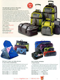
An example from the printed catalog, for “Pack-It Cubes”: The heading “How to avoid the rummaging of Airport Security…” leads into copy, which begins “…and organize all your small, easy-to-lose pieces of clothing and other gear, too.” Typical of copy in this catalog, benefit trumps elements.
BEST, NO. 2:
Sierra Trading Post
What grabs me is the ability of this catalog’s copywriters to add benefit to the descriptive mix.
A women’s microfiber trench coat starts with, “The velvety microfiber in this full-length trench coat is so accepting of color dyes, it won’t fade from its gorgeous, dark night color … not even after machine washing.”
A men’s sweater starts with, “The finished look of a sweater outside, the breathable warmth of a fleece inside, and a dignified berber fleece collar lining for extra comfort.”
Nothing spectacular here, just solid selling copy that never goes overboard — and therefore doesn’t generate returned merchandise.
BEST, NO. 3:
Soft Surroundings
Here’s another catalog aimed at the distaff side, so my appreciation is intellectual rather than emotional.
What lifts this catalog above the milieu of similar catalogs is the elegant, rhapsodic tone of its copy. For “Silk Velvet Poet’s Shirt,” the first descriptive lines:
“Whether your evening calls for caviar and champagne or bagels and Browning, indulge your romantic nature. Slip into our exclusive silk velvet poet’s shirt. Beautifully hand-detailed with gently scalloped cuffs, covered buttons and a flattering hand drape….”
BEST, NO. 4:
R. Crusoe & Son
Including this catalog as one of the best may be unfair, since R. Crusoe has an implicit advantage: It’s practically all copy. Describing travel destinations, both mundane and exotic, the word that lifts the descriptions above the commonplace is “readable.”
A trip titled, “The Ageless Inspiration of Normandy, 8 Days,” begins, “Put simply, we love Normandy (and we still wonder why William the Conqueror left for England in the first place).”
Visualize that copy without the parenthetical phrase and we have a blah beginning. With that phrase we have to read on.
Each description stimulates a “Gotta see that.” In the midst of a pitch for Turkey is “Spend a fascinating evening with whirling dervishes, who spin themselves into trances, arms embracing the sky. After they’ve finished, we ask them what all that twirling is about.”
BEST, NO. 5:
Orvis “Ultimate Gift Guide”
Whoever writes copy for Orvis knows his or her market. Copy aims like a laser at those most likely to consider the item being described.
Suppose you were writing about a bed for older dogs. Would you have headed it as clearly as “Super absorbent therapeutic bolster bed,” stating a problem and then quickly solving the problem? Would you have begun the copy as this writer does, to have heads nodding yes? “Your older dog deserves to be comfortable. As your dog ages, joint pain and incontinence often become problems.”
A women’s wash-and-wear shirt, “Wrinkle-free cotton pinpoint shirt,” could have had many first lines, but how many would be as clearly convincing as: “Silky smooth, luxurious pure cotton emerges from the dryer with a just-pressed appearance.”
Nothing particularly magical here, just copy that quickly convinces.
Enough happy talk. Let’s morph from Dr. Jekyll into Mr. Hyde and look at some catalogs that might (opinion) have had more octane in their copy.
WORST, NO. 1:
Nespresso.com
This is a sticky wicket. Nespresso.com is a highly sophisticated, heavily produced Web catalog. My wife is a constant customer. So what’s wrong?
My wife is also a constant complainer that the site is too hard to crack. Getting into Fort Knox is easier.
Several problems: 1) Can’t get prices without a second click, so can’t make impulse buy. 2) Have to figure out how to order something, which kills spontaneity. 3) Find out belatedly: can’t order unless you sign up. Conclusion: An exercise in pompous production rather than salesmanship.
WORST, NO. 2:
The Territory Ahead
Hey, “worst” doesn’t mean “terrible” here. What drove me to include this catalog on the bad list was some of the wording, which obfuscates rather than clarifies. There’s a Core Leather Vest. What’s “Core” leather? Unexplained.
There’s a Home Range Coat. What about this coat suggests or explains Home Range? There’s Compleat Leather Sport Coat. I haven’t seen “Complete” spelled that way since college-level reading of Izaak Walton’s “The Compleat Angler,” published in 1653. This sport coat is goatskin, which complicates the possibility of clarity.
The merchandise seems superior. The headings sometimes puzzle.
Continue on Page 2
WORST, NO. 3:
Champion and Championusa.com
Two separate sets of problems here. The print catalog has too many parallel descriptions. For example, one two-page spread featuring six styles of men’s basketball shorts has six descriptions. Six descriptions are built around the word “cool.” The Web version demands a click before exposure to descriptive copy such as, “Feel free to wear these Champion rugby shorts both on the field and off.”
WORST, NO. 4:
Solutions
It’s no big deal. I have only one complaint about this catalog, which by and large is thoughtfully and clearly written. That complaint, regrettably, is all too common, as we saw in the previous example: multiple descriptions using the same verbiage.
On facing pages, this catalog has serving pieces, “So practical you can use them year-round” … and warming dishes, “You can even use them year-round without the stand.” Simple-to-solve creative situations such as this one suggest the value of an ombudsman who checks copy for redundancies before it goes on press.
WORST, NO. 5:
Mrs. Fields Gifts
This catalog uses “generic” copy. First sentences — for a Holiday Tin Collection: “The holiday wouldn’t be the same without our bestselling tins” … for a Red & Regal Flocked Box: “This striking gift makes quite an impression and serves a crowd” … for a Rust ‘n’ Rubies Tree: “Decadent and decorative, this gift is fabulous inside and out!” … for Luscious and Lovely Box: “A wonderful way to treat a group or the entire office, this beautiful gift box is brimming with fresh-from-the-oven favorites.”
None of these is terrible. None of these is inspirational. Yes, copy is workmanlike throughout, but hey, it’s a competitive world out there.
And that’s it for this season.
This problem intensifies: Not only can I comment only on catalogs to which I’m exposed; exposure becomes more limited each year with the explosion of Web catalogs that obviously don’t arrive unsolicited.
So to those estimable catalogs I missed, I apologize for not being on your list. For those catalogs I excoriated, I apologize for being on your mailing list.
And before you aim a brick at my window or that of the editor of Multichannel Merchant, remind yourself: These are only opinions. Yours is valuable too. Maybe even more so.
Herschell Gordon Lewis is the principal of Lewis Enterprises in Pompano Beach, FL, and author of 31 books, including Catalog Copy That Sizzles and Creative Rules for the 21st Century.
These came close
Footsmart
Here’s a catalog of women’s footwear whose copy never seems tired — whether describing a simple pair of socks or a designer shoe. And (as those familiar with my principal prejudice are so well aware) clarity is a major factor. Example…
The heading: “How can 2“ heels feel like they’re only 1“ high?” Subhead: “Stand for hours … you won’t believe you’re wearing heels with patented, built-in Insolia weight-shift technology!” Body copy is workmanlike, justifying the eye-catching headline and the claim in the subhead.
Vitacost and Vitacost.com
Is copy in the Vitacost catalogs, both print and Web, brilliant? No. Does the layout qualify as award-winning art? No.
Is the copy clear and aimed at consistent vitamin customers? Yes. The prosecution rests.
I’d give an edge to the print catalog, which seems less helter-skelter in organization, but that comment doesn’t factor into evaluation of copy.
Herrington
I have to include Herrington because of two award-worthy headlines I noticed in a recent catalog: “Meet Runaway, the Alarm Clock That Runs and Hides to Make Sure You Get Out of Bed!” … and “Finally, a Coffee Mug That Not Only Won’t Spill, It Won’t Scald Either — No Matter How Hot the Brew!”
Herrington didn’t quite make the top five because of overdependence on words like “Finally,” not because of initial caps.
LobsterGram
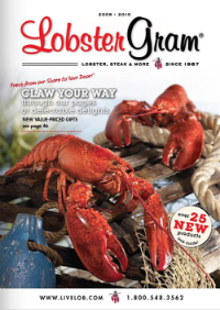
I’m not much of a lobster lover, but I admire convincing copy. First-person copy often stumbles over its own ego, but copy in this specialty catalog rings of enthusiastic sincerity. One glitch — repeated opening questions, some with questionable punctuation: “What’s for dinner, you ask?” … “What’s in a name you ask?” … “What’s not to love about this gourmet dinner?” You get the idea.
Brookstone
I’d have shifted this one up to the top five had copy been more consistently salesworthy. But interspersed with bright and motivational copy were nondescript first sentences such as “This collapsible tree makes holiday decorating easy!” Two laptop desks on the same page use the same key word, “sturdy.” Overall, though, here we have a well-written catalog.
X-treme geek
What a terrific catalog! The operative word is “entertaining.”
Whoever writes copy for this catalog has mastered the art of force-communication, plus the dedication and discipline that lead to a total understanding of what each item does and how it benefits the buyer. These in concert lead directly to copy that causes the reader to say, “I want that.”
Some descriptions veer into the esoteric, assuming the reader is more conversant with an item than can be universally true. That’s the only reason this one isn’t in the very top five.— HGL