Swipe right to like. Swipe left to pass. This is the general basis of Tinder, the popular app that gamifies dating by asking users to swipe to approve or disapprove of a potential match.
Swiping through apps and sites is nothing new. Consumers have been swiping through social networks like Facebook and Instagram for years. And recently, several online retailers have adopted the same type of swipe interface, being nicknamed “Tinderization” in their mobile shopping experience. Shoppers can swipe right if they like an item and swipe left to dismiss it. But does it boost ecommerce conversions? Will Tinderization last?
Here are some pros and cons of using the popular swipe interface in ecommerce.
Bringing the accelerated browsing process to online shopping
Ecommerce has revolutionized shopping, with product recommendations, personalized searches and filtering solutions that put the products your customers want right in front of them, and those they don’t out of sight. But online shopping hasn’t matched the same excitement and feeling of serendipity that so many shoppers chase when browsing in stores. Rather than viewing thoughtful store displays, online shoppers simply scroll and click through store categories.
The swipe interface changes this.
It can bring the excitement of browsing a bit closer to the shopper, giving them the power to decide which items they like and want to learn more about or purchase, and those they dislike, right from their phone. For now, this is the closest thing we have to thumbing through clothing racks and quickly eyeballing price tags. When this swipe interface is combined with better mobile checkout, online stores can improve conversions by three to five times over mobile benchmarks.
What a swipe interface offers retailers
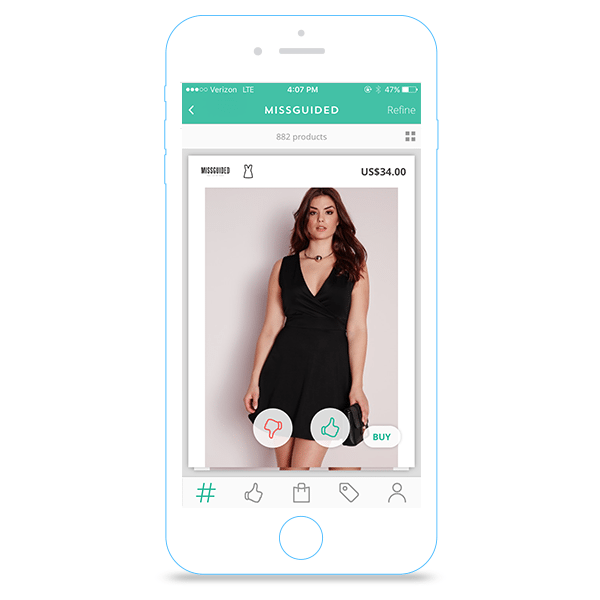
Mobile commerce design is even more important than the desktop design of an online store. Just a few tweaks in how information is presented can make or break the online shopping experience. For shoppers, swiping can make smartphone browsing just a little bit easier and quite entertaining. The traditional grid layout with two to four products in a row forces shoppers to click through to a details page to closely look at an item. The typical swipe design, which Tinder CEO Sean Rad says was inspired by piles of Polaroid pictures and playing cards, features a snapshot of one product at a time. After looking at an item closely, users can click through for more information like product details, alternate views or product videos. This accelerates the shopping speed for brands, especially important to the millennial demographic, who have dwindling attention spans and spend up to four hours each day using mobile devices.
The swiping concept also works well for brands with highly visual, design-focused and interesting products that users may want to get a good look at before exploring further—think home furnishing items like dressers and kitchen appliances, or shoes.
Integrating swipe functionality into a mobile store also helps shoppers organize the products they like and share them with friends, increasing retailers’ social reach. Mobile app Strut features 50 pieces of clothing curated from various online stores each day that users can favorite or discard. Favorited items are shared to a profile with additional styling options. The app even learns shoppers’ preferences to improve the experience and increase conversions.
Similarly, Mallzee, a UK-based shopping app, sells products from more than 100 stores and prominently features swiping. Shoppers can favorite items and save them to get tips from Mallzee stylists.
While swiping can increase conversions when done right, the greatest benefits for retailers lie in the data it can collect from shoppers. Every time a user picks products they love and discards ones they don’t, brands get an idea of what their audience wants to see.
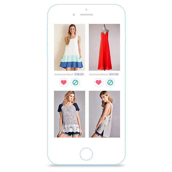
Online retailer Mint Julep Boutique‘s “Love It or Leave It” feature uses a swiping interface to enable shoppers to weigh in on what they love and want to see more of and what they don’t. The retailer then uses this data to determine which items to feature on the site, therefore providing a product offering that their customer base is sure to like and likelier to buy.
Collecting information like this can also yield data on peak usage and shopping times, enabling ecommerce brands to improve shopping experiences. Most-liked items can be featured in marketing emails, social campaigns or pay-per-click advertisements. Both Net-a-Porter and eBags have collected swipe data to learn which items users liked best. When eBags launched their swipe interface, 10 of the first 100 users bought bags.
Why swiping to higher conversion might not work
Using a Tinder-like swiping interface may work in specific instances, but there are pitfalls to implementing it in an ecommerce store. First, swiping through products is great for browsing, but it’s not the best solution for highlighting specific categories of products or inventory you want to move.
Swiping could also have the opposite effect of content marketing, making customers feel disconnected from a brand. Unlike swiping, which lets users dismiss items as soon as they appear, content marketing helps build relationships between a brand and its customers, educating and inspiring them, and boosting sales at the same time. Focusing on great content can help improve a brand and create new relationships when it’s shared on social media or through email.
The act of quickly swiping through products and making snap judgments also brings up an interesting question: How engaged are shoppers when they’re swiping left and right? Shopping app Mallzee gathered usage data and found that its peak times were Friday and Saturday nights, times its users were likely at home watching TV and not fully engaged in the shopping experience. Their data also showed that users browsed with the swiping interface and actually made shopping decisions on a tablet or desktop version of the site. So, while users might enjoy swiping to browse, is it really that valuable as a tool for your ecommerce store? The same effort expended on a feature like the Tinderization of an ecommerce store may be better spent on content initiatives like lookbooks or catalogs.
Conclusion
Is the Tinderization of ecommerce stores a lasting design feature or just a trend? It’s a conversation starter, for sure. But it can’t fully replace the detailed and informative content that draws in customers. In ecommerce, there’s no shortcut for real ongoing engagement. However, you can use the trend to your benefit by collecting data, tailoring product offering and marketing to your shoppers’ preferences.
James Van Arsdale III is Director of User Experience for WebLinc


