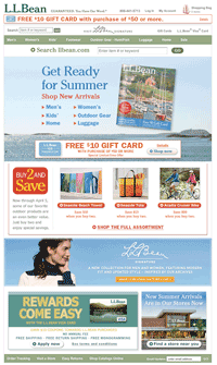
L.L. Bean’s Website delivers an exceptional home page experience, thanks to attractive imagery, strong brand-values messaging and a generally clean layout, according the judges in the 2010 MCM Awards. And the impressive home page was just one factor in LLBean.com taking a Silver Award this year in the Apparel, Sales Over $20 Million category.

Why it won a Silver
Judges appreciated the attention to detail in terms of branding and merchandising. How strong is Bean’s branding online? Even if you take away the logo from the home page, “you’ll still immediately know it’s L.L. Bean,” said one panelist.
The site also does a good job promoting the cataloger’s signature stellar service: Bean’s customer service messaging and contact info is evident from home page through the checkout process.
The use of rich media and technologies helps bring the L.L. Bean products to life. For example, judges were keen on the use of actual fabric swatches to show alternate looks vs. the use of a color block. Shoppers without a fashion sense can choose a “shop by outfit” option to keep from clashing.
“Product options and cross-sells are clear and easy to find,” a judge said. “I love that each product has multiple views, and the shop-by-outfit feature is simple and compelling.”
Bean also takes user-generated content to a new level with the addition of customer bios to reviews. That way, a browser can read not just the review, but determine if the reviewer is someone whose product likes and dislikes are similar or if the reviewer is not relevant.
Why it didn’t win a Gold Some of the online merchandising functions could be sharper. For example, most cross-sell options on the site made sense, but other options were not logical. “Adding hiking boots to my shopping bag provided ‘you might also consider’ suggestions including flip-flops, jeans and another hiking boot,” said one judge. “Where are the socks?”
