Follow US! |
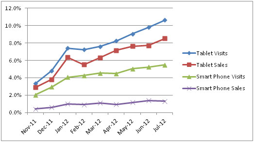
Smartphones have been the slow-growing mobile device in ecommerce over the last nine months. When it comes to “mobile” growth, the tablet is the real cheetah.
This chart compares the growth in tablet visits and revenue to smartphones across a sampling of ecommerce sites. These sites range in annual online sales from $5MM to $45MM, and include hard and soft goods. All spike in sales during the holidays, though some are more seasonal than others.
Tablets trump smartphones both in terms of growth rate and absolute magnitude of ecommerce. All of the sites above have a smartphone optimized site. The site with the highest percentage of sales from tablets in this sample clocked in at 14% in July; several others were over 10%. When it comes to mobile, Tablets are where the money is at!
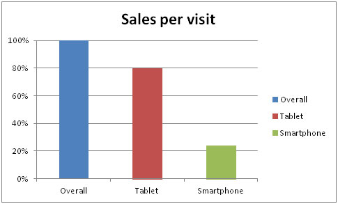
The growth in tablet commerce has come without merchants optimizing their site for the device. They haven’t had time! Obviously, ecommerce sites work pretty well as is on a tablet. However, as this chart shows, they don’t work perfectly.
Shoppers using a tablet convert at a substantially higher rate than those using smartphones, but still don’t convert as well as those using a laptop/desktop.
This presents both an opportunity and a threat for your site this holiday season. The opportunity is to make your site more tablet-friendly. However, if your competition does and you don’t, you may lose tablet shoppers.
Tablets use touch instead of a mouse and keyboard. This means that it’s harder to type or click on small graphics on a tablet site. The key to a tablet-friendly shopping experience is to take advantage of the touch paradigm.
Here’s how:
Follow US! |
- Make all buttons and clickable links bigger. Some of your best shoppers have large, somewhat clumsy fingers that won’t work well with your existing ecommerce site.
- If you use faceted navigation, change to selectable buttons.
- Remove any mouse-over events…there isn’t a mouse!
- Create a touch driven plus/minus on either side of the quantity box on the product page and in cart. Prefill the quantity with whatever default makes sense.
- Allow shoppers to login in with Facebook…chances are they are already logged which reduces typing.
- Use payment methods like Paypal that also require less typing. Tablet owners may be shopping while doing something else…they may not have a credit card handy.
- Take advantage of the “swipe” function to power features like a carousel.
You can optimize for tablets in the same way that most retailers optimized for smartphones; i.e. create an alternate version of your site that makes the changes listed above. For an example of this approach compare www.touchofclass.com on a tablet to a laptop/desktop. Depending on your ecommerce platform, this might be the easier/quicker/cheaper approach for this holiday season.
You can also code your site so that tablet-friendly changes dynamically appear based on the device and screen-size of a visitor. The web design community calls this Responsive Design. It’s a hot topic and is worth your time to learn more about. Change the width of your browser window at www.puplife.com and www.bostonglobe.com for examples of responsive design.
It takes more skill to code this way and can add weight to the page, so may slow down both development and response time. That said, many people believe it’s the future, particularly as differently-sized devices emerge.
Tablet shopping will represent 10% to 25% of ecommerce sales for most sites this holiday season. Give yourself an early gift this year and become tablet-friendly. Chances are your shoppers will give you a gift in return!
Larry Kavanagh is chief ecommerce strategist at Kalio Commerce.


