These came close
![[Click to enlarge] Copy in the Soft Surroundings catalogs shows mastery.](https://multichannelmerchant.com/wp-content/uploads/2013/12/herschell-gordon-lewis-soft-surroundings-236x300.jpg)
Mountain Travel Sobek 2014 smartly and elegantly emphasizes destinations rather than procedures. Specifics aren’t just activities and costs; this catalog builds the offers around uniqueness of the journeys.
OfficeScapes Direct would be in the top five if it didn’t rotate between superb copy and pedestrian copy. The first sentence of a description of an “Executive Ficus”: “Our executive ficus tree makes a dramatic impact.” Oh? Meaning what?

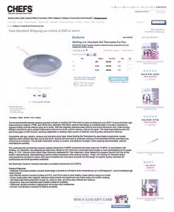
Chefs Catalog and Chefscatalog.com are brilliantly written. For years I’ve been a fan—and an occasional customer—of this marketer. I’m mildly bothered that descriptions in the printed catalog and online aren’t parallel.
An example is a nonstick fry pan, heavily flaunted as exclusive. The printed catalog says, “value $90.00”; the online version says, “Regular $90.” The printed catalog calls the pan “Thermolon eco-friendly ceramic nonstick interior.” The online version identifies the pan as Thermolon, then says, “Eco-friendly ‘green’ nonstick ceramic surface.” Not exactly different, but not quite identical.
Of course the web version has considerably more text, although one Barnum-like line, “The fry pan of the century,” appears only in the printed catalog. I didn’t know whether to applaud or hiss. (Of course, I’m being picky.)

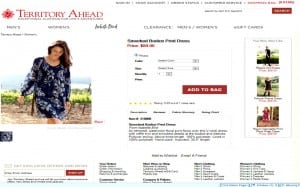
Territory Ahead combines tight copy, clarity and salesmanship. Just the beginning of a single-paragraph description of “Territory True Jeans” (can’t you think of a better product name?): “Our true indigo-dyed denim is easy, midweight, 12-oz. cotton. Machine washable. Choose from three washes: New Light Indigo is a medium blue that looks like….”
Other contenders that could have been in the top five or challenging them, except for space limitation: Body Belle…Magellan’s (of course)…Cuddledown…Miraclesuit…Gardener’s Supply.
And that’s it for this season
Are we witnessing a sea-change to copy that emphasizes benefit over structure? I hope so. That’s the core of trying to separate the best catalogs from the worst. Even the worst, if they highlight benefit, aren’t bad. So, more and more, we have to grade on the curve.
Yep! With luck, next year I’ll throw some fresh curves at catalogs. They’ll either strike out or hit home runs.
Herschell Gordon Lewis is the principal of Lewis Enterprises, Pompano Beach, Florida. Author of 32 books, including the recently published Internet Marketing Tips, Tricks, and Tactics; Catalog Copy That Sizzles; On the Art of Writing Copy (fourth edition just published); Asinine Advertising; and Creative Rules for the 21st Century, he writes copy for and consults with clients worldwide. Web address is herschellgordonlewis.com.