People selling data software and systems tend to extol advanced analytics and automation, but many marketers are still focused on getting the basics right. those who are less than satisfied with their current analysis and segmentation practices may be better off sticking to simple metrics and building campaigns and programs around improving them.
One of the simplest and most powerful metrics is customer recency. You may have a lot of data at your fingertips, but a good start is to really understand the insights available by delving into how recency changes over time.
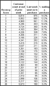 |
| FIGURE 1 |
Recency matters
Simple to calculate, recency is the time since last transaction. RFM (recency/frequency/monetary value) segments that use deciles or quintiles tend to hide the dramatic differences between adjacent recency values. Recency by week provides a good balance between granularity and usability.
Start by understanding your recency response curve. For a broad group of customers, calculate the recency score of each per fiscal week, and group them by score. In other words, those whose most recent purchase was in the fourth week of the year would be in one segment, while those whose most recent purchase was in week five would be in another segment. You should end up with 53 segments—one for each week of the year, plus one for customers who haven’t made a purchase in at least 53 weeks.
In the next fiscal week, identify the purchasers and what their recency score was. Then calculate the percentage of customers in each of the 53 segments that made a purchase. The resulting table is what we call the Percolation Report (see figure 1), since it shows exactly where the recency = 1 group came from–that is, who popped up to the top of the report. (For those of you too young to know what a percolating coffee maker is, ask your parents.)
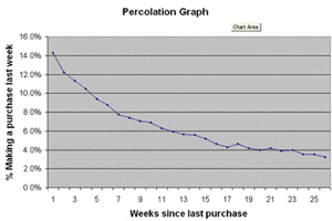 |
| FIGURE 2 |
If you chart the response rates by recency score, the values start high and quickly drop off. The curve gets horizontal fairly quickly. The point at which the curve flattens out is where it is unlikely that additional spending will generate additional revenue (see figure 2).
Using recency
The next step is to graph the same response rates with a 1/x transformation. This should result in a straight line for response up to your asymptote (see figure 3).
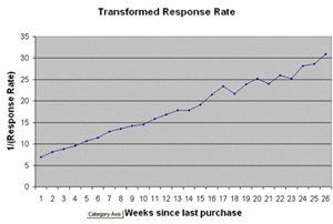 |
| FIGURE 3 |
Any time you see a value above or below the line it is worth investigating. These tend to fall into two general areas:
- One-week outlier: If a single week is higher or lower than the graph suggests, go back and look at your marketing for that week. You may have attracted a better- or worse-than-normal audience. If you tried something out of the ordinary, it’s worth further investigation to determine if you should repeat or eliminate that week’s tactics.
- Contiguous multiweek outlier: If several weeks in a row are above the line (which is bad), you may have a problem with your relationship marketing tactics. Your contact strategy may not be reaching your customers at this point in their interaction with you. Assess your time-based messaging criteria to ensure you aren’t cutting off at too low of a recency. For example, if weeks 14 through 16 are outliers, check to make sure you aren’t too aggressive in cutting off communication after 90 days (13 weeks).
Note that for consumer merchants, there is almost always a “holiday bulge” in the numbers, which translates to a lower response rate for the customers who last purchased in the five weeks prior to Christmas. This cohort will move down the report throughout the spring season.
Using recency in creative ways shows you don’t need a huge amount of data or a wide range of attributes to start learning about your customers’ behavior. This underrated metric can provide a lot of insight into your marketing effectiveness.
Michael Greenberg is vice president of marketing of Loyalty Lab (www.loyaltylab.com), a San Francisco-based developer of customer loyalty programs for the retail industry.