A three-week, pre-honeymoon trip to Australia 20 years ago ended up having a huge impact on my business life. Why’s that?
The Aussies are a rugged and unpretentious people fond of all things outdoors. They’re also quite proud of their many native products and brands, such as Fosters beer and Penfolds wine, Vegemite, Quiksilver and Billabong surf gear, and Driza-Bone oilskin coats.
But it was their practice of walkabouts that I most resonated with — a wandering, exploratory, very nonlinear but quite insightful process.
Much of my work with clients involves helping them look up and out and around their brands and product lines by facilitating significant confrontations and conversations about their past, present and future. I’ve called my process a “BrandAbout,” as it involves looking up and out and around.
It is a business walkabout of sorts — a pause in the daily and weekly hubbub to get a sense of how the brand and all its components are evolving, and to think about any course corrections that might be warranted. This circumambulation can take many forms, but most often it’s an inside-out process.
By “inside-out,” I mean a few things. BrandAbout is an organic process, not a formulaic, one-size-fits-all program. It always begins with the “group genius” inside the organization. I provide the “out” as an unbiased but experienced practitioner.
And, it always involves rolling up our sleeves and turning things upside down and around to see what we might view differently with a new lens. Inside-out merchandising simply means that the products your customers are responding to have stories that need to be noted and may be worth replicating.
Many of us were taught the four Ps of marketing (product, price, promotion and place). Product alone conjures up many other related Ps — positioning, packaging, pricing, personality, practicality, point of view, provocativeness, purpose, profitability and promise, just to name a few. It is the right combination of these Ps in your product portfolio that lead to a propitious merchandising strategy.
Let’s focus on just one of those important Ps for merchants — and one that is too often overlooked: packaging. We’ll take a BrandAbout look by wandering through a few examples from various industries and see how some merchants have excelled in this area.
THE POWER OF A NEW FORMAT: BelGioioso and the ubiquitous wipes
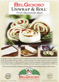
Sometimes repackaging an existing product in a new formulation is all it takes to enliven a category and extend a product’s usefulness.
Take a look at the BelGioioso Unwrap & Roll Fresh Mozzarella Sheets. I first saw this eye-catching product innovation at the Fancy Food show a few seasons ago. It made me squeal: I love mozzarella cheese in all forms — but a whole sheet? That’s just sheer heaven!
Packaging mozzarella in a new shape and size (like the Pillsbury refrigerated piecrusts) gives customers everything they want: convenience and a chance to be creative in their own ways.
Then there’s the whole category of wipes. What started out as repurposing the humble washcloth became a superstar packaging format that has permeated every industry.
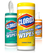
There are now ArmorAll car cleaning wipes, Swiffer floor cleaning wipes, Noxema facial wipes, Cutex nail polish removing wipes, Clorox bleach disinfecting wipes, Pledge multisurface wipes, Cutter insect repellent and even large-size Fresh Body Bath wipes — to give just a few examples!
Take a look at your best-selling product’s existing format. Are there any ways to reconfigure it that would delight your customers?
THE POWER OF A PACKAGING PARTNER: Evian and Ford
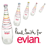
The brand leaders at Evian knew it was time to give this bottled water company a bit of a packaging punch. They rolled out a new “Live Young” ad campaign and partnered with British fashion designer Paul Smith for a limited edition, playful package that will attract new attention on the crowded beverage shelves.
Ford Motor Co. has had long-standing partnerships with Eddie Bauer and King’s Ranch on special editions of its Expedition SUV. Both partners offer Ford customers a chance to showcase their personalities through customized additions to their branded Expeditions.
Are there any partnership opportunities that would enable you to dress up your existing products in a new way, offer your customers something more, and challenge your brand’s status quo?
THE POWER OF A CLEVER NEW DISPLAY: Sephora
Fashion-forward companies such as apparel retailer H&M and cosmetics merchant Sephora are used to reacting quickly to trends. Their customers crave up-to-the-minute fashion-forward products and expect these brands to deliver the goods, pronto.
Sephora built the excitement of all that pent-up demand into its Runway Palette, a set of eye shadows, bronzers and blush “created to make applying fall’s hottest runway looks easy and fun.” The merchants at Sephora capitalized on two things: the clever naming of the product and also a perspicacious delivery of the product.
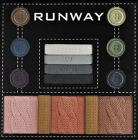
This Runway Palette separates itself from other on-trend makeup collections because it packages the eye shadows and blushes in configurations that look like buttons and cable knit sweaters — a little but major detail that will certainly catch the attention of fashionistas.
Would any of your products benefit from some clever naming (or renaming)? Can you deliver the benefits of your products in a new and provocative way that adds some buzzworthiness?
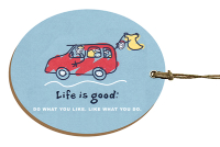
THE POWER OF THE LEAVE BEHIND: Life is Good and Hobo International
Merchants often fail to remember to save time and energy for the last and potentially most memorable product component: the hang tag. It may be as small as a business card, but the hang tag can be an important packaging component that differentiates a brand.
For instance, sportswear company Life is Good has double-sided thick paperboard tags that remind customers how the company got started and how it continues to “spread optimism worldwide” on one side, while driving home its logo and tagline of “Do What You Like. Like What You Do.” on the other.
Hobo International, a leather and accessory “carry-on” brand, uses its card (slipped inside wallets and handbags) to connect more deeply with its customer base. “Designed by women, for women,” states the card. “At Hobo International we have been helping women carry on in style since 1990. As women ourselves, we know what it takes to get there…”
Is there a packaging component that would make your product become a better brand sales tool? How and where do you say “thank you” to your customers now? Is it meaningful? What if your hang tags were your chief merchant’s business card with a note requesting feedback from your customers about product improvements?
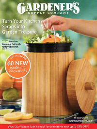
THE POWER OF POSITIONING: Gardener’s Supply Co.
When one thinks compost, one does not often think pretty. And one wouldn’t normally want to “display” a compost container.
Next Page: MAXIMIZING THE POWER OF COLOR: Fresh Produce Sportswear
Juxtapositioning is another tool to get customers to pay attention. And that’s just what the merchants at Gardener’s Supply Co. accomplished by thinking about the practicality of a product’s packaging when developing its stylish and sustainable bamboo crock with removable pail.
“We designed this compost crock for good looks and convenience,” reads the selling copy. This product just might persuade some of those averse to kitchen composting to change their minds by selling “pretty” right next to “practical.”
What are some of your product “givens”? Is there any way you can mash up some new solutions and repackage your product to appeal to a new audience?
MAXIMIZING THE POWER OF COLOR: Fresh Produce Sportswear
This women’s apparel company is all about fun, comfortable cotton clothes packaged in happy colors. Cofounders Thom and Mary Ellen Vernon take color seriously and package it as an integral part of their brand.
Their beach-inspired palette with names like Citrus and Sangria and South Beach Blue and Aqua Del Sol helps to position all their clothes as wearable art and evoke that sought-after vacation feeling.
These colors are used not just on their clothes, but throughout their entire company as an integral brand component. Offices are painted in these hues, teams are named by these colors, and fashion shows revolve around these colors.
Color increases brand recognition significantly. Whether it’s the red of Target’s bull’s-eye, the green of John Deere’s tractors or the all encompassing orange at Home Depot, color is an important packaging asset that is often underleveraged.
Does your brand own a color, or should it? Can that color be made a more vibrant part of your merchandising platform?
Use these examples to start your own packaging conversation and see if they may inspire a bit of propitious merchandising for your next product development sessions.
Look up, look out, look about! Go on your own packaging walkabout. You don’t have to go all the way to Australia, though if you can, I’d highly recommend it!
Andrea Syverson ([email protected]) is president of the consultancy IER Partners, and author of BrandAbout: A Seriously Playful Playbook for Passionate Brand-Builders and Merchants.