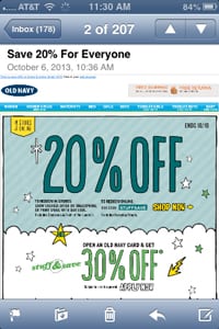
 According to industry statistics, in the first half of 2013 more than half of emails were opened on a mobile device and more than four out of ten mobile email users looked at emails at least four times per day.
Of those email users, however, it’s been reported that only 2% will re-open an email on another device. So clearly your emails – especially those being sent to on-the-go shoppers this holiday season – better render and work well when opened on a smartphone, laptop or tablet.
Here is a quick look at 10 best practices for reaching holiday shoppers with responsively-designed emails:
Think of content as a grid
Consider content as a grid of moveable parts that must work in a number of different arrangements depending on the screen. Be sure to keep the main message front and center and consider how you want recipients to interact with it.
Be mindful of font size
If using text as part of an image be aware that it can scale down so small that it will be unreadable on a mobile device. If using HTML text, use a minimum of 22 pixels for headlines and 14 for body copy and be sure the font is easy to read.
Use pre-header text to support your subject line
On some mobile devices, the subject line can get cut off if too long, so it’s especially important to use pre-header text to support it. Use the pre-header to tell recipients what to expect and give them a reason to open the email.
Simplify navigation
Website navigation or menu links should be pared down and stacked at the bottom of a mobile email message. Customers can navigate your entire website once they’ve clicked through.
Design for thumbs
Realize that at least part of your message will be obstructed by thumbs as recipients scroll through. Use ample whitespace to avoid frustrating click errors and make buttons and links large enough to be seen and deliberately and easily clicked on.
Make calls-to-action stand out
Again, buttons and tap targets should be large and easy to use, as well as clearly labeled with your call-to-action.
Make it easy on customers
Offer click-to-call and auto-apply discount codes so customers don’t have to toggle between open tabs and apps.
Embrace white space
There’s no need to cram everything into a small area – mobile users expect to have to scroll.
Test on different devices
Responsive email design works in native apps on iPhones and Android platforms, but mobile browsers in other email apps may display the desktop version.
Monitor metrics
Try sending campaigns at different times to maximize opens, clicks and conversions.
Travis Buck is Listrak Creative Director at Listrak Find more tips on responsive email design here.