Many consumers are now choosing to shop using their mobile devices. BI Intelligence estimates that mobile commerce will make up 45% of total US ecommerce by 2020. This shows how important it is to maximize sales made through mobile shopping channels such as mobile apps and sites.
However, there are many barriers that prevent consumers from completing purchases through a mobile site. In fact, a massive 77% of mobile phone users abandoned their shopping carts in 2015, according to Barilliance. Shopping cart abandonment can happen as a result of users becoming distracted or experiencing problems with the mobile shopping process.
As a digital retailer, you can boost sales by identifying any issues and taking measures to minimize shopping cart abandonment on your mobile site. Apply these seven tips to your mobile site to improve the customer experience, and you will surely see a decrease in mobile shopping cart abandonment:
Design the shopping cart specifically for mobile use
By ensuring your shopping cart is optimized for mobile use, you can provide customers with a more enjoyable experience. Research by MoPowered found that 30% of mobile consumers will abandon their carts if it is not optimized for mobile use. It should be responsive and mobile-friendly, as opposed to being an identical, but smaller, version of your desktop site. Create a mobile shopping cart that is designed especially for use on a touch screen mobile device by making buttons and text large and easy to read and click.
Shorten the checkout process
Mobile customers expect your checkout process to be fast and convenient. BI Intelligence found that 39% of US cart abandonments occur due to lengthy checkout forms. The quicker the checkout process can be completed, the more likely it is that consumers will complete it in one go. Minimize the number of details a customer needs to enter. The entire payment process should take a maximum of 2-3 steps for a guest. It’s also worthwhile to ensure users can modify their details without having to begin the checkout process all over again.
Make the shopping cart loading speed faster
 Make it easy for your customers to add items and view what is in their cart, fast. Mobile users tend to lack patience and many do not have high-speed connections. It’s your job to do whatever you can to make your shopping cart load quickly.
Your shopping cart should be simple, meaning it should be free of redundant images, side menus, and other heavy, unnecessary content.
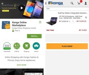
Online shopping mall Konga.com has a mobile app with an ideal shopping cart. It loads quickly and has a simple design. It’s easy to adjust quantities and remove products with a single click, or advance straight to the payment page. The cart also has a mobile-friendly ‘slide-to-refresh’ feature.
Offer a wide variety of payment methods
Many consumers often have a preferred method of payment. While the default online payment option is usually a debit or credit card, many prefer mobile payment options such as mobile wallets or mobile money. This is often due to benefits such as speed, security, and convenience. Research by Adobe Digital Insights found that including mobile wallet options increases cart completion by 10%. Bottom line – if you offer a wider variety of payment methods, you will be able to grow your reach and expand your customer base.
Make the mobile shopping checkout experience interruption-proof
Mobile users are easily distracted. If they receive a phone call or an SMS, for example, they may simply leave your mobile site in the middle of the checkout process. Save customer details to ensure that they can easily return without having to reenter information or refill their shopping cart. This will encourage them to complete their purchases.
Make registration more friendly
 Many times, an online or mobile site will require a user to register in order to complete a purchase. This can take time, and users often have to type in many personal details. When using a mobile device and shopping on-the-go, this is highly inconvenient.
But registration can be useful as it saves customer details for seamless and streamlined future purchases. Use incentives to encourage registration and make the process as quick and mobile-friendly as possible. However, never force registration on a mobile user. Allowing a customer to check out quickly, as a guest, can also increase completed purchases.
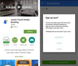
A great example of this is the simple pop-up registration request used by the Jumia Travel Hotels Booking App. It provides the opportunity for users to register and lists the benefits of registration. It also features a ‘later’ button, making it easy to exit for those who do not wish to register.
Do re-engagement campaigns with push notifications
BI Intelligence also found that a reminder email sent three hours after a cart was abandoned had a 40% open rate and 20% click-through rate. This shows the importance of re-engaging customers when it comes to preventing cart abandonment.
To encourage users to return to your mobile app and complete a purchase, use push notifications. These are extra powerful and mobile-friendly messages that bring customers back to their shopping carts – hassle-free. Remind customers about their shopping carts and send notifications if products are running out of stock. You can also offer limited-time special discounts or tailored product recommendations to encourage customers to complete their purchases – the sooner the better.
For optimal results, target recipients who are more likely to complete purchases. This includes customers who have made a purchase before, added multiple items to their carts, or have spent a long time browsing your mobile app or site.
Eran Feinstein is the founder of Direct Pay Online, a global ecommerce and online payments solutions provider for the travel and related industries.