EDITOR’S NOTE: Legendary copywriter and Multichannel Merchant contributing author Herschell Gordon Lewis passed away on Sept. 26 at the age of 90.
For about 20 years, Herschell served up bricks and bouquets in his annual Best and Worst Catalog Copy column. If he thought you were among the crispest copywriters, you got a pat on the back. If you were among the worst… well, you weren’t too happy about it, and you hopefully got a lot of mileage out of Herschell’s complimentary critique.
Herschell submitted his annual Best and Worst Catalog Copy article for 2016 on Sept. 12, with the intent of it running on MultichannelMerchant.com the first week of November. And now, posthumously, we present Herschell Gordon Lewis’s final Best and Worst Catalog Copy column.
Rest in peace, Herschell.
Sticking My Head Into the Lion’s Mouth…
This year’s choices: Best and worst catalog copy
About twenty years ago, I reveled in the ease with which I could look at a catalog and decide in a flash whether it was worthy of applause or abuse.
In that vintage twentieth-century era, I could make a case just from grabbing what was in the mailbox and slipping on a pair of glasses.
Even then, subliminally I knew I was living in the past. Online catalogs were rumbling, and some printed catalogs were dumping tradition in favor of the New Age.
Here we are, on the cusp of Anno Domini 2017, and any of us who claim a dispassionate and authoritative analysis of the catalog market – especially “copy,” which grabs or repels response – had better allow at least equivalence to e-catalogs or be exposed as fuddy-duddies.
So:
Equivalence is (at least) in order. Some catalogs have simply added an online version with few or no wording changes. Others tailor their copy to the medium. And yet others have abandoned printed versions altogether, assuming that anyone in a position to rate their wording will also be web crawlers.
That’s where we are. Five years from now? Hey, ask me in five years, assuming we both are still alive and still in business. For now, assume the medium isn’t the message. We’re looking at copy, and that exists as a single factor, whether on paper or on the screen.
Two disclaimers
Before joining me in what may be a suicide mission, consider two factors that can affect each of our reactions, positively or negatively:
First, neither I nor anyone sees every catalog. We’re limited to those that cross our desks in printed form or appear on our screens in digital form.
Second, copy that appeals to one reader may outrage another. We’re dealing in broad strokes here. That this column has survived all these years is an achievement that may survive or may pass into history. –
Got that? OK, here goes.
Best No. 1: Crate & Barrel
 Visualize a two-page spread of armless upholstered chairs. No background, just limbo. Can you build excitement or anticipation without adding a load of bits and pieces that might detract more than attract?
Here’s the “stopper” heading:
Rhythm and blues. Swoops and curves flow like ikat to paisley, menswear to bohemian, tufted velvet to nailheads, host chair to guest chair.
Every word counts. Each chair has its own customized description, and each description appeals without turning away the previous or next chair in line. Just the beginning of one:
Sasha Dining Chair Striking Silhouette with an elegant, cinched padded back and plush tight seat is smartly tailored in a vibrant, ikat-inspired pattern….
Best No. 2: Coldwater Creek
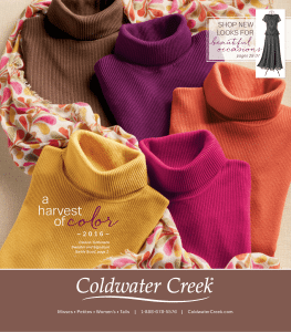 Here’s a catalog that never lets the reader down. One visualizes the copywriter determined to maximize a salesworthy image. Each description somehow includes a unique selling proposition. Few can match the unerring combination of visual appeal and technical appeal. Example, just the beginning of the description of a group of shirts:
Easy Care Long Sleeve Shirts
Absolutely the most versatile essentials in your wardrobe – with little or no ironing needed. You’ll immediately notice how we’ve subtly updated traditional tailoring details to complement your style today – plus we’ve chosen an incredible high-performance cotton that resists wrinkles like a champ….
Best No. 3: The Company Store
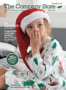 Surprised that this veteran marketer, in its 105th year, is grabbing attention at a pace beyond so many that modernized their descriptions? The Company Store is an evergreen. You say “bullet” copy is out of fashion? Right on, for a catalog nestled in a mailbox. But online – if ya wanna compete, ya grab and ya shake .. leaving room for literate text.
Economy of words sometimes backfires. Not here. As an example, note the tightness that drives impact for window panels. First sentence of the text:
Fern Leaf & Solid Linen Window Panels
Airy and light (yet substantial enough for privacy), our pure linen panels are a portrait of relaxed sophistication, enhancing your views with elegant patterns and natural texture.
The web version suffers here, and if that were the only medium, this marketer would have missed the boat. Here’s web copy for the identical item:
Refresh your space in an instant. These window panels feature the breezy, lightly textured finish that makes linen a perennial favorite. In an array of natural and sherbert shades, this versatile curtain panel has a place in any decor, from elegant to casual.Do you sense flatness replacing melody? Even if you don’t, the web version deserves a “Huh?” sherbert? That alone is enough for those whose corporate pride has been wounded to sue … if not for outright divorce at least for separate maintenance.
Best No. 4: Catalog Classics
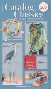 Who would expect catalog descriptions that interlace reasons to buy with confidence bordering on a sense of humor?
Danger lurks there, but in these capable hands the reader is lifted back to those calmer, gentler times in which he or she actually read the descriptions rather than just fished through for a possibly wanted item.
An example, on the back cover, is a pair of sandals priced at $79.95. (The entire catalog is a throwback, because prices throughout still end in 95 cents rather than the current standard replacement, 99 cents.) Total copy:
TORTUGA SANDAL
Absolutely hip and completely gorgeous, these dyed- and handpainted leather sandals have a boho vibe and no-heel comfort. Velcro-close instep band keeps them securely on your feet; comfort footbed and no-slip soles. Imported. Whole sizes 6-10. Specify Turquoise Blue or Red.
See how a single word – “boho” – creates an image? That’s a reminder of what effective catalog copy used to be.
This almost made the Top Four: Relax the Back
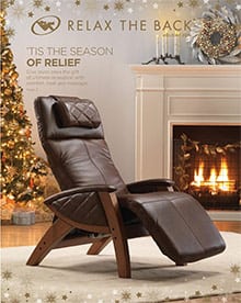 The catalog’s title alone generates the desired response – I want one.”
The only reason this catalog isn’t on the uppermost level is its substitution of generalizations where specifics might do a better job of grabbing and shaking. Example, subhead in a full-page description headed “The ULTIMATE EXECUTIVE CHAIR”:
At last a chair that fits and is comfortable. All made possible by careful attention and customer service. Best chair I ever had.
They didn’t need a copywriter for this, because no specific motivator has been transmitted. It’s “Rah! Rah!” without “Here’s why.”
“Worst?” Only on a comparative level
If this annual analysis didn’t exist, neither would the word “worst.” But down here in Copywriter Purgatory we grade on the “curve,” and oversights that damage response drag down the comparative position on any catalog
Not one of these deserves condemnation, except within the hallowed halls of perfection the winners enjoy. We criticize on a professional level most potential customers never consider. For example…
Worst No. 1: Woman Within
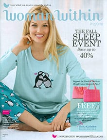 Here’s a blue poncho sweater atop black pants. The entire copy-block except for pricing::
Fine gauge poncho sweater
has a single shoulder opening on the right, slight boat neck, asymmetrical pointed hem; 26” to 28”. Soft, washable cotton/acrylic knit. Imported. No blue noir floral, Fresh mint, Crystal honey.
And what’s wrong with that? Confusion. The illustration shows a solid blue top. Copy says, “No blue noir floral.” Huh? Is “noir” a typo? Nothing visual suggests why “floral” should be mentioned at all. We all know the rule: the shorter the copy-block, he greater the demand for specificity.
Worst No. 2: Woodcrafter.com
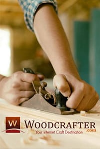 All the information a web-skimmer might seek is here. But it’s piled onto itself in a huge copy-lump that defies clarified reading. Note the opening – just the opening – of “Craft Supplies”:
Arts and crafts have always been a great form of self expression, but it’s even better when you have the finest craft materials. Whether your activity involves painting and intricate design on an unfinished box, personalizing bags, or creating a pin to wear as a fashionable accessory, we have the craft supplies to turn your vision into reality. Creating unique items from all different mediums and materials is a cathartic way to spend time. There is something calming about pulling out your craft bag and letting the art organically evolve from the materials. It is an activity embraced by all ages, thus is a great way to bond with others. Use various items stored in your craft bags to create while having a conversation and enjoying another’s company. The result is wonderful memories and crafts that remind you of the fun experience you shared.
Terrible? No. Competitive? Also no. Overwriting such as this can be acceptable when the medium is a direct mail solicitation. As catalog copy, it falls into a self-opened hole.
Worst No. 3: Beretta
 What’s that catalog doing here? It’s a macho statement with almost no embellishment. The potential customer who happens without prior knowledge upon the catalog or something in it has to wonder whether total upscale and understatement are aimed elsewhere. This is a typical entire description:
Beretta Silk Linen Blazer
$725.00
Every detail speaks of this blazer’s quality, from the Italian silk/linen blend to the working buttons on the sleeve hems.
EU Size:
Hey, you guys, while you’re adding at least one line justifying the price, why not delete the decimal-zero-zero, out of fashion in this stratosphere?
Worst No. 4: Dick’s Sporting Goods
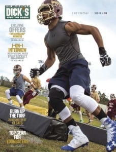 Generating the buying-impulse within the tricky half-world of physical activity requires two components – Vigor and Vocabulary.
One of those, without the other, typifies the screechy sports announcer whose verbal artifice betrays its artificial core. Woven together, enthusiasm becomes contagious.
Dick’s Sporting Goods has a sizable retail presence, so the thrust of a catalog has to aim itself at least in large part to prospective customers who don’t usually (if ever) head for a store. Online, that doesn’t seem to happen. A search for “Dick’s Sporting Goods Catalog” brings up this:
FREE SHIPPING ON ORDERS $25 OR MORE + FREE IN-STORE RETURNS
Below, in mice-type: Online only. Exclusions apply.
Come on, Dick. We’ve traveled all this way and quickly are half-rejected. What possessed you to dedicate prime space to “Exclusions apply”? Why not save that until it doesn’t destroy a yet-to-be-offered deal?
And there we have it, for this year
Is it too early to gaze into the crystal ball, anticipating a happier turnout for 2017? Of course it is. But as students of our strange craft, we can see evolution at work. The year 2017 may well be the pivotal year in which online catalogs make the next attention-grab, overtaking printed catalogs by an even greater distance.
Should practitioners of the catalog arts worry that print is fading, as online grows sharper? The answer, at this point, depends on the comparative capital investment.
So let’s hunker down and place our bets where sound business judgment rather than nostalgia or preconceived viewpoint drives our estimates for the safe route to survival, whether we’re selling or buying from a catalog. OK?
#####
Herschell Gordon Lewis is the principal of Lewis Enterprises, Pompano Beach, Florida. Author of 32 books, including Internet Marketing Tips, Tricks, and Tactics; Catalog Copy That Sizzles; On the Art of Writing Copy (fourth edition); Asinine Advertising; and Creative Rules for the 21st Century, he writes copy for and consults with clients worldwide. Web address is [email protected].
