While shopping on mobile phones is on the rise, mobile purchasing is still elusive for most merchants. Technology researcher Forrester forecasts that total mobile phone sales will reach $31 billion by 2017. The number sounds impressive, but it represents just 9% of predicted ecommerce sales. Given that roughly half of U.S. consumers use the Internet on their phones, which are potentially convenient tools for on-the-go-transactions, the figure looks downright small.
So what’s holding back phone commerce? One problem is inherent to the mobile phone format; even models with the largest of color screens can’t compete with a computer or tablet when it comes to the shopping experience. Forrester found that while 10.7% of all visits to eCommerce sites are from smartphones, the percentage of smartphone page views is just 7.6% — suggesting that most mobile users are unwilling to view compare products, view multiple images or videos, and scroll through reviews on their phone screens.
But another challenge is one merchants can — and should — fix: a poor mobile phone checkout experience. When asked why they were reluctant to purchase on their mobile phones, the top response from participants in the 2012 MarketLive Consumer Shopping Survey was that shopping was “too awkward”, while the second most popular response was that they were “concerned about giving credit card information over a mobile connection.” Forrester, in turn, found that 44% of consumers would buy if mobile payment services were safer.
The solution, then, is two-fold: merchants must streamline bulky checkout forms as much as possible, and simultaneously allocate real estate throughout the mobile shopping experience to earning customer trust on the small screen. Among the strategies to consider:
- Proceed with caution with responsive design. The premise of responsive design is that a single base of code can serve multiple touchpoints by detecting the device and browser used and changing the layout and functionality accordingly — promising merchants a streamlined process for updates and maintenance.
But while sophisticated use of code can resize, rearrange and even add or omit elements on the page, it can be difficult to create a truly device-specific experience that meets or exceeds shoppers’ expectations. And nowhere is such tailoring needed more than in checkout, where every pixel of screen real estate is crucial to the task of helping shoppers complete their purchases. The responsive-design Web site for Perry Ellis brand Original Penguin imperfectly translates the first step of checkout, where shoppers either log in or proceed as a guest; the “view navigation” heading is overpowering, while the guest checkout option — which should be most prominent — is easily overlooked.
By contrast, the custom-built checkout for MarketLive merchant Perricone MD places equal emphasis on the two options, clearly labeling the registered-user checkout as being for a “returning customer”, while the guest checkout highlights that shoppers can proceed “without signing in.”
- Adopt alternative payments. Over a two-month period, 67% of mobile purchases were completed using an alternative payment system versus a credit card, according to a study from eCommerce provider ShopVisible. By giving shoppers a way to avoid entering credit card payment details, alternative payments increase efficiency by reducing the number of form fields shoppers must fill out. And shoppers need only enter a username and password, so their financial information isn’t shared via the mobile web.
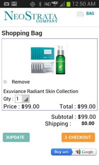
To reassure mobile shoppers who are hesitant to become mobile buyers, merchants should highlight the availability of alternative payments within their mobile shopping environments, as MarketLive merchant NeoStrata does with a prominent link to Google Wallet from the shopping cart.
- Link prominently to customer service. Shoppers on mobile sites should have the same instant access to customer service options that they do on the eCommerce site, including the ability to finish their transaction using the phone built into their devices. Apparel merchant Peruvian Connection puts customer service front and center on its mobile home page, giving shoppers access to live help within the first screenful.
As they proceed along the path to purchase, shoppers should have access to relevant customer service information, even on the small screen. Apparel merchant V.I.M. achieves this feat on the mobile product page with tabs featuring information on shipping rates and returns — proactively addressing shoppers’ questions to encourage the add-to-cart.
Finally, in the shopping cart and checkout, access to customer service is especially crucial — so merchants should feature a link to live help prominently, as MarketLive merchant BeachBody does in the shopping cart with a large “Contact Us” button and a click-to-call 800 number in the footer.
Ken Burke is founder and executive chairman of ecommerce software and solutions provider MarketLive.