The copy in L.L. Bean’s Christmas 2009 edition is “the best in the business,” raved a judge. Added another: “You can hardly find a block of copy in the entire book that’s not good.” Combine that with a strong merchandise mix, effective product photography, and “promotional offers that stand out without looking tacky,” and you have a winner of a catalog — literally, as Bean’s Christmas 2009 edition earned a Silver MCM Award in the Food/Gifts, Sales Over $20 Million Print category.
Why it won a Silver Award
As we already noted, the copy bowled over the panelists, in large part because, as one said, “there’s a real effort to highlight one or two product benefits in each copy block, not just features and specs.”
This effort extended beyond the core descriptions to captions (“Elastic cuffs adjust with hook-and-loop closures”; “Knees are double reinforced for comfort and durability”) alongside the product shots. The judges also liked the use of customer testimonials as callouts.
Judges praised the visual presentation of the products as well. “I happened to be on page 87, looking at the way the shoes are depicted, with the laces seemingly randomly placed, and noticed that one shoe was tipped up so that you could see the sole design,” explained a judge. “It was just very well done. Ditto for the way parkas are shown, or stacks of clothing showing the colorways, folded casually but not sloppily.”
Another panelist singled out the use of graphics designed to resemble hang tags as a graceful way of calling attention to value pricing.
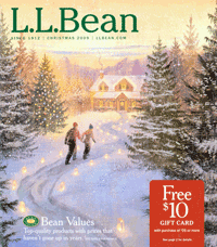
The front cover and opening spread promoted the offer of a $10 gift card with a purchase of at least $25. That no doubt appealed to gift buyers of the “one for them and one for me” persuasion. “There’s a low hurdle for a small reward,” said one admiring judge, “but that $10 will probably bring in some nice $95 orders.”
Why it didn’t win a Gold Award
Although one or two judges thought that the front cover–an illustration of a wintery scene–was in keeping with Bean’s long-standing brand image, others felt that it, along with the back cover, should have worked harder to sell products and urge recipients to plunge inside the book.
And a few of the panelists were less than thrilled with the catalog’s overall design. One went so far as to harrumph, “Typical boring Bean. It looks like the Sears catalog of my youth.”