We’ve said it before, but it bears repeating: The Annual Multichannel Merchant Awards aren’t a beauty contest. That’s as true this year as it has been in years past. Customer service, merchandising, usability, and results count at least as much as creative. That’s why our judges point out such features as a company’s low-price guarantee or the speed with which an e-mail query is answered or the subtle yet effective way in which add-on items are promoted on product pages.
But while the basic judging criteria have remained the same, this year’s MCM Awards do differ from previous programs. We realigned the categories, for starters, to better reflect the industry today. Also to better reflect the new realities of multichannel commerce, we introduced the B-to-B Multichannel Merchant of the Year and the B-to-C Multichannel Merchant of the Year awards.
These new awards speak to an old saw: The whole is greater than the sum of its parts. By providing shoppers with multiple channel choices, merchants can benefit far more than simple addition would suggest.
The “whole is greater than the sum” sentiment applies not just to the Multichannel Merchant of the Year winners but also to the Gold and Silver winners in both the print and Web categories. And it’s also why we continually emphasize that the winners aren’t merely, or necessarily, the most attractive catalogs or Websites. The winners are more than pretty, or well merchandised, or user friendly. They are all of that, and more.
Judges 2006
PRINT CHANNEL
GEOFF BATROUNEY, executive vice president, Estee Marketing Group
MONIQUE BERGER, director of print production, The Territory Ahead
JOHN BORTA, partner, Real Results Marketing
SANDRA COOPER, vice president, creative/account services, Marke Communications
MICHAEL EISENBERG, chief marketing officer, McIntyre Direct
JIM HARKINS, principal, JJH Direct Marketing
JIM KLAUS, president, CWDKids
MARY ANN KLEINFELTER, consumer marketing director, Carus Publishing
JOHN LENSER, president, Lenser
BARRY LITWIN, vice president/general manager, Block & Co.
PAM MAXWELL, vice president, marketing, Interline Brands
DOUG MEYER, vice president, direct marketing, Levenger
PHIL NIEMEYER, president, Nasco
DON OAKES, senior vice president, creative, L.L. Bean
JACK ROSENFELD, president, Potpourri Group
JACK SCHMID, founder, J. Schmid & Associates
AL SCHMIDT, president, Schmidt Group International
ED SCHMULTS, CEO, FAO Schwarz
LINDA SPELLMAN, director of multichannel business, The Home Depot
THOMAS TWEEDIE, director, consumer direct marketing and forecasting, Day-Timers
GINA VALENTINO, owner, Hemisphere Marketing
CRAIG WINER, vice president, Garrett Wade
MARIA YOUTH, former vice president, catalog and Internet, Lenox Collections
WEB CHANNEL
AMY AFRICA, chief imagin.8.ion officer, Eight by Eight
WAYNE AIELLO, vice president, e-business services, Corporate Express
STEVE BALDWIN, marketing manager, Did-It Search Marketing
KEVIN CHURCHILL, director of merchandise, Patagonia
LAUREN FREEDMAN, president, The E-tailing Group
TONY GASPARICH, vice president, direct sales, West Marine
JOHN HAMMERSLEY, chief operating officer, Eclipse Direct Marketing
ALAN RIMM-KAUFMAN, founder/president, The Rimm-Kaufman Group
TOM ROSENBAUER, marketing director, The Orvis Co.
PHIL TERRY, CEO, Creative Good
INTERNATIONAL (PRINT CHANNEL)
MARK BRIDGES, vice president/director, international, Mokrynskidirect
KLAUS GOEZ, director of business development, Accenture
MARTIN GROSS-ALBENHAUSEN, publisher, Der Versandhausberater
IAIN MACDONALD, principal, Casa Consulting
B-to-B Multichannel Merchant of the Year
GOLD WINNER: BUSINESS SPECIALTY PRODUCTS | Print Channel Galls, Summer 05V
GOLD WINNER: BUSINESS SPECIALTY PRODUCTS | Web Channel Galls.com
Galls
Galls is “The Authority in Public Safety Equipment and Apparel” according to the tagline on its catalog cover.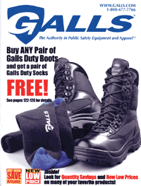 It is also an authority on print and Web catalog marketing, as it is the Business-to-Business Multichannel Merchant of the Year. Selling such items as uniforms, badges, tools, medical supplies, flashlights, and emergency equipment, Galls took Gold Awards in the Business Specialty Products category for both the print and Web channels.
Why it won B-to-B Multichannel Merchant of the Year
For starters, Galls “presents the most comprehensive selection of any company in this category,” said one judge. Right from the print catalog’s cover, noted another panelist, the marketer makes “excellent use of private- label brands and reinforces the Galls position in the marketplace.” The large, detailed image of a Galls duty boot on the front cover “makes you want to open up the catalog,” said a judge. “The cover also piques interest with promotions that are tastefully advertised at the bottom.”
On the Web, Galls’ home page “sets expectations by clearly indicating that it’s a retailer and exposing the type of products being sold,” said one judge. Added another panelist: “Here is a b-to-b site that offers specials, testimonials, great merchandising, and a compelling home page.” Thanks to touches such as humorous true-life stories submitted by law enforcement officials, the site “makes b-to-b look as fun and easy as a consumer site,” a judge said. And the usability is “excellent,” according to another member of the panel. “The search function breaks results out by products that match as well as by categories, including the number of items in each category.”
Galls also drew rave reviews for its copy in both channels. In the catalog, “the copy for these products is interesting but also easy to read,” said one judge. “This is important, as it is such a big book to get through.” A panelist on the Web side was even more enthusiastic: “One of the best sites I’ve seen in terms of item-specific copy. Very detailed descriptions, very technical data presented in easy-to-read bullets — no pun intended.” Given the serious nature of its business, the judge added, “this site successfully creates a high level of credibility.”
On the print creative end, Galls boasts “great photography and prepress quality,” said one judge, “which is unusual for this category of catalogs.” Rotogravure printing “is a good choice for this type of catalog on this paper stock,” the judge said. What’s more, the book has “excellent design, plus good use of color and range of fonts.” Another judge added that the catalog’s backgrounds and product in-use photos are “wonderful.”
Idea to steal
Galls presents “tons of extra information in the form of online learning,” said one member of the panel. For example, the Website has “all you ever wanted to know about bulletproof vests in a series of articles written with considerable authority” in its Galls University section, the judge said. “Courses” offered include Fabrics 101 and Automated External Defibrillators, with an eye to providing site visitors with the information they need to select the right product — while solidifying Galls’ position as “the authority.” — Melissa Dowling
GALLS: Print Catalog
Merchandisers: Benny Belcher, Linda Carter, Mary Ciarlette, David Frye, Wendy Holland, Shawn Lancaster, Ann Kuchar, Jenny Noplis, Neil Orbach, Jane Owen, Wendy Pettit, Aden Randles, David Robbins, Jennifer Robbins, Navapol Tarakam, Laura Thomas, Ann Yarbrough
Marketing: Andrea Clinch, Monique Meeker
Copywriters: J.W. Abraham, Barbara Elliott, Chad Kinzel, Adarrell Owsley, Allison Perry
Designers: Lane Boldman, Min Young Bowling, A.J. Davidz, Mark Dorsey, Mark McCain, Tom Randols
Imaging: Linda Slone, Cameron Wood
Printer: R.R. Donnelley
Inserts: Three Z
Order form: Quebecor World
GALLS: Website
Managers: Steve Lockridge, Greta Leach, Andrea Clinch
Marketing: Fernando Garces, Sam Guy
Creative: Justin Coburn, Evette Loiselle
Web development: Yuqiong Fan
Imaging: Linda Slone, Cameron Wood
B-to-C Multichannel Merchant of the Year
GOLD WINNER: Food | Print Channel Harry and David, Cool Fruit 2005
GOLD WINNER: Food | Web Channel HarryandDavid.com
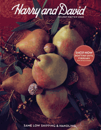
GOLD WINNER: Gifts | Print Channel Harry and David, Holiday Preview 2005
GOLD WINNER: Gifts | Print Channel Harry and David, Holiday Book of Gifts 2005
SILVER WINNER: Food | Print Channel Harry and David, Gifting & Entertaining 2005
When you look at a Harry and David catalog or the company’s Website, it’s nearly impossible not to be drawn to the products for sale. The venerable gourmet food gifts merchant attracts customers with its vivid photographs, in which the items — luscious cherries, juicy pears, succulent pastries — appear real enough to smell, touch, and taste. Marveled one judge: “they find a way to sell you something no matter what kind of excuse you have for not ordering. You can’t refuse them.”
Why it won B-to-C Multichannel Merchant of the Year
Whether selling from a catalog or a Website, Harry and David remains peerless. Although it’s best known for its fruit, the company’s merchandise line includes vegetables, baked goods, plants, meats, and seafood from all over the country. Harry and David’s catalog pagination and pacing are “excellent,” a judge said, and “beautiful full-page photos stop the readers in their tracks to gaze at the delicious creations.”
All of these items are not only exquisitely photographed but expertly described as well. Here’s a sample copy block from the Website, for Harry’s Original Cheesecake: “Indulge yourself and your friends with our original New York-style recipe, baked here in our kitchen, with only the freshest, creamiest ingredients — plenty of sweet cream cheese and eggs. The perfect union of sophisticated flavor and farm-fresh goodness.” Declared one panelist, “I found the copy to be the perfect complement to the mouth-watering photos.”
Another perfect complement: the stellar service. Referring to the Website’s home page, one of the judges noted: “All kinds of special gift services, continuity services, last-minute offers, and quick shipping from stores shows they are an integrated, full-service merchant that really knows their customer.”
The Website even offers a special section titled Last Minute Gifts, items ranging in price from $49.95 to $99.95, for which express delivery is available for the cost of regular shipping. Another site feature, Same Day Delivery, allows shoppers to enter a recipient’s zip code to see if same-day delivery of a gift basket from one of the Harry and David stores is available in that locale.
To top it off, Harry and David provides what it declares to be the “Strongest Guarantee in the Business: You and those who receive your gifts must be delighted, or we’ll make it right with either an appropriate replacement or a refund.” That’s a promise certain to sway the most hesitant first-time buyers.
Judges couldn’t toss around enough accolades about Harry and David. “They bake their own concoctions. They grow their own pears.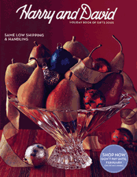 They make their own chocolate,” enthused a panelist. “The catalog, the Website, and the brand as a whole convey the idea that anyone can be a terrific host and impress their guests.”
Idea to steal
Some people know Harry and David as the Fruit-of-the-Month Club folks. The company has grown beyond the original club selections to offer such variations as the Light Size Club and the Deluxe Blooms for All Seasons Club. The variety of these programs distinguish Harry and David from the competition. What’s more, they enable the merchant to stay in continual contact with gift recipients — and with each successful contact the company is more likely to turn a gift recipient into a future gift-giver.
“More marketers should try continuity products,” suggested one of the judges, “as they sure must be successful for Harry and David.” — Jim Tierney
PRINT CATALOG
 Director: Estin B. Kiger
Designers: Kelly Barton, Jim Samuel, David Holman, Mark Edinger, Alberta Fujihara
Creative directors: Cheryl Lewin, Michelle Javanovic
Marketing director: Mike Zodrow
Print/production directors: Neal Schuler, Jack Kobinsky, Lisa Chang
Merchandiser: Denise Tedaldi
Copywriter: Marcus G. Smith
Photography: Ron Anderson, Eric Groetzinger, Jim Bowie, Iridio, Noel Barnhurst
Printers: R.R. Donnelley, Lancaster
Color separator: Schawk
List manager/broker: American List Counsel
WEBSITE
Creative director: Estin B. Kiger
Marketing director: Anne Ashbey
Webmaster: Sue Eagan
Website designer: Ken Nash
Merchandiser: Denise Tedaldi
Copywriter: Marcus G. Smith
Photography: Ron Anderson, Eric Groetzinger, Jim Bowie, Iridio, Noel Barnhurst
Operations director: Stacy Shelley
Print Catalog of the Year
GOLD WINNER: BUSINESS SPECIALTY PRODUCTS | The Big Pigalog Buying Guide 2006
Never one to cast its pearls before swine, New Pig Corp. knows exactly who its audience is and how to target it.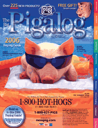 The merchant takes what could be considered a deadly dull product line such as industrial cleanup and safety supplies “and turns it into a humorous, colorful, and easy-to-buy-from catalog,” said one impressed judge. Not only did New Pig nab the gold award in the business specialty products category, the company’s Big Pigalog Buying Guide is the 2006 catalog of the year.
The cover of the Big Pigalog manages to be hot and cool at the same time, depicting a sunglasses-sporting piglet floating on what looks like an inflatable pillow and raft. The photo of the sunbathing swine does more than just grab the readers’ attention and get them to open the book; it also sells several products. Here’s the copy that accompanies the photo: “A high-living hog dozes behind stylish NASCAR GT Eyewear while floating on a Pig SKIMMER Pillow in a high-volume Portable Containment Pool. Why is he so relaxed? Because he knows that even if his vacation gear suffers hoof damage, order transfer or mud stains, everything’s covered by our 100%-forever, no-hassles-ever, freight-charges-included, no-products-excluded, Money-Back Guarantee.”
The marketing concept “enhances the brand and really drives the creative and merchandising,” said one judge. “There’s a constant theme that if there’s a need or product to keep the workplace clean and safe, they’ll find or make it.” This catalog “is all about the marketing,” said another panelist. “They have done a great job in taking plain product and presenting it in a creative and entertaining concept.”
That’s not to say that New Pig doesn’t take its product line seriously. Benefit headlines such as “Maintenance-free Eyewash connects to existing water supply” and “Compact Polyethylene Acid Cabinets provide superior corrosion resistance” make it clear why customers need certain products.
New Pig garnered so much praise from the judging panel that it’s tough to single out specific strong points. But the judges tried, with comments such as “informative headers and captions,” “copy just does not get any better than this,” and “the best-designed b-to-b catalog in the marketplace.” One judge pointed out that “there are so many services that it takes several pages to describe everything.” The cataloger provides 15 reasons “you’ll love doing business with New Pig,” which range from its free tech support and electronic data interchange capabilities to its discount pricing and free samples.
Idea to steal
Free gifts may be the oldest trick in the book, but New Pig gives them a new spin: These b-to-b promotions are fun. The company has long offered a series of collectible items; in this edition New Pig offers a ceramic mug shaped like Sparky, its cartoon pig mascot, shipped free to customers spending at least $350. Other examples of New Pig’s porcine presents include a bobblehead Sparky doll, a bottle of “Boar BQ” sauce, and pig-adorned playing cards. — MD
NEW PIG CORP.
Executive directors: Doug Hershey, Nino Vella
Marketing directors: Mark DeYulis, John Fraundorfer, Tammie Shoop
Product merchandisers: Doug Evans, Ray Fedeli, Dan Ferrell, Chris Iuzzolino, Tim McMillen, Mike Shouldis, Clark Stapelfeld, Mark Woytowich
Creative directosr: Stacie Fronk, Beth Love, Ames Parsons
Project managers: Michael Haslet, Lonna Pfeffer, Krista Rehm
Designers: Lori Erickson, Brenda Kerr, Kevin Ludgate, Jeff Schiefer, Laura Shoup, Stephanie Yingling
Copywriters: Lisa Baxter, Norman Benford, Keith Eldred, Dustin Hess
Proofreaders: Barb Hall, Kelly Otto
Tech services: Chris Dilley, Karen Hamel, Bill Hannak
Prepress: Quad/Graphics, Gina Baker, Jennifer Harker, Julie White
Photography: McManus Studios, Gina Baker
Print buyer: Donna O’Brien
Illustrator: Bruce Van Patter
Printer: Quad/Graphics
List manager/broker: Edith Roman Associates
Cover paper: 100 lb., grade 3, Sommerset gloss
Text paper: 38 lb., grade 4, Mission web
Trim size: 8″ × 10-1/2″
Number of pages: 438
Website of the Year
GOLD WINNER: CONSUMER SPECIALTY PRODUCTS eBags.com
eBags | www.ebags.com
It’s difficult to create an online store that successfully integrates top-of-the-line functions with stellar services, but bags and accessories merchant eBags has done it — yet again. Proving that it is a best-in-class Web merchant, this year eBags was named Multichannel Merchant’s Website of the Year for the fourth time. (The company also took home the title in 2001, 2002, and 2004.) EBags’ user-friendly navigation, deep merchandising, strong pricing, and commitment to customer service demonstrate what it takes to be the best.
Why it won Website of the Year
In summing up the eBags site, one panelist said: “It hits all the right notes,” adding, “You can feel the testing that they’ve done and that everything is where it should be.”
Beginning on the home page, the customer is treated to lots of information — from product specials to service guarantees. But the page is designed with enough white space so that the visitor doesn’t feel overwhelmed.
A box visible without scrolling reads, “Don’t listen to us, listen to our customers,” touting (as of press time) more than 917,000 consumer reviews of more than 42,000 products. This conveys a tremendous depth of merchandise while offering solid brand credibility.
Panelists said eBags’ merchandise mix was strong and appealing. “Even where merchandise diverges from bags — business accessories, for instance — it still makes sense and works well,” added a judge. Although handbags and backpacks make up the bulk of its product line, eBags now offers items such as wallets, MP3 player cases, and toiletry kits as well. Including on category pages the precise numbers of new products and of products per brand is brilliant, said one judge, because it keeps customers returning again and again to see what’s new.
Judges also approved of eBags’ decision not to relegate customer service to a single page. Rather it includes a customer feedback form, the 800-number, and an e-mail sign-up on each page.
Left-column navigation on the home page is simple, listing text links to categories such as Handbags, Backpacks, and Summer Sale and to a selection of subcategories. The panelists especially liked the consistency of the navigational column throughout the category and subcategory pages, which gives customers options to filter category results. On the school backpacks subcategory page, for example, customers can filter results to find CD/MP3 player packs, “urban style,” or mesh bags; they can also narrow results by brand, price, and material.
A two-tier navigation bar across the top repeats a list of product categories, with a third tier allowing customers to use eBag’s powerful on-site search, which judges commended for its ability to recognize and fix misspellings. For example, a search for “diper bag” directs customers instantly to search results for “diaper bag.”
Idea to steal
EBags makes comparing products on its site especially easy. Shoppers can choose which products they want to compare by clicking on the “Add to comparison chart” link on the product page. Alternatively they can select “See similar items,” which instantly arranges similar items in a comparison chart with product specifications such as weight, dimensions, and warranty information. — Heather Retzlaff
EBAGS
Creative director: Karen Centner
Marketing director: Chris Seahorn
Website designer: Marc Brown
Merchandiser: Jonathan Fox
Photographer: Casey Brown
Operations director: Mark DeOrio
Finance director: Steve Slotter
Business Specialty
SILVER: PRINT CHANNEL
Diamondback Tactical | Volume 5
The cover photo of four men kneeling in the snow, wearing combat gear and dark sunglasses while holding M-16 rifles as they face in opposite directions, leaves little doubt as to their mission — or the mission of Diamondback Tactical, a supplier of training tools for the combat community.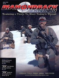 And if anyone needed clarification, the caption above the ominous front cover photo sums it up succinctly: “Training & Tools To Meet Today’s Threat.”
Why it won a Silver Award
The 356-page catalog shows that “institutional copy can be so good that every potential customer will want your catalog,” one judge said. The clear and informative merchandise descriptions received praise as well. “Products are presented in action with compelling and complete copy, making this a catalog that every customer would want and keep,” one judge said.
Panelists were also impressed with Diamondback Tactical’s visual presentation. “The design throughout is excellent, particularly the use of action shots showing equipment in use. Excellent,” said one judge. Added another: “This proves that great design and romance can be applied to even body armor.”
The merchandise selection is comprehensive, said one judge, and “the use of kits encourages much higher order values.” Products include special operations light tactical vehicles and weapons, to military goggles, rescue stretchers, and oxygen vessels, demonstrating, in the words of one panelist, a “laser-beam focus on the products and services necessary for meeting today’s military threat.” In addition, the judge said, “The logo, masthead, and cover image all convey a seriousness and a merchandising commitment.”
Why it didn’t win a Gold Award
The panelists felt that Diamondback Tactical fails to connect on a few key points. For one thing, “the back cover was simply forgotten,” a judge said. And the ordering instructions and the order form “are using valuable real estate as the inside back cover.”
Another judge suggested that the catalog’s president’s letter could take on more of a customer perspective: “It read too heavy on self-compliments,” the judge said.
On the creative front, one judge complained that the green background on the opening spreads reduced readability; another panelist pointed out that while the large photographs are excellent, “many of the smaller images are of poor digital quality.” — JT
Director: Jason Beck
Designer/creative director: Ryan Quan
Marketing director/copywriter: Dan Stevenson
Print/production director: Aaron Bercovich
Operations director: Brad Ditchfield
Finance director: Jim Thompson
Photography: Aaron Bercovich, Jason Beck, Ryan Quan
Printer/color separator: Trend offset
Cover paper: 100 lb., #3 Sommerset
Text paper: 60 lb., #3 Sommerset
Trim size: 8-3/8″ × 10-7/8″
Number of pages: 356
SILVER: WEB CHANNEL
Edmund Optics | www.edmundoptics.com
The Edmund Optics Website, said the judges, excels at marketing products — industrial optics — for a fairly technical user. The product pages are very detailed and include links to related products and a variety of technical specification charts, diagrams, and photographs. The site also educates, with links to related articles and a “University” for FAQs and technical documents.
Why it won a Silver Award
The copy projects an air of professionalism that the panelists cited as being both appropriate for the target audience of manufacturers and engineers and also easy to scan and read. Spec tables present the most pertinent information at a glance; product pages also indicate the stock status of the items. Some product pages even include links to “helpful literature,” such as glossaries, primers, and usage information.
The search function handles misspellings well, said most of the panel, though one judge deducted points because searches for popular products tend to return a long, unfiltered list of items. And panelists appreciated the speed and friendliness with which customer service responds to e-mails.
Why it didn’t win a Gold Award
One of the judges described the Website’s conversion rate as “terrible,” adding that it reflects “the many customer-experience challenges on the site.” For instance, the contextual left navigation enables customers to view only two products at a time. “Only allowing customers to view two products per page will likely lead to a lot of frustration,” a judge said. Also, the “buy” link is completely buried at the bottom of product pages, making it difficult for the customer to put items in the shopping cart.
And the home page doesn’t merchandise categories or products, a panelist noted, while “category pages only merchandise two products and hide other categories, and product pages hide everything but the specific product.” — Tim Parry
Internet development manager/Webmaster: Maria Tavener
Marketing manager: Jeff Harvey
Creative manager: Mike Harris
Consultant: InterActive Design Solutions
Children’s Products
SILVER: PRINT CHANNEL
American Girl | Wishes, November 2005
What little girl wouldn’t be excited to see the American Girl catalog arrive in her mailbox? The catalog is a-brim with dolls sporting every hair, eye, and skin color imaginable. It also offers enough accessories and apparel to outfit the dolls — and the girls themselves — for months. Perhaps most important, the catalog also includes enough variety to keep girls’ imagination going for years.
Why it won a Silver Award
“The size itself makes this unique,” said one panelist about the book, which sports a 10-1/2″ × 13″ trim size. Top-notch production quality and large pictures on the extralarge pages provide plenty of room for product and editorial copy, even though the company uses copy sparingly. Rather, the hard sell is left to the visuals, which included many shots of children playing with the products. This makes it “easy for customers to visualize using the products,” noted a judge.
American Girl has homed in on its marketing niche, 8- to 12-year-old girls, with product descriptions that are just long enough to highlight essential details. For example, copy for Josefina’s Picnic Lunch reads, “Fill her pottery canteen with water, and load the checked wool bag with a pretend homegrown feast: a bright cloth to spread on the ground, a bunch of onions, two corn tortillas, fresh goat cheese, a ripe plum and a yellow squash. Yum!”
This description just hints at American Girl’s merchandising excellence. “If you’re going to buy one thing on a spread, you’re going to buy everything,” said a panelist. Strong add-on selling permeates the catalog, with clothes, furniture, books, toys, camping gear, and more offered for each American Girl character. “Once a child has a doll, she has to have many of the apparel and lifestyle items to go with it,” said a judge. “It’s a dynamic merchandising concept very well done.”
This add-on selling extends to plugs for the American Girl Club, gift registry, gift certificates, and more, which are scattered throughout the catalog. So are reminders to watch a new made-for-TV movie about the American Girl character Felicity, a girl growing up in Virginia just before the American Revolution.
Why it didn’t win a Gold Award
Judges quickly pointed out that the catalog was missing the 800-number and Website address on its covers. They also felt that customer service and ordering information was buried in small type. “Whenever I see this, I think the company doesn’t want customers’ attention called to the customer service elements,” said a judge. Another panelist felt that with the generous use of white space throughout the catalog, there was certainly sufficient space to devote more space to order information.
Several judges said that the catalog was overly designed. Specifically, they mentioned that spreads were too modular without enough variation and that product images were nearly all silhouettes against a white or tinted background. — HR
Printer/color separator/prepress provider: R.R. Donnelley
Cover paper: 120 lb. text, #2, Productolith web gloss
Text paper: 45 lb., #4 IP Liberty gloss
Trim size: 10-1/2″ × 13″
Number of pages: 112
GOLD: WEB CHANNEL
One Step Ahead | www.onestepahead.com
With its Website, One Step Ahead declares that its goal is to “make life easier for parents, more enriching for children, and more enjoyable for the entire family.” In achieving this goal, the catalog of apparel, toys, and supplies for babies and toddlers also manages to earn a Gold Award.
Why it won a Gold Award
“Well designed with clear, appropriate branding for the market,” said a judge. “Navigation overall was extremely well done. Search results brought back many products, and there was also a filtering navigation that allowed me to easily refine further based on age, sex, category, price range, and other relevant data.” “The checkout is very user-friendly,” added another judge.
In addition to a photo of each product and a brief but informative description on each product page, the Website offers a “Shop Smarter” heading on each category page. These link to articles on how to select certain products as well as general parenting stories such as “What the Experts Say About Thumbsucking” and “15 Ways to Soothe a Fussy Baby.” This sort of editorial distinguishes One Step Ahead as a reference source, one to which parents are sure to return time and again.
“The marketing and merchandising capabilities are a marketer’s dream,” enthused a panelist. “Every conceivable type of promotion is available through this well-built Website.” On a typical visit the home page alone will promote the gift registry, gift certificates, new products, seasonal items, and the ability to receive exclusive offers via e-mail. “There wasn’t a type of promotion or cross-sell I didn’t see on this site,” said another judge. “It’s a marketer’s dream.”
Idea to steal
One Step Ahead offers a lowest-price guarantee: If a customer finds the exact same item for a verifiable lower price, One Step Ahead will match it. — JT
Internet director: Rachel Pendon
Webmaster: Bill Baldwin
Website designer: Anna Sandoval
Web merchandiser: Dan Tussing
Copywriter: Julie Kramer
Photographer: John Shelves, Summit Studiop>
SILVER: WEB CHANNEL
CWDKids | www.cwdkids.com
Richmond, VA-based children’s clothing merchant CWDKids (formerly Children’s Wear Digest) traces its origin to 1911, when the grandfather of its founder helped launch the Richmond Dry Goods Co., so its Website, launched in 1997, is a relative whippersnapper. In Internet time, however, a nine-year-old Web business is almost ancient. With its Website, though, CWDKids proves that you can teach the proverbial old dog new tricks. Having continually improved its site over the years, CWDKids this year earned a a Silver Award.
Why it won a Silver Award
The judges agreed that the Website’s overall navigation and clean, colorful design were worthy of praise. They also appreciated the advanced search function, which allows shoppers to search by size and brand in addition to gender and season. This way, visitors won’t risk falling in love with a particular item only to discover it’s not available in the correct size.
The panel singled out the site’s merchandising as another strength. Targeting a somewhat upscale audience, CWDKids offers items — a number of them exclusives — from such well-regarded brands as Polo Ralph Lauren, Lilly Pulitzer, Mulberribush, and Sweet Potatoes. While stylish, the apparel is never overly faddish, and it certainly doesn’t sacrifice quality for trendiness. “The assortment is good and fits the brand,” said a judge.
Why it didn’t win a Gold Award
“No gifting — almost a mortal blow,” lamented one judge. That’s especially true given that, as another panelist said, “I imagine that this could be a good gift site for grandparents who wish to purchase gifts. In that case, gift cards are a must, but I could not find any mention of gift cards on the home page.” The site also “lacks some promotional capabilities such as item-to-item cross-sell,” said another judge. — JT
President: Jim Klaus
Creative director: Kelly Lutton
Marketing director: Tracy Schneider
Website designer: Bruce Namerow, Interactive Strategies
Merchandiser: Mary Lou Bean
Copywriter: Tammy Gray
Photographer: Herbert Cosby, Images Unlimited
Computers, High-Tech Equipment, and Software
GOLD: PRINT CHANNEL
Black Box Corp. | The Cable Catalog 2005
The Cable Catalog from Black Box Corp. targets resellers and IT personnel with the company’s line of cables and connectivity products. That’s not a product line your average Joe — or average judge — is familiar with. Yet the accessibility of the product copy won over the panelists, which in turn helped Black Box win a Gold Award. As one judge said, “I look at it like this: If I can understand it, it’s good. I think just to make this readable is a huge accomplishment.”
Why it won a Gold Award
One judge praised the “excellent balance of selling copy vs. editorial copy,” such as the educational sidebars designed to assist novice users. The ability to offer advice and demonstrate the benefits of buying and using a particular product distinguishes the Cable Catalog from its peers, the panel agreed. “In a technical market, the merchandising and copy are helpful resources,” one judge said.
The free tech support hotline is another big plus, said a judge, and is in line with the branding message. Although the catalog emphasized reduced prices — beginning on the front cover, with a bright yellow-and-green “New Low Prices” icon on the lower left — it doesn’t make price its sole differentiating factor. Instead with its copy, creative, and focus on service, Black Box calls attention to quality and customer support as well.
To show that competitive pricing is just another facet of its overall value proposition, products with reduced prices aren’t isolated in some sort of clearance section of the book. Instead the SKUs remain in the applicable product categories, though they are highlighted with the yellow-and-green logo.
In fact, the judges praised Black Box for its use of color throughout the book as a tool for organizing and visually separating information — particularly helpful, said one, given the wide array of merchandise. “Considering how many SKUs they have, the catalog is laid out very well,” said another judge.
The front-cover creative won kudos too. A panelist pointed out that with its array of assorted cables and connectors, it clearly communicates what kind of product you can expect to find inside. “The front cover is as good as it gets,” said another judge.
Idea to steal
“Being the authority in a niche is a strong marketing position,” noted a judge. One of the easiest ways to establish that sort of authority is by presenting educational and explanatory copy along with product descriptions. Black Box does it throughout the Cable Catalog with its “Black Box Explains” sidebars. A typical “Black Box Explains” is the one about component video on page 126, which discusses the difference between the types of cables, and how each can enhance a user’s video devices. Though the item descriptions are written with techies in mind, these sidebars are written for those who make the purchase decisions and may well not have technical expertise. — TP
Printer: Perry Judd’s
Cover paper: 100 lb., gloss
Text paper: 32 lb., Sno-Cote
Trim size: 8-3/8″ × 10-7/8″
Number of pages: 184
SILVER: PRINT CHANNEL
Crutchfield Corp. | Fall 2005
If you are in the market for a car stereo or a home theater, the Crutchfield catalog is a must-have. One panelist described the book as a strong integration of creative, marketing, and merchandising that provides customers with an “excellent selling experience.”
Why it won a Silver Award
The copy won unanimous praise for striking “a productive balance between selling and editorial,” according to a judge. “Crutchfield supports its brand with informative copy that is descriptive and helpful. Sidebars reinforce the selling process with testimonials, comparison charts, installation instructions, and suggestions for accessories.” Indeed, another judge pointed out that the strong customer testimonials reinforced Crutchfield’s “here’s why you should buy from us” positioning.
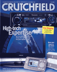 Panelists also praised the cataloger for its effective use of promotional strategies, such as its positioning on the front cover of a bold yellow box announcing free shipping and its placement on the back cover of information regarding its Great Gear Giveaway.
The hard-working back cover also spoke to Crutchfield’s service-oriented branding with a list of reasons — free tech support for life, free return shipping — for buying from the cataloger. As one judge said, “Crutchfield makes customer service the cornerstone of its marketing.”
Why it didn’t win a Gold Award
While the judges agreed that Crutchfield excels at selling auto audio and home theater components, “the catalog does not do a good job of communicating the presence of other products such as cameras,” said a panelist.
The front cover also dragged down Crutchfield’s scores. “It is uninteresting and does not catch our attention,” said a judge, “and the large TV in the center shot that features a tall building distracts from the brand image.” — John Fischer
Art director: Amy Lenert
Circulation: Melanie Bentley
Print production: Tim Hensen, Michele Rick
Editors: Barry Montgomery, Mike Colley, Erin Blanton, Mike Sokolowski
Photography: J. Stoll
Merchandisers: David Weisman, Carl Mathews
Operations: Kurt Goodwin
Printer: Quad/Graphics
List manager: Mokrynskidirect
Cover paper: 60 lb., #3 Stora Orion
Text paper: 30 lb., #5 IP Advocate and 30 lb., #5 Stora Consopress
Trim size: 8″ × 10-1/4″
Number of pages: 124
Computers, High-Tech Equipment, and Software
GOLD: WEB CHANNEL
SILVER: CONSUMER SPECIALTY PRODUCTS
Musician’s Friend | www.musiciansfriend.com
Madonna sang a few years ago that “music makes the people come together.” That may be true, but the Musician’s Friend Website makes the musicians come together for super service and great deals on instruments and accoutrements. “This site knows how to sell product,” commented one judge.
Why it won a Gold Award
Musician’s Friend rocks a lot of merchandise. “Product is deep and perfect for the market,” said one judge. If you need a guitar, a keyboard, DJ gear, or recording equipment, you’ll find it here. And you’ll find it pretty easily, particularly when you drill down to the product subcategories. The site has a “good comparison functionality, nice use of recommended accessories, and a solid presentation of list and actual prices,” said one panelist.
The site hits another high note with copy. Here’s a sample: “The Fender Standard Stratocaster is the guitar design that changed the world. The Fender Strat is made with the perfect blend of ingredients to help you take your music to the top… At this low price, why play anything but the real thing?” The product descriptions are solid, enthused one judge, with “lots of selling points, clearly written for the Web and not recycled from the catalog, with nice use of subheads and bullets.” A believable tone and voice add to the copy’s appeal, the judge said.
Another strong suit: “The real-time inventory status is excellent,” proclaimed one judge. Let’s say you need a new set of skins: After perusing the site you settle on the Tama Swingstar Ready to Rock Standard Drum Set. If you click “availability,” you can immediately see if each option and style for the set is in stock, and if it’s not, when the due date is. Musician’s Friend also boasts a 45-day best-price guarantee and a 45-day satisfaction-guaranteed policy, among other service standards.
Idea to steal
The customer reviews “really add a big dimension to Musician’s Friend,” said one judge. For instance, you may think a cowbell is a cowbell. But when a customer review says, “THIS IS AN AWESOME COWBELL!! It is the first cowbell I’ve added to my 20 piece arsenal. This is a top notch buy and I would recommend it to anyone testing the cowbell waters. AWESOME AWESOME AWESOME!” it’s clear that some cowbells are better than others. Hearing it from an objective source — in this case, a fellow musician — is more persuasive than hearing it from the manufacturer or the merchant. — MD
Creative director: Ken Sager
Marketing director: Michael Eisenberg
Webmaster: Christopher James
Website designer: Jason Cave
Merchandiser: Shane Halstead
Copywriter: Marty Paule
Photography: Dave Blees
SILVER: WEB CHANNEL
Crutchfield Corp. | www.crutchfield.com
You’d probably expect a merchant of consumer electronics to have a killer Website, and Crutchfield does not disappoint. Land on the home page and you’ll find links for hot specials and features, “our top picks,” helpful info and shopping tools, real-life stories (or “notes from the Crutchfield community”), and a learning center full of articles and reviews — “all the elements that make a strong home page,” said a judge.
Why it won a Silver Award
“These guys are merchants!” declared one impressed panelist. If you need a sound system for your car, a high-definition television set, digital entertainment gear, or the latest in DVD camcorders, you can find it on this site. Better still, you’ll have no trouble locating add-ons, accessories, and whatever you may need to install a product. A panelist cited Crutchfield’s “good use of upselling on product pages offering wire kits, speaker wire, and any other essentials to install a music system.”
Copy is “very informative and to the point,” said a judge. For example, the description of a home theater speaker system begins: “You won’t notice the speakers — you’ll notice the sound. The redesigned Acoustimass 6 Series III system boasts five tiny single-cube satellites and a powered bass module, all of which virtually vanish into your decor. Team it with a 5.1-capable receiver, and this affordable system pours out rich, room-filling surround sound…”
Service is also a strong point. Under the “helpful info and shopping tools” heading, readers will see “Looking for some quick answers? Check out these timesaving links for shopping help you can trust…” The “Why Crutchfield” link gives customers “great reasons to trust the brand,” a judge said. And the site’s navigation “is an extension of the great merchandising,” remarked a member of the panel. “Good combo packages and good offers.”
Why it didn’t win a Gold Award
One judge pointed out that the site’s search function did not allow for misspellings. For instance, the term “speakerwire” brought up no results. Also, the “add to cart” button is difficult to see, said another panelist. And Crutchfield doesn’t promote its “Need help? Call…‥” button enough. “That could be a huge benefit for them,” the judge said. — MD
Site director: Andy Stevenson
Creative director: Archie Miller
Interactive designer: Jeremy Piontek
Interactive developer: Russ Bombardieri
Marketing (lead generation): Garrett Mathews
Merchandising: David Weisman, Carl Mathews
Editors: Jim Ralston, Mike Colley, Charlie Pastorfield, Mike Sokolowski
Photography: J. Stoll
Consumer Apparel
GOLD: PRINT CHANNEL
L.L. Bean | Christmas Selections, Christmas 2005
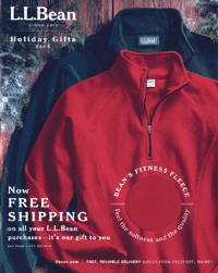 When one industry expert describes a catalog as “a benchmark for the apparel industry,” and another declares, “This catalog exemplified best practices consistently and reaps the rewards for doing so,” you know you’ve got a winner. L.L. Bean’s Holiday Gifts 2005 edition is a case in point.
Why it won a Gold Award
This catalog had the judges at “hello” — or rather, with the front cover. A die-cut revealed a sample of Bean’s Fitness Fleece: “Feel the softness and the quality,” teased a coverline — and indeed, the fabric was puppy soft. “You can’t help but open the catalog because of the die-cut,” said a judge.
And that wasn’t even the only enticement on the cover. The other piece of promotional copy read: “Now FREE SHIPPING on all your L.L. Bean purchases — it’s our gift to you.” “The marketing concept is especially successful because it is customer-focused from the outset,” explained a judge. “The cover offers the customer a gift — the free shipping — and a chance to feel the fleece for himself. This focus is consistent throughout the catalog.”
The copy reinforces this focus by homing in on product benefits. “Our turtlenecks keep their shape, wash after wash,” reads one headline. The description of the Insulated Comfort Boots begins, “A double layer of Bean Tested fleece wraps your ankle and foot in soft, wind-resistant warmth.” “Comfort ratings” that tell you just how warm each coat is and an explanation of the different fits of women’s jeans are other ways in which Bean uses copy to persuade hesitant shoppers that they can’t go wrong ordering from this book.
The strong service offerings reemphasize this message, starting with the prominent, iron-clad guarantee. And don’t forget the free inseam alterations, gift boxing for $5, and paper and electronic gift certificates.
The merchandise selection is as comprehensive as the customer service. Outerwear, footwear, pants, sweaters, and nightwear for men and women make up the bulk of the product mix, but as one judge noted, “the catalog offers a wide range of high-quality products from bedroom slippers to binoculars and even a new auto-safety kit.”
Though some of these products might seem at odds with the mission of what is ostensibly an apparel book, “the line extensions are really part of Bean,” said a judge, in that they capture the comprehensiveness of the brand.
We’ll let one of the judges have the last word on this catalog: “Excellent stuff, really well done…brilliant!”
Idea to steal
A bind-in card promoting the free shipping was positioned so that the catalog all but automatically opened at pages 4-5 — and page 4 was dedicated to Bean’s stellar services. If you’re going to include a bind-in card, be sure to place it so that it draws attention to a compelling product or offer. — Sherry Chiger
Creative directors: Don Oakes, Marcia Minter, Jim Hauptman
Copywriters: Craig Fessler, Leslie Gomes, Kate Boak
Designers: Erica Eysenbach, Liz Cook, Tracey Jo Kelsey
Photo/art directors: Cheryl Donohue, Betty Fuller
Printer: Quebecor World
Color separator/prepress: Vertis
Cover paper: 70 lb., IP Influence
Text paper: 38 lb., IP Advocate
Trim size: 8″ × 10″
Number of pages: 168
SILVER: PRINT CHANNEL
Patagonia | Fall 2005
Judges were impressed with several aspects of Patagonia’s fall edition, such as the use of recycled paper, the eye-catching action photography, and the environmental essays. “There’s no doubt Patagonia knows its customers,” said one judge, admiring the placement of a testimonial from a “Patagonia ambassador” on page 2. “This is where a president’s letter might be in another catalog,” noted the judge. “Perhaps customers really do outrank presidents.”
Why it won a Silver Award
The copy is extremely credible, enthused the panelists, and speaks to the needs and interests of Patagonia’s audience. Ditto the merchandising, a well-rounded assortment of outerwear and actionwear created to enhance customers’ outdoor experiences. The copy does a sterling job of letting readers know the specialized attributes of seemingly similar items.
Patagonia’s customers are apparently as involved in conservation as they are in outdoor sports. To that end, Patagonia offers innovations such as its Common Threads underwear recycling program, the description of which includes a customer letter that begins “Thanks for covering my ass.” As one judge said, you can’t get more original than underwear recycling.
“Talk about ‘know thy customer,’” exclaimed another judge. “The next time I go mountain climbing, this catalog will be in my back pocket.”
Why it didn’t win a Gold Award
As much as the judges oohed and aahed at Patagonia’s spectacular outdoor shots, they felt that such photographs do not enhance the catalog’s merchandising. For instance, one of the judges said, the front-cover image of a shirtless man walking a tightrope is beautiful, but it and the cover need to speak more about the company, the merchandise, the model, and/or the location. The back cover was left to take up the slack, and as a result is unappealingly jammed with information. — TP
Designer: Annette Scheid
Creative director: Rob BonDurant
Marketing director: Morlee Griswold
Production coordinator: Sarah Sweeny
Merchandisers: Carrie Randolph, Kevin Churchill
Editor: Kasey Kersnowski
Photo editor: Jane Sievert
Printer: Arandell Corp.
List manager: Ken Storey
Cover paper: 80 lb., Orion dull, 20% PCW
Text paper: 45 lb., Polario Press silk, 40% PCW
Trim size: 10-1/2″ × 10-1/2″
Number of pages: 88
SILVER: WEB CHANNEL
Consumer Apparel/Sporting Goods
L.L. Bean | www.llbean.com
For more than 90 years, L.L. Bean has been selling apparel, outdoor equipment, home furnishings, and gifts via mail order. During the past decade it has also embraced the Web channel with gusto — so much gusto that this year L.L. Bean took the Web Channel Silver Award in not only the Consumer Apparel category but in the Sporting Goods category as well.
Why it won Silver Awards
L.L. Bean’s Website provides an “incredible breadth of merchandise, yet also cohesive taxonomy and hierarchies,” said one judge. This same judge applauded the cross-selling on the product pages. For instance, “when I was looking at a camp flannel sleeping bag, I was offered the ice cream ball, which makes sense for car camping. And when looking at a zero-degree backpacking bag, I was offered a backpacking headlamp. Nice stuff.”
The strong home page uses space well, with most of the critical links and product categories above the fold, or on the first screen, said a panelist. Another judge pointed out that Bean’s use of a perpetual shopping cart on the site “is an excellent strategy, but it should be started on the entry page.” The site also boasts a strong ordering process, said a judge, citing in particular the guest checkout so that customers can buy without registering and the “huge guarantee.”
The merchandising “is right on the money,” a panelist noted. Copy is consistent and compelling, and headlines are clear. The body copy is particularly well done from a Web perspective, according to a member of the panel. Said another judge: “Clearly this is Web copy, not repurposed catalog copy, and it takes advantage of the longer space available online.”
Why it didn’t win a Gold Award
In a word, search. “Their search function is slower than molasses!” said one judge. Also, “there is no ability to refine your selections by anything other than category, which is not helpful from a user’s perspective.” L.L. Bean might consider a directed search, “and a much more aggressive presentation for their ‘no finds,’” a panelist advised. The merchant might also update its inventory status and available ship-time information, a judge added. — MD
Creative director: Sara Holihan
Vice president, e-commerce: Mary Lou Kelley
Copywriter: Mark Ferguson
Consumer Specialty Products
GOLD: PRINT CHANNEL
Country Walkers | 2006
Nobody wants to hear “go take a hike,” unless the directive comes from the Country Walkers catalog.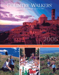 This marketer of walking vacations provides adventure travel throughout Europe, Africa, Asia, and the South Pacific as well as in Central, South, and North America. In business for 27 years, the company says it aims to help consumers “explore the world one step at a time.” If the judges’ reaction to the book is any indication, Country Walkers is achieving its objective.
Why it won a Gold Award
There are the stellar creative and production values, to start, including stunning photography. “This design makes reading inviting, even if you’re not interested in walking,” said one judge. For example, a crisp, sunny shot of hikers on the coastal paths in Tuscany has you all but ready to dive right into the Mediterranean Sea. Beautiful photos of scenery often incorporate locals and tour travelers, noted another panelist. “The use of actual tour photography works very well.”
Copy is another high point of Country Walkers: “Everything relating to copy is done on a high professional level,” said a panelist. “Great care is taken to make the reader fully understand the rigors and elements of each trip.” Said another judge: “In this type of catalog there is a lot of room for copy, and it is extremely well done. Excellent descriptions of what you will see!”
The catalog’s covers also won high marks. Both covers do a fine job “expressing all the essential items — good logo, the dream of travel, and real people enjoying the trip,” one judge said. The back cover includes teasers for offerings such as new tours for this year, private trips, women’s adventures, and special departures. Based on the covers alone, said another panelist, “I am ready to walk.”
The selection of trips is impressive too. From Croatia’s Dalmation Coast to the markets of Marrakesh to the lake district of Chile to the Canadian Rockies, there is likely a walking trip to appeal to any prospective traveler. “This catalog provides every conceivable walking tour, very interestingly presented,” said a panelist. “All details of each tour are carefully spelled out along with the difficulty of each trip.” It helps that the president’s letter on page 2 addresses many concerns a customer might have; Country Walkers also devotes the next 10 pages to information about the company and the tours before it starts promoting individual trips.
Idea to steal
Country Walkers’ Encore guest loyalty program provides an incentive for customers to keep coming back. Tour participants are automatically enrolled in the Encore program when they complete their second trip with the cataloger; complimentary benefits include savings on subsequent trips, gifts, referral credits, and travel updates. — MD
Director/marketing director: Carolyn Fox
Designer/creative director: Tina Christensen, Christensen Design
Copywriter: Erik Eskilsen
Map illustrator: Janet Fredericks
Printer/color separator/prepress: Progress Printing
Cover paper: 7 pt., #2, Sterling gloss cover
Text paper: 80 lb., #2, Sterling/Westvaco
Trim size: 8-1/2″ × 10-3/4″
Number of pages: 114
SILVER: PRINT CHANNEL
Sherrill Tree | Ascend, Introductory
Sherrill Tree wants to help consumers rediscover the joys of being among the treetops.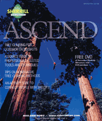 The company served the urban tree-care industry for 22 years before branching out with the Ascend catalog of recreational tree-climbing products in 2005. “It’s a very interesting concept for a company to take a b-to-b product line and target a consumer end market with it,” said one judge.
Why it won a Silver Award
Ascend opens with a “really exciting cover and opening spread,” said one judge. The front cover photo of several professional climbers in harnesses dangling from what looks like two giant redwoods is impressive, as is most of the book’s photography. “Great action photos are woven throughout,” enthused a panelist.
From a merchandising standpoint, “this catalog contains everything anyone could want to climb trees, embellished by lots of know-how tips and very careful detailing of every product and how it is used,” said one panelist. What kinds of products do recreational tree-climbers need? Sherrill Tree’s product line includes foot straps, harnesses, pulleys, helmets, and ropes. “The company sells product while selling the concepts of safe and effective tree-climbing,” said one panelist. “Very educational and entertaining, with lots of applicable products.”
The catalog is a good read as well: “Copy is well written, very informative, with a strong benefit sell,” said a judge. “Each product is clearly defined.” Another panelist pointed out that “the copy really feels like an expert’s delivered advice.”
Why it didn’t win a Gold Award
Ascend was felled by weak customer service: “It appears the company used its b-to-b page and just copied it out of their other catalog.” There doesn’t seem to be a general guarantee, plus there’s no order form and limited phone ordering, said another panelist. And in a rather ironic observation about a catalog that caters to tree lovers, a panelist noted that the paper “seems needlessly heavy.” — MD
Director: Jason Chenier
Designer: Jeffrey Seay
Creative director/marketing director: Tobe Sherrill
Print/production director: Tom Darrill
Copywriter: Pam Goldberg
Photography: Bryan Kotwica
Printer: Press of Ohio
Color separator: Kreber
Cover and text paper: 70 lb., #2 gloss
Trim size: 9″ × 10-5/8″
Number of pages: 56
Food
SILVER: WEB CHANNEL
Ethel M. Chocolates | www.ethelm.com
You can’t smell or taste a product such as fine chocolate from your computer. What’s more, Web shoppers are just a mouse click away from a host of other chocolate sites. So a chocolates merchant must excel in several areas to succeed online. Fortunately for Ethel M. Chocolates, its Web team is up to the task.
Why it won a Silver Award
The home page and the navigation flow “are both straightforward,” said one judge. “The expectations are clear.” For instance, at press time the home page promoted Ethel M.’s Taste of Las Vegas Deluxe assortment, with links along the bottom of the page directing shopper to Truffles & Cremes, Nuts & Caramels, and Deluxe Assortments. A navigation bar on the left has the same categories, along with more links to Seasonal Collection, Liqueurs, Party Favorites, and Gift Certificates.
The home page also has links to Design Your Own Box and Corporate Gifts sections. In particular, said one panelist, “I love the ‘design your own chocolate’ section — nice functionality and very clever and easy to use.” A simple screen says “Create your own personalized gift of pure chocolate indulgence from Ethel M. It’s easy… design your own box in 3 Easy Steps. (1) Select the box and size. (2) Choose from an assortment of seasonal or classic varieties. (3) Place your order…”
Product copy for the most part is Web-friendly, although one panelist noted that some of the longer descriptions “could benefit from some bullets.” But the judge added that the copy “does truly get your mouth watering, and the descriptions are specific and compelling without being too trite.”
Overall, commented another judge, “the merchandising is deep enough and appropriate for the brand.” But for shoppers who may not be familiar with Ethel M.’s brand, a story that positions the product would be helpful, the judge said.
Why it didn’t win a Gold Award
The site suffered from a lack of suggestive-selling. “What this site misses is merchandising,” said one judge. “I felt that other than the home page, every page was database driven, with few upsell and cross-sell features.” And the search function and the overall service were only “adequate,” said another panelist. “It takes 24 hours for an e-mail order confirmation, which is a little slow these days.” — MD<
Marketing director: Susan McKenzie
Webmaster: Kyle Barz
Photography: Myron Beck
Copywriter: Lori Wildrick
Gifts
SILVER: PRINT CHANNEL
L.L. Bean | Holiday Favorites, Christmas 2005
This catalog was about getting customers to buy holiday merchandise,” said one judge about L.L. Bean’s Holiday Favorites edition. “To that end, it does an excellent job.”
Why it won a Silver Award
“The merchandising in this book is astounding,” a panelist said. “The addition of the gift-idea pages at the front is a cool innovation.”
Another judge observed that the copy is well written and appropriate for the audience, observed one panelist. “Headlines draw the reader into the product story, and all is legible and clear.” Another judge was even more enthusiastic: “Best copy job I have ever seen; from headlines to copy on the items, it tells a story.”
Another panelist cited Bean’s clean layouts, which make it easy for customers to find gifts at certain dollar values. Bean also does a good job of promoting its Website throughout the print book, the judges said. And its service polices are very customer focused: “The no-holds-barred guarantee ensures total customer satisfaction.”
Why it didn’t win a Gold Award
It couldn’t have come closer to winning a Gold. The only negatives comments on this catalog were that L.L. Bean may have gone slightly overboard with the holiday promotions on the front cover. “Bean sacrificed some brand recognition for the impact on harried holiday shoppers,” said one judge. — MD
Creative directors: Don Oakes, Marcia Minter, Jim Hauptman
Designers: Erica Eysenbach, Liz Cook, Tracey Jo Kelsey
Photo/art directors: Cheryl Donohue, Betty Fuller
Printer: Quebecor World
Color separator/prepress: Vertis
Cover paper: 70 lb., IP Influence
Text paper: 38 lb., IP Advocate
Trim size: 7-7/8″ × 8-15/16″
Number of pages: 204
Home and Gardening Products
GOLD: PRINT CHANNEL
Jackson & Perkins | Garden Decor 2005
When it comes to flowers and plant gifts, Jackson & Perkins is the master.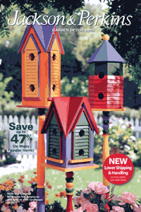 So it’s no surprise that the merchant has made a smooth foray into garden decor products. This edition is “a unique spin-off from their traditional flowers-only catalog,” according to one judge; it’s also a Gold Award winner.
Why it won a Gold Award
The bright, colorful front cover featuring a trio of painted birdhouses gets things started. “It brings a strong, clean visual punch to the brand,” said one judge.
Inside the book, the array of merchandise, from whimsical to practical, is alluring. Products range from a mosaic birdbath to an all-weather wicker bistro set to a steel Victorian garden arch with a gate. With its garden accessories, Jackson & Perkins has an advantage in that it can “fill all the lovely garden items with appropriate accessories and help the customer grow them,” a judge said.
Copy is another of the cataloger’s strengths. Jackson & Perkins’s gardening expertise “comes through in the copy and product mix and nicely supports the brand,” pointed out a panelist. The book has “a good mix of nice information and personality,” said another. Headlines range from “Handsome and Enduring Copper!” to “Grow a Deeresistable Garden!
Headline, subheads, and product copy really work hard to draw the reader in. For example, a Vintage Tricycle Planter boasts the subhead “A beloved remnant of a bygone era — right at home in today’s garden.” The copy block for the item begins: “You might have seen it peeking out at you from an antique store window, but we’ve brought this treasure home for you (recreated it, actually, with a roomy planter basket) so you can enjoy a bit of romantic nostalgia on your porch, patio or garden walk. Fill it with flowering bulbs in spring, mums in the fall and poinsettias for Christmas…”
Jackson & Perkins is “very solid, as always, in marketing execution,” said one judge. The cataloger also pays “excellent attention to customer service details,” such as how to contact the company and information on plant shipments and product availability. And although many other catalogers have abandoned the printed order form altogether, this mailer understands that many customers still prefer to fill it out. In fact, one panelist applauded the “good use of the order form,” adding, “and I like the clarity of the shipping information.”
Idea to steal
It might only be worth stealing if you sell perishables as well as hard goods, but Jackson & Perkins has separate guarantee information for horticultural products and nonplant items. Satisfaction is always guaranteed, no matter the product, but the cataloger asks to be notified within 60 days if a plant is not performing to a customer’s expectations, at which time it will replace the item free of charge or refund the money. — MD
Director: Estin B. Kiger Designer: Ginny Egan
Creative director: Neal Schuler
Marketing director: Craig Wilson
Print/production director: Lisa Chang
Merchandiser: Deborah Hill
Copywriter: Jill Thacker
Photography: Ron Anderson, Eric Groetzinger
Printer: R.R. Donnelley, Lancaster
Color separator: Schawk
List manager: Bruce Kimmel, American List Counsel
SILVER: PRINT CHANNEL
MacKenzie-Childs | From Garden to Table, Summer 2005
If you love ceramic tableware and accessories, you’re probably familiar with MacKenzie-Childs.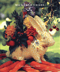 The manufacturer/marketer of majolica ceramicware is renowned for bright, fanciful designs. The front cover, which shows flowers and vegetables in a yellow-polka-dot planter shaped like a rabbit, is sure to make customers and prospects “want to investigate MacKenzie-Childs more deeply,” said one judge.
Why it won a Silver Award
Judges couldn’t stop raving about the catalog’s visuals. “Rich photographs and a light, airy feel to the book make for very pleasant browsing,” noted a panelist, who applauded the “less is more” design philosophy. “Beautiful lighting and photography in general,” said another judge, “and excellent production values in terms of paper quality.”
When it comes to merchandising, MacKenzie-Childs owns it — literally. “There’s a nice mix of proprietary product,” said one judge. “No worry of competition; they own the manufacturing.” The company also knows how to sell its goods. In particular, a panelist cited the cataloger’s “lifestyle groupings for multiple-item sales.” For instance, one spread includes a breakfast table set with bearded iris-patterned dishware — everything from dinner plates to candlesticks.
The catalog was photographed at the Mackenzie-Childs studio in upstate New York, set above a lake on a 65-acre Victorian dairy farm. The backdrop of the studio appears in several product photos; display copy assures customers, “Yes, we work in the silo! And in every other inch of the barns attached to it…” This treatment provides an “excellent tie-in to the company’s headquarters in Aurora, NY,” said one judge, who suggested that MacKenzie-Childs add a map and directions how to get there.
Why it didn’t win a Gold Award
The book could use more product copy, said one judge. “Except for the tie-ins to the company headquarters, the copy is nonexistent — no benefits, no product descriptions. The opening-spread letter is good, but it stops there.” And some panelists didn’t like the placement of the order blank between pages 35 and 36 of the 46-page catalog. “It will be lost,” said one judge. What’s more, said another judge, the catalog is “not quite as high end in service as the product warrants.” — MD
Director/marketing director: Jennifer Ellsworth
Creative director: Pleasant Rowland
Designer: Myland McCrevey
Print/production director: Beth Colvin
Merchandiser: Rebecca Proctor
Copywriters: Jennifer Ellsworth, Pleasant Rowland
Photography: Rudy Hellmann
Printer: Quad/Graphics
Cover and text paper: 70 lb., grade 3, Sonoma
Trim size: 8-11/16″ × 10-1/2″
Number of pages: 48
Home and Gardening Products
GOLD: WEB CHANNEL
Cooking.com | www.cooking.com
Cooking.com’s wonderfully technical product information, powerful onsite search engine, and easy checkout process almost intimidated the judges. They quickly got over it, though, agreeing that the site accomplished its marketing goal of offering a complete assortment of products from every top brand wrapped up in a simple shopping experience.
Why it won a Gold Award
Cooking.com packs a powerful punch in its home page, with product categories running alphabetically down the left side of the screen, a $5 shipping credit on orders of $25 or more in the center of the page, additional offers along the right side, and links to the most highly reviewed products, new items, and customer service along the bottom. The clean design makes it easy for customers to decide how they want to begin shopping.
Navigating through Cooking.com is easy as well, despite the breadth and depth of its product line, which ranges from bakeware to small appliances. Each page includes category or subcategory links and the ability to sort items by brand, price, relevancy, and customer reviews. The judges especially liked the onsite search functionality, which organizes results by category as well as provides the option of narrowing results by best-sellers and new items. “It’s one of the best search engines I’ve used,” stated a judge.
Where Cooking.com really sizzles is with its merchandise assortment. Panelists felt that the featured products were well targeted to customers’ needs and wants and that the site’s cross-sells were positioned effectively. For example, on a page selling a two-piece Calphalon Nonstick Skillet Set, images, price, and copy for a shallow sauce pan, a stir-fry pan, and a griddle pan are included down the right side of the screen.
Product copy is written from the customer’s point of view, addressing both obvious and more-subtle product benefits and shoppers’ potential concerns. A case in point: “The Bodum Kenya French Press is the easiest and fastest way to the best cup of coffee: add your favorite ground coffee, hot water, press and enjoy the most aromatic delight in the shortest period of time.”
Cooking.com’s customer service is as gourmet as its product selection. One judge who put the merchant to the test said response to an inquiry submitted through the Website’s online form was quick, friendly, and helpful.
Idea to steal
With a merchandise selection as large and varied as Cooking.com’s, finding the right product for the job can be difficult. But an Interactive Selection Guide helps customers winnow their options down from the more than 1,600 items offered; all the shopper has to do is answer six easy questions. The number of matching items is dynamically changed after each question is answered, and at the end, customers have the option to display results or start a new search. — HR
President: Tracy Randall
Chief operating officer: Bryan Handlen
Chief financial officer: Laura Shaff
Chief technology officer: Gerald Morgan
General manager: Larry Sales
Marketing director: David Gaeta
SILVER: WEB CHANNEL
Lenox | www.lenox.com
A manufacturer/marketer of tableware and collectibles, Lenox understands that many of its customers are gift givers. To that end, it has designed its Website so that, in the words of one judge, it’s “personalized gift-giving made easy.”
Why it won a Silver Award
The site’s Personalized Preview feature allows visitors to see what a personalized product — a piggy bank with a baby’s name and birthdate printed on the side, for instance, or monogrammed shot glasses — will look like before purchasing. Other gifting features include gift reminders, in which shoppers can sign up to receive automated e-mails prior to special occasions, Wish Lists, and the Gift Finder, which sorts items by occasion, recipient, price, theme, and product type.
Guided navigation works well for Lenox.com, as shoppers are directed through its product selection in a logical way using intelligent inconsistency (featuring the most-popular category at the top of the navigation). And for customers who would rather perform an onsite search for a product, misspellings aren’t a problem. And each product page includes a selection of items “you may also like,” encouraging larger order values.
Perhaps best of all, Lenox assures customers of an enjoyable buying experience by offering a complete refund or a replacement if they are ever less than completely satisfied. Topping that off is the Lifetime Breakage Replacement Policy, in which customers who break a piece can get a replacement, provided the item is in stock, at 50% of the current retail price.
Why it didn’t win a Gold Award
Although customers aren’t required to register, they do have to provide an e-mail address at a point fairly early in the checkout process. The presentation of this log-in screen is confusing, the judges believed, and could be a source of cart abandonment. The panelists also felt that the checkout process as a whole could be simplified. — HR
Internet marketing manager: Philip Marcella
Internet merchandising manager: Lori Leone
Assistant e-mail marketing manager: Timothy Foy
Web designer: Steven Pashley
Creative assistant: Mindy Sorasky
Copywriter: Darcy Silvers
IT project manager: Brian Innes
Web developer: John Hill
International
GOLD: PRINT CHANNEL
New Pig Corp. | The Big Pigalog (U.K.)
Whether it’s right here in the U.S. or across the pond in Britain, New Pig Corp., a manufacturer/marketer of industrial cleanup supplies, knows how to have fun with cleaning.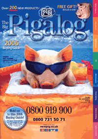 Sparky, New Pig’s illustrated mascot pig, and the rest of the gang strutted off for the second year in a row with a Gold Award for the U.K. version of the Big Pigalog.
Why it won a Gold Award
New Pig’s U.K. edition creates a memorable brand experience before customers even flip open the catalog. The front cover features a real-life Sparky lounging on a Pig Skimmer Pillow (used to absorb oily spills) in a Pig Portable Containment Pool (used to catch leaks). Panelists called the cover fun, eye-catching, and engaging. But New Pig is about more than humor, as one judge pointed out: “The section tab index along the right side is a gentle reminder that there’s a serious side to this too!”
New Pig proves its seriousness and dedication and to workplace safety with its persuasive, benefit-driven copy. “Matting provides traction, anti-fatigue properties and drainage in oily work areas,” reads a typical headline. An excerpt from a typical product description: “Its large 22mm × 22mm drainage holes make it perfect for wet and oily industrial environments where liquid and swarf gather.”
Panelists agreed that this catalog makes good use of callouts, which give additional product instruction, whether it’s done in a traditional form or by “hambassador” Sparky. “It makes a potentially mundane product category come alive with an excellent creative platform,” a judge said.
Judges were impressed with the Pigalog’s range of merchandise — everything from safety signage to disposable respirator masks. The front cover touts more than 200 new products, while the back cover declares, “We have over 2,200 solutions to your problems!”
New Pig highlights its 100% money-back guarantee on the catalog’s opening spread and promises a full refund, including freight both ways. Panelists commended the cataloger for this and other service features, such as same-day dispatch, next-day delivery, free samples, and custom orders. On page 4, New Pig gives customers 15 reasons why they’ll love dealing with their “partner in grime.” One judge felt that while New Pig keeps the subject matter light it nonetheless provides an “excellent presentation of customer service features that communications a real sense that the customer focus is serious.”
Idea to steal
No matter how seemingly mundane or technical its product line, there’s no reason that a business-to-business catalog needs to be boring. At the same time, you don’t want to undermine your credibility with gratuitous humor. New Pig strikes an ideal balance by having the cartoon Sparky appear throughout the catalog — hard hat on, to be safe — pointing out pertinent product features. Though you shouldn’t necessarily use this exact creative treatment, you might benefit from the overall concept of selling via humor. — HR
Creative directors: Ames Parsons, Beth Love, Leroy Eckenrod
Marketing director: Allyson Bryan
Product merchandisers: Darran Hamilton, Gayle Paterson
Project manager: Edward S. Engle III
Designers: Stephanie Yingling, Brenda Kerr, Kevin Ludgate, Laura Shoup
Copywriters: Norman Benford, Dustin Hess, Keith Eldred
Prepress services: Julie White, Gina Baker, Jennifer Harker
Photography: McManus Studios, Gina Baker, Alan Stewart
Illustrator: Bruce van Patter
Printer: Wyndeham
Cover paper: 225 gsm, Regency gloss
Text paper: 70 gsm, UPM, Finesse gloss
Trim size: 297mm × 210mm
Number of pages: 156
SILVER: PRINT CHANNEL
Black Box Corp. | Network Services 2005-2006 (U.K.)
In its U.K. Network Services book, computer networking products and services provider Black Box offers dazzling customer service (round-the-clock lifetime technical support! onsite consultations!), an impressive guarantee, and an awe-inspiring product selection — enough to fill more than 700 pages.
Why it won a Silver Award
With an astoundingly comprehensive selection of 90,000 products, Black Box is the hands-down authority on networking products. So many products can, of course, easily intimidate even the most savvy customer. To minimize the chances of that, Black Box uses a table of contents and a color-coded navigation design that is well thought out and easy to understand. One judge even said that Black Box’s navigation is “almost a case-book study in navigation management.”
The copy works hard to give customers essential product details and loads of benefits. “The copy carries an intimidating weight of technical information with a deceptively light touch, which makes for surprisingly easy reading,” said one panelist. Both product descriptions and auxiliary copy, such as the “Black Box Explains” sidebars, are informative, authoritative, and accessible. Take this example, from the description of the Video Scan Converter Plus: “The Converter Plus also features a rear-panel connector for RS-232/V.24 remote control. That means you can use all front-panel functions — zooming, screen scrolling and anti-flicker options — from a connected control device, such as a PC.”
Why it didn’t win a Gold Award
While the front cover imparts a clean, no-nonsense professional look, judges felt that it doesn’t work hard enough or encourage customers to purchase. There are no promotional cover lines, no references to specific products, nothing but the image of some sort of network router, the Black Box logo, the catalog title, and the tagline, “One Source for Worldwide Infrastructure Services.” “Maybe the brand is so well known they don’t have to try too hard,” remarked one panelist. — HR
Printer: Perry Judd’s
Cover paper: 124 lb., Sterling
Text paper: 30 lb., Film Coat
Trim size: 8-3/8″ × 10-7/8″
Number of pages: 712
SILVER: WEB CHANNEL
Calendars.com | www.calendars.com
The Calendars.com Website claims to offer “the best selection of calendars in the known universe.” So it’s fitting that the Internet merchant took the Silver Award in the International category.
Why it won a Silver Award
The site has some 4,500 styles of calendars in stock for 2006 (and as of August 2006, more than 5,000 available for 2007). The site boasts a plethora of subject categories to choose from, including Cars & Truck, Cats, Ethnic Heritage, Firefighting, Health & Fitness, Lighthouse, Science, and TV Shows. “An excellent selection of calendars in just about every topic,” said one judge, who also cited Calendars.com’s “recommend buys for each selection.”
On the left side of the home page, the list of categories sits above an equally long list of “popular subjects.” These range from America and Ansel Adams to Vintage Poster and Wysocki. These lists are “perhaps a bit too long,” said one judge. But the same panelist applauded the “colorful” home page, which also displays the 10 top-selling calendars on the right, for its “with easy-to-read navigation by category at the top.”
Copy is also strong. “Excellent product descriptions, very detailed, links to relevant information such as binding, grid size, mount, etc,” said one judge. The description for a Coffee 2007 Wall Calendar: “The ultimate calendar for coffee lovers! Twelve photos to cover as many months feature everything from coffee beans to steaming cups of coffee to the cafes where it’s served.”
A panelist also praised the “multiple views of calendars” that show the front and the back. And Calendars.com’s solid cross-selling efforts include many recommendations, a judge said.
Why it didn’t win a Gold Award
Navigation is a problem area for Calendars.com “because of the sheer number of product categories,” said one judge. Overall, “the navigation is not intuitive, with categories seeming completely random,” the judge said.
Another panelist pointed out that entering misspellings into the search function returns no results; what’s more, the “no results” page is “overwhelming and presents the advanced search form, which is long and confusing.”
And on the customer service side, a judge noted that there is no publicly available e-mail address, “forcing the customer to use a form to submit questions.” — MD
General manager: Hillel Levin
Creative directors: Coe-Truman Technologies, iSite Design
Marketing director: Hilarie Pozesky Consulting
Webmaster/consultant: Coe-Truman Technologies
Website designer: Patrick Craig, iSite Design
Merchandiser: Catapult by Coe-Truman Technologies
New Web Merchant
SILVER: WEB CHANNEL
Schaul’s | www.schauls.com
Schaul’s first venture into e-commerce is a tasty one, the judges agreed. Photos of beautifully garnished lobster tails, New York strip steaks, and other gourmet foods make it clear why Schaul’s feels entitled to use the tagline “The finest food products for discriminating tastes since 1923.” The color palette, typefaces, and copy reinforce this branding, as does the well-defined left-hand navigation bar, with such descriptive categories as Gourmet Poultry, Tender Pork, and Savory Lamb.
Why it won a Silver Award
The Schaul’s Website, particularly the home page, is heavy on the text, which judges thought may have been for search engine optimization purposes. But the copy does a nice job of establishing expectations; to wit: “At Schaul’s, we offer a complete selection of exquisite gourmet foods including tender and juicy Certified Angus Steaks, succulent Jumbo Shrimp and Lobster Tails plus many other mouth-watering selections like our premium Hickory Smoked Hams, popular Salmon Filets and meaty, flavor-filled Pork Chops.”
Beyond the introductory and product copy, the Website offers cooking and serving tips and several dozen recipes — a subtle way of establishing Schaul’s credibility regarding cuisine. The judges were impressed with the Website’s promotional tools, which were used to cross-sell along general categories. Those include continuity clubs and corporate gifts and incentives programs. In fact, Schaul’s focus on general gift-giving is effective and well executed, said the panel.
For instance, the left-hand navigation bar gives prominent placement to gift options such as the ability to shop by occasion and by price. The site also features a “gift-giving address book” function, and the product pages include the reminder that “gift messages may be added during checkout.”
Why it didn’t win a Gold Award
While the Website was praised for its design, the judges said its search function was on the basic side and might have benefited from filtered navigation and advanced search functions.
And while every product page included links to three suggested items, panelists felt that the recommendations were rather random. On the Completely Trimmed Filet Mignon product page, for instance, the cross-sells are Filet Mignons & Lobster Tails, New York Strip steaks, and Cold Water Lobster Tails. “I’m surprised it never recommended any spices or steak sauces, for example,” said one judge. Nor did offers of add-on items appear during the checkout process.
The cross-sell recommendations point to what some believed was a merchandising shortcoming: “I was surprised to see the lack of peripheral items for the main food products,” said a judge. While Schaul’s does sell chocolates and nuts in addition to entrees and gift baskets, the panel believed that by adding appetizers and side dishes to its product offering, the company could boost its average order value and promote itself as a one-stop source for all of a shopper’s gourmet food needs. — TPCreative and marketing director/merchandiser/copywriter: Tom Schaul
Webmaster/Website designer: Suzy Eilers
Photography: Steve Schaul
Office Supplies, Furniture, and Stationery
GOLD: PRINT CHANNEL
Day-Timer | Your Holiday Gift Headquarters, December 2005
You may not think of pens, daily and yearly planners, binders, and desk accessories as presents one might hope to find under the Christmas tree. But Day-Timer does, and its award-winning holiday catalog is so compelling that you may find yourself asking Santa for a personal finance organizer or a leather wine journal this year.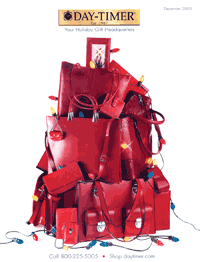 The book effectively covers the bases in a way that keeps the pages “fresh and inviting beginning to end,” as one judge said.
Why it won a Gold Award
Certainly the front cover plays up the holiday theme, with a photo of large Christmas lights dangling from a pyramid of red tote bags and wallets. “The front cover showcases the products as ideal gifts for the holidays,” said a judge. Added another panelist about the cover: “Very clean, colorful, and well done.”
When you open the catalog, you’re greeted with a brief president’s message, along with three easy ways to order, a 100% satisfaction guarantee, and a small advertisement for gift certificates. “Merchandising is totally appropriate, is broad in range, and has variables within the classifications to appeal to multiple tastes,” one judge said. It’s clear immediately, said another panelist, that Day-Timer is “much more than agendas, calendars, and datebooks.”
The judges had plenty of praise for the copy as well. “The headlines work well with the editorial callouts, which all work with the body text. Together they form a solid selling story for the customer, giving him all he needs to make a buying decision,” said a judge. Another panelist lauded the catalog’s copy as “clear and informative and well presented,” a more than suitable compliment to the mix of products. The judges also appreciated the catalog’s “clean” and “easy to follow” layouts and style.
Overall, Day-Timer has “covered all the bases,” one judge said. The catalog achieves what it sets out to accomplish with subtle style. “The reader is pulled through the catalog by a coordinated effort by the writer and the designer working in unison with the merchandising group,” a judge said.
Idea to steal
One judge in particular appreciated the attention Day-Timer paid to an ongoing problem for consumers: “This catalog addresses the customer receiving duplicate catalogs and how to handle that,” the judge said. “If a customer receives duplicate catalogs, there are steps to follow to remedy that situation on the mail order form in the center of the book.” — JT
Creative director: Stiner Pieri
Designers: Glen Solosky, Jim Wascoe
Marketing director: Donna Robatta
Print/production director: Maureen Moorehouse
Photography: Kevin Bubbenmoyer Photographers
Cover and text paper: Tembec 60 lb., Delta Brite, #4 grade
Trim size: 7-5/8″ × 10″
Number of pages: 48
SILVER: PRINT CHANNEL
Office Depot | Green Book 2005
Launched three years ago, Office Depot’s Green Book sells earth-friendly products, such as biodegradable packing peanuts and energy-efficient light bulbs. In keeping with its mission, the catalog is printed on 100% recycled postconsumer content paper. “The creative and merchandise execution is integral to the brand,” commented one judge. “Everything is in keeping with the green philosophy.”
Why it won a Silver Award
This 124-page book employs clear, concise copy and color that is “striking in products you often think of as shades of gray,” one judge said. In addition, color tabbing in the table of contents “makes it very easy for the reader to identify what he needs quickly,” one judge said.
Office Depot’s strong message about recycling was not lost on the judges. “The cover, paper stock, and overall impression immediately differentiate the brand for Office Depot,” a judge said. “Visuals and copy work together to communicate product value as well as excellent service.” Another judge praised the catalog’s “highly distinctive positioning as being environmentally friendly. That message relates to the company and the products. Much of the copy is designed to show customers how committed the company is to the environment. Excellent use of small editorial messages throughout convey and support the central theme.”
Why it didn’t win a Gold Award
The panel had a few quibbles regarding design. One judge said the graphics used on the front and back covers are “busy and distracting, taking away from logo and masthead. The back cover essentially functions as a second front cover.” What’s more, the judge said, there is “very little design on selling pages and virtually no pacing.” Another judge added: “My only criticism is the use of white type over photography. The ghosted background for the type takes away from the photograph and takes away from the copy so that neither is effective.” — JT
Director/creative director: Suzy Campbell
Designer: Sandra Strasser
Marketing director: Dean Jackson
Print/production director: Peggy Regan
Merchandiser: Mitch Salley
Copywriter: Ben Lippel
Photography: KSC Studios
Printer: Quebecor World
Consultant: AGA
Cover paper: 80 lb., Environment text web, Neenah Mills
Text paper: 24 lb., Environment writing web, Neenah Mills
Trim size: 8″ × 10-1/2″
Number of pages: 124
SILVER: WEB CHANNEL
Day-Timer | www.daytimer.com
Day-Timer’s day planners, journals, and other organizational products are available in office-supplies stores nationwide. Nonetheless, “this is the place to purchase a Day-Timer,” said one panelist. One reason is that Daytimer.com offers the complete product line in one easy-to-use locale. Another reason is that the site offers more than products; it also provides tips and tricks to help just about everyone become more productive.
Why it won a Silver Award
Category links along the left column of the home page lead customers to a wealth of planners, travel gear, car organizers, and desk accessories. Visitors can also select one of the links in the home page’s center section and order new planner pages, create a custom planner, or request a catalog. “The home page is excellent and conveys the best of what they are about,” said one judge.
Day-Timer scored points with its copy, which the panelists felt made good use of bulleted text to highlight the main features of a product. Merchandise descriptions manage to address product benefits clearly yet succinctly. For example, copy for the CommuteMate Cell-Cup claims it’s “a must for all commuters” that “provides a secure location for your cell phone. Unique foam insert conforms to any size cup holder. In addition to the cell phone pocket, a second pocket holds a small note pad, spare keys, or coins. Two wells keep pens or pencils at the ready. Bottom connection access port accepts car rechargers.”
Judges also praised Day-Timer for repurposing its e-newsletter content on the site. “I like the articles they publish from their e-newsletters, many of which subtly sell their product,” said a panelist. How-to articles include “5 Easy Tax Record Organization Tips,” “The ABCs of Business Success,” and “8 Ways to Simplify Your Life…Starting Today!” As one judge commented, “They do the best job of helping people organize their lives, both with product and with helpful hints.”
Why it didn’t win a Gold Award
Panelists felt that the Website’s photography needs to be upgraded. Worse, they said that its onsite search falls flat. The search engine is hidden in the top navigation bar with sample text in the input — “which may not be such a bad thing, because the onsite search is pretty useless,” a panelist said. And although Day-Timer tries cross-selling in the shopping cart (albeit ineffectively, according to at least one judge), the panel chided the merchant for not cross-selling on product pages. — HR
Webmaster: Cindy Polzer
Website designer: Tom Coderre
Copywriter: Sue Williams
Photography: Kevin Bubbenmoyer Photographers
Small Catalog/Web Merchant
SILVER: PRINT CHANNEL
Fiorella’s Jack Stack Barbecue | Holiday 2005
Jack Stack could eat no fat, his wife could eat no lean…” Oh wait, that’s Jack Sprat. Jack Stack, or as it’s officially known, Fiorella’s Jack Stack Barbecue, is all about the fat — in the best possible way. One look at the tantalizing spare ribs on the meat mailer’s front cover, and readers are ready to partake in what the catalog describes as “A World-Class Tradition Direct from Kansas City.”
Why it won a Silver Award
“It does a really good job of selling the steak and the sizzle,” quipped one judge. “They have figured out more ways to sell more butts of steers and pigs than one can imagine. Very impressive core products and related menu items.”
Jack Stack also does an excellent job of encouraging higher average orders, said another panelist. For instance, the catalog promotes its “signature add-ons,” such as hickory pit beans to go with ribs, “to move the buyer through the catalog and encourage him to add line items to his order,” the judge explained.
Jack Stack is “beautifully designed” to boot, according to one judge. “You can almost taste the ribs on page 4 and the cakes on pages 18-19.” The catalog does a good job of capturing and communicating the surface textures, “the look and feel of a barbeque rib plank or turkey breast,” added another panelist. “Presenting brown meats is not as easy as it sounds.” And the copy is credible and builds confidence in the product, noted a judge. “Copy even points out the number of servings, which is very helpful.”
The catalog “supports the marketing concept very well,” concluded one judge. Another panelist cited the information on the order form that explains how every gift item is packaged with care as a great tactic to reassure gift-givers. A third judge was more direct in his assessment of the marketing concept: “Right on the money. I’m a foodie, I’m hungry, and I want it right now!”
Why it didn’t win a Gold Award
The judging panel skewered Jack Stack for hiding its customer service policies. “When you can find them, they seem strong. But they remain somewhat hidden — especially the returns policy,” said one panelist. Another judge could not easily find or understand the shipping policies. And while you may want a barbecue meats catalog to look “hot,” an overly warm color palette can mean too much of good thing. “The catalog colors run too much red/yellow throughout,” a panelist said. — MD
Director: Matthew Fey
Designer/creative director: Teri Hare
Marketing director: Robert E. Kilgore
Print/production director: Angie McClure
Operations director: Wiley R. Fisher
Copywriter: Pat Friesen
Photography: Don Wolf at New Vision
Printer: Banta Digital
Color separator/prepress provider: Artlithocraft
Cover and text paper: 60 lb., #3 sheet Sonoma gloss
Trim size: 8″ × 10-1/2″
Number of pages: 28
GOLD: WEB CHANNEL
Steiner Sports Memorabilia | www.steinersports.com
If you’re a sports aficionado, especially one who collects autographed pictures, posters, baseballs, footballs, or basketballs from your favorite past and present players and teams, the Steiner Sports Memorabilia Website is a must-visit. The company, which entered the sports business world in 1987, has relationships with more than 1,700 athletes, including exclusive autograph deals with stars such as Derek Jeter, Joe Torre, and Tiki Barber.
Why it won a Gold Award
The judges heaped praise on the Steiner Sports Website because of the efficient manner in which it allows visitors to choose from a plethora of merchandise. Drop-down menus on the left side of the home page enable shoppers to browse by team, by player, or by product. Across the top are links to sections devoted to specific sports. This makes it easy for, say, a baseball fan to buy autographed photos of a favorite player, baseballs, bases, bats, batting gloves, batting helmets, cleats, gloves, hats, jerseys, programs, and even seatbacks in one fell swoop. The site provides a “great home page,” enthused a judge. “It even drew me in, and I have never purchased or been interested in memorabilia.”
The options continue on the category pages, where visitors can select Best Sellers, New Arrivals, and Web Exclusives as well as specific players or teams; they can also sort items by price, popularity, and date of arrival. The product pages offer thumbnail pictures and links to related items as well as links to related categories. “Cross-selling from team, person, and era,” a judge said. “A good merchandising machine.”
All autographed items purchased carry an authenticity guarantee, which, according to the Website, means a Steiner representative witnessed the signing and the athlete signed an affidavit. The site also offers online auctions of rare collectibles.
A judge proclaimed Steiner Sports Memorabilia “an excellent niche site, with great copy and product information. Specialization can work well!”
Idea to steal
Links to athlete signings and personal appearances at affiliated stores are posted prominently near the top of the home page. Chances are your business doesn’t lend itself to celebrity signings, but if you have a brick-and-mortar channel, you could try spotlighting any grand openings, special promotions, or live events in a highly visible position. — JT
Marketing director/Webmaster/merchandiser: Kevin Lee
Finance director: Steve Lam
Consultant: Alex Schmelkin at Alexander Interactive
Creative director: Josh Levine
Spin-off
GOLD: PRINT CHANNEL
The Orvis Co. | Gifts for Men, Holiday 2005
Who says a print catalog needs to be 8″ × 10″? Orvis breaks out of the standard catalog mold with its Gifts for Men spin-off, which measures 8″ square. The smaller-than-average trim size certainly didn’t hurt the cataloger/retailer of outdoor sporting goods, apparel, and home decor. Rather it gave Orvis the opportunity to show off its copywriting capability, pagination prowess, and niche know-how.
Why it won a Gold Award
The judging panel agreed that Orvis not only created an interesting marketing concept but followed through on it by offering merchandise so varied in its themes, interests, and price points that customers were sure to find the perfect gift for the man in their life. “This was a great idea — men are hard to buy for!” exclaimed a judge. Products range from The Scotch Whisky Book for $38 to cashmere sweaters for $129 to an extravagant cruise in Brazil for $2,100 per person. And many items include free personalization, such as an engraved monogram watch, a poker chip and carousel set, and a cattleman’s money clip.
On the front cover, Orvis efficiently uses four photos to give a sampling of what’s inside. The back cover worked hard too, by encouraging customers to visit Orvis stores for even more items.
As if its trim size didn’t make Gifts for Men distinctive enough, the catalog used a flap on the first page to run a letter from Orvis president Leigh “Perk” Perkins in which he says the catalog’s purpose is to make a woman’s holiday buying easier: “Because let’s face it, women do most of the shopping.” Judges praised the letter for making the catalog “a bit more personal.”
Well-thought-out spreads, nice use of silhouettes and photo sizes, and excellent detailing on the photographs further simplify shopping. Images of the Bandera leather jacket, for instance, are sharp enough to reveal the stitching on the leather’s smooth outer shell and soft inside.
Headlines such as “Guys love gadgets: cool stocking stuffers” point gift-buyers in the right direction to find the perfect present, while product copy is casual and informative. “It would have been easy to skimp on this, but the company holds true to its traditions and makes for better sales, I’m sure,” said a panelist. Copy for a leather-bound atlas of national parks, for instance, ensures that the buyer is well aware of the product’s benefits: “He won’t want to leave home without it. This atlas includes maps and travel information on scenic highways, national forests, state parks, historic sites, hiking trails, and all of our nation’s 52 parks.”
Idea to steal
Plenty of merchants offer gift cards and certificates. But Orvis stands out in its presentation of them. Instead of shipping them in a simple envelope that makes it seem as if the gift were an afterthought, Orvis presents its cards in a box with tissue, ribbon, accompanied by a copy of the company’s latest catalog so that the recipient can get shopping right away. — HR
Creative/advertising director: Bill Eyre
Art director: Tim Achor-Hoch
Marketing director: John Rogers
Marketing managers: Jon Mori, Stephanie Lynn
Merchandise directors: Joe Carpenter, Pam Kerr
Production director: Meg Cassin
Customer service director: Angela Wolfe
Production managers: Sharon Poddick, Victoria Woodruff
Copywriters: Kimberly Bellamy, Tom Murray
Photo producers: Susie Stuart, Bev Kerr
Photography: Macomber
Printer/color separator: Quad/Graphics
List broker: Millard Group
Cover paper: 70 lb., VPM Cote
Text paper: 34 lb., VPM Cote
Trim size: 8″ × 8″
Number of pages: 96
SILVER: PRINT CHANNEL
Smith+Noble | Preferred Customer Idea Book, Spring 2005
Nearly every catalog company asks for customer feedback, and most implement minor changes based on what they hear. Smith+Noble went so far as to engineer a spin-off, the Preferred Customer Idea Book, to present its products in a format requested by its customers: with dozens of before-and-after pictures of rooms made over with Smith+Noble window treatments.
Why it won a Silver Award
Panelists extolled the decor cataloger for its terrific use of photography and for the concept as a whole. The before-and-after examples allow customers to easily envision how a purchase (or two) from Smith+Noble could improve their home. Product copy further encourages imagination. For example: “Though generally hardware is selected to be consistent with overall decor — ornate pieces with traditional style; sleek and streamlined with modern — there’s absolutely no reason you can’t break the mold!”
Judges raved about a special section with charts that communicates product information in a one-stop shopping sort of way. Each type of window treatment, from woven shades to draperies, has its own chart of specifications, options, and upgrades. Sidebars explain each element of the chart and offer tips for what will work best. “There’s a lot of information and options, but I think it was laid out clearly,” said a panelist.
Panelists also gave high points to Smith+Noble’s expert assistance available over the phone. “It’s reassuring to the customer in that there is help available,” a judge noted. The catalog guides consumers to its Website, too, where they will find detailed information about measuring for window treatments among other helpful guides.
Why it didn’t win a Gold Award
Despite praising the before-and-after concept, the judges also felt that the creative gave Smith+Noble an unfair advantage. “The ‘before’ photos seem misleading, as they are in black and white, while the ‘afters’ are in color,” commented a judge. In another knock against the creative, the panel criticized the catalog’s italic and reverse type as being difficult to read. Several judges also felt that the covers didn’t differentiate the spin-off enough from the core version. — HR
Circulation manager: Susan Enders
Production manager: Jim Meek
Copywriter: Robert Prevost
Photography: Dave Carlin
Color separator: Color Scope
Printer: Quebecor World
List broker: CMS
Cover paper: M-Real 74 lb., #1
Text paper: M-Real 78 lb., #1
Trim size: 8-3/8″ × 10-1/2″
Number of pages: 68
Sporting Goods
GOLD: PRINT CHANNEL
L.L. Bean | Outdoor, Summer 2005
Packing a variety of products into a slim catalog, L.L. Bean proves itself a source for just about every summer activity from hiking to biking.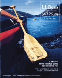 Bean also proves it’s a leader among catalogers with hundreds of new products, an iron-clad guarantee, and multiple ways to shop. Best-of-class marketing, photography, copy, and design guarantee it a spot on the winner’s stand.
Why it won a Gold Award
If L.L. Bean’s unique cover shot of a man canoeing in a lake doesn’t entice you to open its summer catalog, the headline proclaiming the company as “Your trusted guide for summer fun” probably will. Inside, the multichannel merchant lays out its promise to satisfy customers: Buyers can return any product at any time if they are less than 100% satisfied in any way. One judge commended Bean for calling out this guarantee in its opening spread, as well as for using the valuable real estate for a table of contents and Web callouts.
A call for stories from customers about trips they’ve taken with their L.L. Bean gear and apparel is certain to make shoppers feel like a vital part of the company, if not like a member of an exclusive club. Bean’s Outdoor Discovery Schools get a plug as well: “Whether you’re just starting out or looking to improve an existing skill, our programs make it easy to learn — with expert instructors in a relaxing environment.”
Lifestyle shots on nearly every page show the products in use. In one photo a mother demonstrates to her son the proper way to hold a canoe paddle; in another a man uses an LED headlamp to read a book after dark. Product call-outs near the photographs explain why L.L. Bean’s products are top of the line.
Several judges praised the cataloger’s product copy and headlines. By detailing the product specifications and key benefits, the copy not only provides reasons to buy but also reinforces the overall brand credibility.
Take this headline, for a Katadyn Exstream Water Purifier: “The only water bottle available today with a virus-removing purifier built in.” Or this snippet of copy, for the Teva Ricochet Pro Shoes: “Whether you’re exploring coves or hiking your favorite trail, the ventilated mesh upper of these amphibious shoes will keep your feet cool and comfortable. Wraparound webbing and quick-drying sock liner provide a secure fit. 360° drainage system lets water escape.”
Throughout the catalog, Bean leverages classic catalog layout and page flow to guide readers through each product category. “The catalog makes excellent use of pagination to take consumers through the categories — water to cycling to backpacking to camping to outerwear. Consumers can page through and buy all of their accessories,” said one of the panelists.
The judging panel also hailed the catalog for its airy design, which made the book easy to browse. “Great use of white space to isolate product attributes,” said one judge. Another summed up the creative in two words: “Very nice.”
Idea to steal
L.L. Bean includes “Tested in the Field” sections throughout the catalog to explain where and how it tested a particular product, such as its Buzz Off line of clothing with an insect shield built in. By making readers aware of Bean’s stringent focus on merchandise quality, the sections work to sell not only the products but also the brand as a whole. — HR
Creative directors: Don Oakes, Marcia Minter, Jim Hauptman
Copywriters: Chris Seid, Ming Linsley
Designer: Vivian Page
Photo/art director: Elise Plakke
Merchandiser: Stephen Whitworth
Photography: Steve Mason, Macomber Photography
Printer: Quebecor World
Color separator/prepress: Vertis
Cover paper: 60 lb., IP Velocity
Text paper: 38 lb., IP Advocate
Trim size: 8″ × 10″
Number of pages: 116
GOLD: PRINT CHANNEL
L.L. Bean | Outdoor, Winter 2005
In its winter Outdoor catalog, L.L. Bean reminds consumers that winter is about more than sipping hot chocolate by the fireplace. It’s also the season to bundle up in a warm fleece pullover, pull on a ski hat, and hit the slopes or don the snowshoes.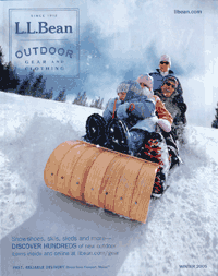 From the front cover — depicting a laughing family sledding down a hill covered with pristine snow — to the comprehensive product mix, L.L. Bean proves itself to be the outfitter for all your winter wonderland needs.
Why it won a Gold Award
There are many things that L.L. Bean does well, but perhaps the most notable is its iron-clad guarantee. Of the cataloger’s customer service and ease of ordering, one judge said, “Come on, it’s L.L. Bean. Of course they have all of these bases covered.” Indeed, Bean offers a branded Visa credit card, gift certificates, gift boxing, free alterations, international shipping, guidelines on choosing the correct size clothing, monogramming…the list goes on.
The catalog emphasizes that there is more to winter than just downhill skiing; it’s also about snowshoeing, Nordic walking, and camping. L.L. Bean comes through with apparel and gear for all these activities. “The book is well organized and is a resource for winter outdoor fun and activities,” noted a panelist.
L.L. Bean’s marketing goal of making winter fun was definitely accomplished, said one judge, adding that the action photography played a huge role in accomplishing that. Smiles abound in pictures of children and their parents clad in Bean gear and experiencing the great outdoors.
The company’s brand is reinforced unobtrusively at the bottom of each page with listings for its Website and 800-number. Bean further encourages cross-channel shopping by touting its Website throughout the catalog as a way to find a wider assortment of merchandise. For instance, “With hundreds of Thule products at your fingertips and the help of our interactive Fit Guide, outfitting your vehicle is fast and easy,” reads one blurb. What’s more, the URLs are category specific, sending customers to particular sections of the Website such as outerwear, outdoors, or gear.
Product copy goes well beyond the basic, providing extra information such as the best use and terrain for various types of snowshoes. And the introductory copy accompanying the item descriptions is consumer friendly and evocative, as in this example, introducing the Turtle Fur Superlight Accessories: “The ultimate layer for taking the edge off brisk winter air.”
“It’s hard to find fault with these guys,” said one panelist about L.L. Bean’s pagination. One page flows to the next without so much as a hiccup between a spread featuring ski luggage to a spread of winter camping gear. Add to that spreads that are neither too airy nor too cramped, and you’ve got yet another reason that Bean deserves to skate home with a Gold Award.
Idea to steal
If your product descriptions need to include myriad product details in order to sell effectively, you risk producing overwhelmingly dense copy blocks. L.L. Bean avoids that by using mini-snapshots to show some of these additional product details. For its Glad Gore-Tex Soft-Shell Jacket, for instance, Bean uses the copy block to tell consumers how the item will keep them dry even in a torrential downpour and displays small photos to showcase the jacket’s goggle pocket, removable snow skirt, and fleece lining. — HR
Creative directors: Don Oakes, Marcia Minter, Jim Hauptman
Copywriters: Chris Seid, Ming Linsley
Designer: Vivian Page
Photo/art director: Elise Plakke
Merchandiser: Stephen Whitworth
Photography: Steve Mason, Macomber Photography
Printer: Quebecor World
Color separator/prepress: Vertis
Cover paper: 60 lb., IP Velocity
Text paper: 38 lb., IP Advocate
Trim size: 8″ × 10″
Number of pages: 100
SILVER: PRINT CHANNEL
The Orvis Co. | Fly Fishing, Spring 2005
Zip. Shhh. Plop. That’s the sound of the fly reel on the front cover of Orvis’s spring Fly Fishing catalog.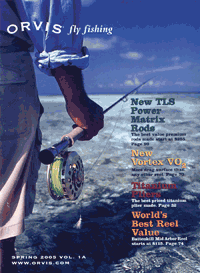 You can practically hear the sound of the water lapping and the fish biting in the striking photograph of a man scanning a flat for a bonefish in southern Belize. Orvis follows through on that image with solution-driven copy, glowing testimonials, and a rich product assortment.
Why it won a Silver Award
As a cataloger/retailer of outdoor sporting goods and apparel, Orvis knows how to deliver what its customers want. Judges were impressed with the catalog’s range of new and carry-over product geared to the serious angler. “Wow! What a great selection of merchandise. What else could you need? Luckily they have a table of contents to get you where you need to go,” one panelist said. The table guides customers from performance apparel to polarized sunglasses to waders to fly lines.
Orvis excels at presenting technical information in an interesting and easy to read way. The catalog brims with charts detailing rod specifications and what type of line to use for particular species of fish. There’s even the Orvis Flex Index (“For the first time in the history of fly-rod manufacturing, we can take a fly rod and compare it numerically and precisely to any other fly rod in terms of its action…”). Despite this wealth of information, however, the catalog is still easy to browse. “Each spread has personality,” said a judge. “It makes you want to linger with this catalog.”
And every judge was in agreement with the cataloger’s use of problem/solution boxes, in which the company’s experts resolve fly-fishing dilemmas. To the query “My old fly reel and line don’t sing like they used to,” Orvis recommended reel reconditioning and new line loading. Orvis just happens to offer such services, promising to overhaul equipment and return it ready in one week (during the off-season) or two weeks (during peak season).
By promoting this affordable service ($15.95 for basic cleaning and refurbishing) rather than trying to sell new equipment to resolve the issue, Orvis positions itself as a resource and helpmate rather than as merely another retailer. And by offering the service in the first place, Orvis also reinforces its credibility as an expert in the sport.
Why it didn’t win a Gold Award
The catalog includes customer testimonials praising Orvis’s service, but very little space in the book is dedicated to its service offerings themselves. The judges noted that Orvis does include a telephone number and e-mail address for technical questons, but they felt some of its other services, including its promise of “100% satisfaction guaranteed,” could have been promoted better. They also thought the lack of an order form was a mistake.
In addition, a few panelists pointed out that all the catalog’s technical information and quotes from experts could be intimidating for someone just starting in the sport. “Does it scare away novices?” one panelist wondered. Offering some editorial tailored to newbies could help. (In fact, Orvis does have a “Beginner’s Corner” on its Website, with articles such as “How to Successfully Sharpen a Hook.”) — HR
Creative/advertising director: Bill Eyre
Art director: Tim Achor-Hoch
Marketing director: John Rogers
Marketing managers: Jon Mori, Joan Nash
Merchandise directors: Mike Gawtry, Jim Lepage
Production director: Meg Cassin
Production manager: Victoria Woodruff
Customer service director: Angela Wolfe
Copywriters: Tom Murray; Eric Rickstad
Photo producer: Mary Allen
Photography: Macomber Photography
Printer/color separator: Quad/Graphics
List broker: Millard Group
Cover paper: 80 lb., #3 Escanable Encore
Text paper: 34 lb., #5 UPM Cote
Trim size: 7-15/16″ × 10-1/2″
Number of pages: 168
Syndicated/Co-op
GOLD: PRINT CHANNEL
Catalyst Communication | David’s World Cycle, 2005 Cycling Guide
Picturesque mountains rising above a line of fir trees are the backdrop for the front cover of the David’s World Cycle 2005 Cycling Guide catalog. Completing the picture are two cyclists riding in the foreground, while below the logo reads the tagline: “It’s All About The Experience.” At the bottom of the page, below the cyclists, another tagline reads: “Wherever You Ride, We Have The Bike For You.” All of which sums up the catalog, and the company, perfectly.
Why it won a Gold Award
This catalog draws in both avid cyclists and novices and never lets go. Merchandise coupons, advertisements for weeklong bike excursions, and cycling tips are among the elements that set this catalog apart. One sidebar, for example, discusses the pros and cons of aluminum, steel, titanium, and carbon fiber bike frames. Other topics covered in the tip sections include how to select a bike for a child and how to “pedal like the pros.”
“Excellent usage of cycling information to make David’s World Cycle a trusted expert,” a judge declared. “Interesting use of personalized coupons and even a letter to a senator recommending approval of bike-related legislation. All of the additional information makes the catalog useful as a cycling equipment guide and makes the company come across as a source for serious cyclists.”
A serious cycling catalog wouldn’t be complete without pictures of and references to seven-time Tour de France champion Lance Armstrong. “Saddle up with the #1 Name in Bikes” a headline on page 3 says, accompanied by a picture of Armstrong. The subhead reads: “Trek road bikes: Lance-level performance for everyone.” The catalog also includes photos of three-time Tour de France winner Greg LeMond. The references to these cycling celebrities solidify the catalog’s own credibility.
“There’s lots of information” in the book, noted a panelist, “but it’s easy to read and follow, thanks in part to the placement of the product-specific benefits near images.” Silhouettes of bicycles, for instance, are accompanied by captionlike call-outs such as “Shorter crankarms for better acceleration” and “Stable handling and more upright position for comfort and control.”
In summation, one judge stated: “Copy excellence, category ownership, product shots that are enticing — everything about this catalog leaves you wanting to buy.”
Idea to steal
On the inside front cover, next to a brief president’s letter and a few paragraphs detailing the benefits of buying from David’s, is a column entitled “Ask David’s World Cycle: Answers to common service questions.” There’s no “sell” in the answers — other than the soft sell of David’s expertise. — JT
Director/creative director: Leslie Bohm
Designers: Jason Poole, Scott Kronberg, Robb Deeter
Marketing director: Vanessa Curry
Print/production director: Theresa Regnier
Operations director: Gregg Thayer
Copywriter: Lee McCormack
Photography: Trek
Printer: Royle Printing
List manager: Kevin Stein
List broker: Jim Hall, Chilcutt
Cover paper: 80 lb., Influence gloss book
Text paper: 70 lb., Influence gloss book
Trim size: 9″ × 10-7/8″
Number of pages: 28
SILVER: PRINT CHANNEL
Catalyst Communication | Black Creek Outfitters, Outdoor Guide, Fall/Winter 2005
As it says on the catalog’s inside front cover, Black Creek Outfitters is “the First Coast’s premier outdoor store.” The bottom of the short greeting is signed by the owners, the Butler family — Helen, Joe Jr., and Joe Sr. This homey flavor runs throughout the catalog.
Why it won a Silver Award
Besides the family greeting, the inside cover touches on topics such as the staff’s knowledge of kayaking, hiking, and other outdoor activities; guaranteed special ordering (at no extra cost) of out-of-stock items; and a company history. It also mentions the company’s pledge of 1% of net sales to the Red Cross for hurricane relief and has snapshots of grinning staffers. “It’s a great page two,” enthused a judge.
The panelists thought that the mix of product copy and editorial features (tips on staying warm when engaging in winter sports, “Fun Foot Facts,” a listing of river conservation organizations, even a recipe for spicy hot chocolate) was solid as well. “Good use of supplemental information to a backpacking customer that is interested,” said one judge. “Great use of fun facts,” added another member of the panel.
Why it didn’t win a Gold Award
“The cover design is too institutional for this market,” contended a judge. Said another: “The front cover is average at best, and there’s no product featured on the back cover.”
The back cover featured virtually the only mention of Black Creek Outfitters’ phone number and URL. Even though the catalog’s primary purpose is to drive retail traffic, the judges felt that more cross-referencing of the Website in particular was in order, especially as the site includes such features as equipment checklists and events listings. — JT
Director/creative director: Leslie Bohm
Designers: Kristal Boni, Diane French
Print/production director: Theresa Regnier
Operations director: Gregg Thayer
Copywriter: Diane French
Photography: PatitucciPhoto, Jef Maion at Nomad’s Land, JupiterImages
Printer: Times Printing
List manager: Vanessa Curry
List broker: Jim Hall, Chilcutt
Cover paper: 80 lb., Influence #2
Text paper: 70 lb., Influence #2
Trim size: 9-1/4″ × 9-1/5″
Number of pages: 20
SILVER: WEB CHANNEL
Tessco | www.tessco.com
If you’re in the market for wireless products and solutions, the Website of Tessco Technologies is a good place to start. The home page of the Silver Award-winning site includes such categories as Network Infrastructure Equipment, Mobile Devices & Accessories, and Installation, Test, Equipment & Supplies, all of which are no doubt valuable to shoppers of wireless equipment.
Why it won a Silver Award
You may have to be a wireless technology guru to truly appreciate the Tessco site. For instance, if you need mobile antennas, transmission lines and cables, or calibration tools, you should be able to find them here. The navigation labels are technical, noted one judge, but “they probably make sense to Tessco’s customers.”
Same thing with the copy, which “contains bullets with highly technical language,” a panelist pointed out. For instance, the copy for a type of heat-shrink tubing states that “3M FP-301 is a heat shrinkable flexible polyolefin tubing that offers an outstanding balance of electrical, physical and chemical properties for a wide variety of industrial and military applications. Rated for 275°F (135°C) continuous operation. FP-301 tubing is typically used as a shrink-fit electrical insulation over cable splices and terminations. It is also used for lightweight wire harness covering, wire marking, wire bundling, component packaging and fire resistant covering….” While a layperson wouldn’t understand much of this, Tessco’s customers evidently do: The site boasts a high conversion rate that impressed the judging panel.
Onsite search provides relevant results and breaks them into categories. And with searches for popular categories, Tessco breaks down the results into subcategories, which is helpful, a judge said. Also, “the compare feature is nice,” said another.
Why it didn’t win a Gold Award
“Tessco is assuming that their customers know exactly what they want and don’t need any help deciding,” said one judge. “There is no merchandising on the site,” pointed out another. “The home page and category pages expose categories and don’t merchandise products, and product pages hide categories and don’t merchandise products. There are no cross-sells or upsells.”
And the ordering process is “incredibly confusing,” said a judge. “To add to their cart, customers need to click on an add button that triggers a JavaScript pop-up alert indicating that ‘the following SKU has been added to the worksheet.’” To then begin checkout, customers need to click on the “View worksheet” link. “The worksheet page is really the shopping cart, and the ‘confirm price’ link is analogous to ‘process to checkout,’” a judge said. — MD
Wholesale/Dealer
GOLD: PRINT CHANNEL
Jackson & Perkins | Roses for 2006
Some catalogs just have a knack for using beautiful photography and imagery to promote their offerings to the full effect. The Roses for 2006 book from Jackson & Perkins is one of them, with 68 pages of what one panelist called “absolutely glorious photography that appropriately dominates both the front and back covers.” Unlike some other horticultural books, Jackson & Perkins’s wholesale catalog uses full-bleed photos to display the merchandise in all its blooming glory. And while the stunning imagery encourages the reader to keep turning the pages, the understated page layouts and well-coordinated product labeling make it easy to identify the appropriate copy for each photo.
Why it won a Gold Award
The catalog provides retailers with what one panelist identified as “fresh and informative text,” giving these resellers the information they need to pass on to those who shop their stores. At the same time, the copy and creative enhance the information with a generous helping of romance.
The front cover is a prime example of this sort of romance: A black-and-white still of Ingrid Bergman and Gregory Peck from the film Spellbound is juxtaposed against a vividly hued Spellbound rose. Inside, evocative product copy appeals to the senses (“Radiant yellow-tinged orange blossoms in wave after wave of large, lemon-scented clusters” is a typical description).
Beneath each description, though, is an easy-to-read listing of key product specifications, including stem length, height, parentage, and fragrance. “With so much text and product to deal with,” said one judge, “I think the designer did an admiral job of pulling the reader through the catalog.”
Pretty is as pretty does, however, and Jackson & Perkins does plenty to show its commitment to the independent garden centers who are the core consitituency of this catalog. Its Ultimate Series, for instance, consists of rose varieties that it sells only to small resellers, not to big-box competitors. The catalog also promotes its complimentary point-of-purchase display materials. Little wonder that one judge declared Roses for 2006 “a very focused overall catalog marketing effort.”
Idea to steal
Catalog readers — whether they’re shopping for business or for pleasure — welcome quick reference features that enable them to find what they want in a jiffy. Jackson & Perkins includes a “Rose Index” page on the inside back cover, featuring an alphabetical list of each rose offered, its classification (such as climber, English, miniature), and the page number where it appears. — JF
Director: Estin B. Kiger
Designer: Mara
Creative directors: Neal Schuler, Dave Withers
Marketing director: Craig Wilson
Operations director: Charlie Anderson
Print/production director: Jack Kobinsky
Merchandiser/list manager: Greta Mikkelsen
Copywriter: Jill Thacker
Photography: Ron Anderson, Rob Rebman
Printer: CDS Publications
Color separator: Schawk
Cover paper: 80 lb., Pacesetter gloss cover
Text paper: 70 lb., Pacesetter gloss book
Trim size: 8-1/2″ × 11″
Number of pages: 68
Awards Finalists
PRINT CHANNEL FINALISTS
Business Apparel
Aramark, Fall Prospecting Guide, Vol. 837
Aramark, Spring Personalization Sale, Vol. A120
Galls Uniforms and Apparel, Fall/Winter 2005 (05W)
PremiumWear, Lifestyle Apparel and Accessories 2005
Sanmar Corp., Ladies Edition 2005
Business Specialty Products
FranklinCovey, Government Products 2005-2006
Galls, Buyer’s Guide 2005, Biggest Reference Book Ever, 05J
Wesco Distribution, Wesco Buyers Guide MRO Products, 1st Edition
Children’s Products
Learning Resources, Preschool Teacher Catalog, January 2005
One Step Ahead, Holiday Preview 2005
Computers, High-Tech Equipment, and Software
HPShopping.com, November 2005
Consumer Apparel
L.L. Bean, Guide to Winter Warmth, Winter 2005
The Orvis Co., Women’s Clothing, Summer Discoveries
Sundance Catalog Co., Holiday Core 2005, 1st Edition
The Territory Ahead, Fall 1
The Territory Ahead, Christmas 1
Vivre, Fall 2005
Consumer Specialty Products
The Orvis Co., The Dog Book, Holiday 2005 Patagonia, Winter 2005
Sundance Catalog Co., Holiday Jewelry & Gift 2005, 2nd Edition
Sundance Catalog Co., Spring 2 Jewelry 2005, 2nd Edition
Food
Scottish Gourmet USA, Holiday 2005, Premier Edition
See’s Candies, Mail Order, Holidays 2005
See’s Candies, Mail Order, Fall 2005
See’s Candies, Mail Order, Fall/Winter 2005
See’s Candies, Mail Order, Winter 2005
Gifts
Jackson & Perkins, Holiday Gift Inspirations 2005
L.L. Bean, Christmas Special 2, Christmas 2005
Musician’s Friend, Offstage Gift Catalog 2005, 511H
National Geographic, National Geographic Catalog, Holiday 2005
The Orvis Co., Gifts for Men, Holiday 2005
The Orvis Co., The Gift Book, Holiday 2005
Hardware, Tools, and Automotive Supplies
The Home Depot, The Home Depot Tool Book, Fall 2005
Home and Gardening Products
Army & Air Force Exchange, Home Decor, Fall 2005
Cuddledown, Last Minute Gift Ideas, Holiday 2005
The Orvis Co., Summer Home, May 2005
International
Europe by Net 2005 (UK)
New Pig Corp., The Big Pigalog (German)
The Orvis Co., Men’s Clothing, Christmas 2005 (UK)
The Orvis Co., Women’s Clothing, Late Summer 2005 (UK)
New Catalog
Schaul’s Signature Gourmet Foods, Winter/Spring 2005-2006
Office Supplies, Furniture, and Stationery
FranklinCovey, Fall, Be Proactive
Small Catalog
Promo Direct, 2005 Summer
River Street Sweets, Sweet Holiday
Entertaining, Holiday 2005
Scottish Gourmet USA, Holiday 2005
Premier Edition
Spin-off
Black Box Corp., Wireless, 2005
Smith+Noble, Preferred Customer Idea Book, Fall 2005
Wesco Distribution, Wesco Buyers Guide MRO Products, 1st Edition
Sporting Goods
The Orvis Co., The Hunting Book, Fall 2005
Syndicated/Co-op
Tessco Technologies, Wireless Products and Solutions Guide, Vol. 23
Wholesale/Dealer
Harmon Group, Stuller & Paspaley, South Sea Cultured Pearls, Book II Volume 51
WEB CHANNEL FINALISTS
Business Specialty Products
www.ada.org
www.diamondbacktactical.com
Computer and High-Tech Equipment
www.blackbox.com
Consumer Apparel
www.grapevinehill.com
www.orvis.com
www.starstruck.com
Consumer Specialty Products
www.countrywalkers.com
www.dvdempire.com
www.ferretstore.com
www.magellans.com
www.sheetmusicplus.com
Gifts
www.orvis.com
www.sfmusicbox.com
Home and Gardening Products
www.orvis.com
International
www.europebynet.com
New Web Merchant
www.uscondex.com
Sporting Goods
www.cabelas.com
www.mackspw.com
CROSS-CHANNEL FINALISTS
Business-to-Business
Diamondback Tactical Tessco Technologies
Consumer
Crutchfield Corp.; Europe by Net (UK); L.L. Bean; One Step Ahead; The Orvis Co.; Schaul’s Signature Gourmet Foods
For information about entering or judging next year’s MCM Awards, contact Heather Retzlaff at [email protected] or 203-358-4233