Punishing Mistakes with Rework
The end goal of any ecommerce site is to get the transaction and convert the visitor into a customer. But heaven forbid the visitor makes an error! Poor form and, specifically, error message and flow design cause frustration and abandonment. If fields are wiped clean due to one error on the form, chances are high the user will give up instead of filling out multiple fields all over again.
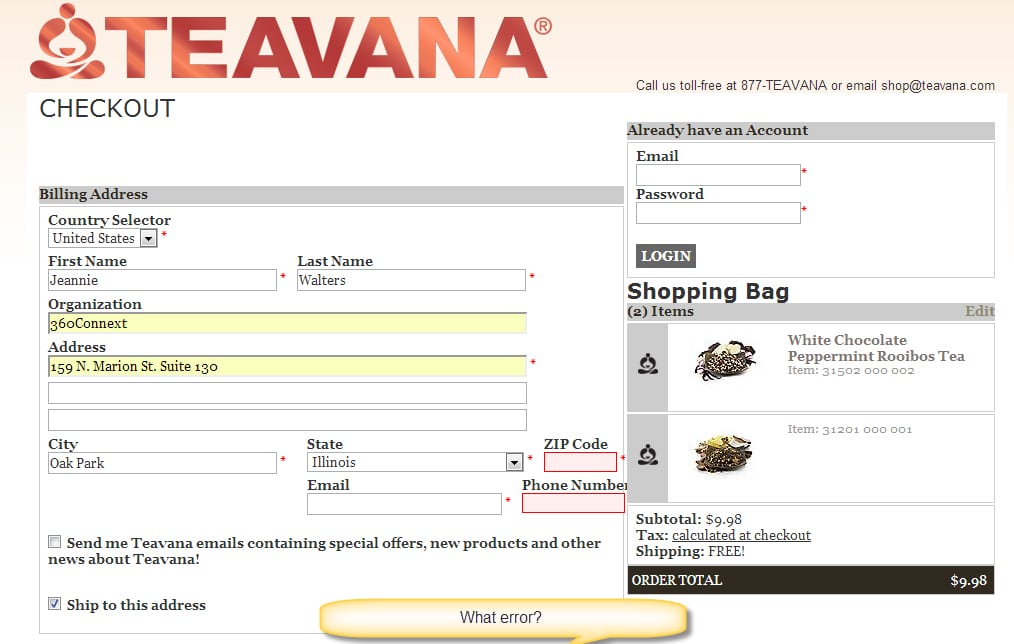
Error messages and direction are critical to the journey online, and yet often these scenarios are not tested with a human eye before rollout. Some sites are now automated the response to errors to the point of not explaining them to the user.
Recently, I tried to order some tea from Teavana and neglected to put in my zip code when ordering. Instead of offering a message or alert, the empty field was highlighted in a subtle red outline. I had thought the site wasn’t working! I decided to check via my phone, and this appears to be how it’s handled on their mobile site, too. It works better on the small screen because of how the field is presented. Otherwise, the user could get very lost and frustrated. It goes to show you why testing per device is so important.
![]()
![]()
![]()
![]()
![]()
![]()
![]()
![]()