Asking Too Much
Few things irritate more than extra steps. Considering how many users are now on teeny, tiny mobile screens now, making everything easier is essential. Date fields are usually within a specific range. When asking for dates or other finite numbers, using a dropdown field starting at 1900 is typically overkill and always inconsiderate.
Letting the user type in the last two years or even all four digits might be easier, especially if responsive design is enlisted. Thinking about the actual situation of how your customers are interacting with the site and how they might be doing it leads to cleaner, easier design.
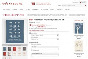
Red Envelope does a nice job explaining how to input the date fields in an open text field. As these dates might stretch back to the early 1900’s (now that’s a love story!) it’s simpler for users to just enter the dates according to the MM.DD.YY framework shown.
