
Website accessibility is a key part of offering a great user experience (credit: Markus Spiske on Unsplash)
According to the World Health Organization (WHO), more than one billion people live with some form of disability, one in four adults in the United States alone. Even if you ignore the increased lawsuits, ignore the new ADA laws requiring website accessibility, and ignore the boost in traffic you’ll see, it’s important your company is welcoming to all users. Marketers, this means you.
Unfortunately, working with developers to create an ADA-compliant website is not an easy task, even though these guidelines are established.
What are Website Accessibility Barriers?
Anything that blocks or restricts access to web content for someone with an impairment is a website accessibility barrier. There are five categories of disabilities that can hinder web access:
- Visual: This not only references the blind, but also those with color blindness, epilepsy, blurred vision, etc.
- Auditory: This includes sensory, conductive and mixed hearing loss
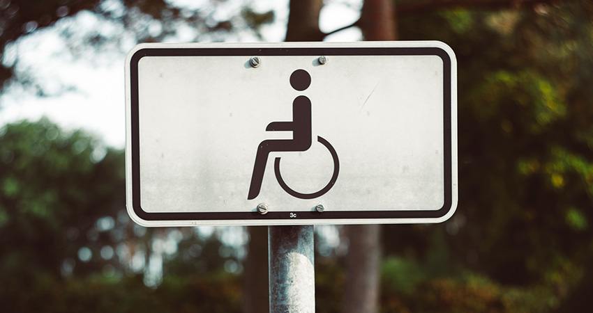
- Motor: The most common impairment is those who can’t use a mouse
- Cognitive: Ranges from mild to severe, which makes this the most forgotten roadblock for web developers
- Speech: Especially an issue if your website relies on voice activated technology
Understanding the limitations of each will help you form the foundation of ensuring you have an accessible website.
While the following list is not exhaustive, it lays down some of the most common barriers to website accessibility. Fortunately, many are easy fixes.
Elements That Aren’t Keyboard Accessible
Users with visual or fine motor impairments may not be able to use a mouse, so your site should be fully navigable by keyboard. For instance, the tab key is used to logically move the visitor from one section to another. Most blind people rely on screen readers to consume online information—an assistive technology that doesn’t use a mouse.
Images Without Appropriate Alt Texts
Making a website accessible doesn’t require you to forgo images; it merely requires site designers or editors to be mindful of the alt tags they assign to them. Alt tags or alt texts are short descriptions that convey the essence of an image to visually impaired web users. It is important that alt text is crisp, concise and accurate.
Another good practice is to make sure that your image caption is different from the alt text. Otherwise, the user will end up hearing the same information twice. It is also best to avoid displaying important information as an image, for instance, a home button that’s an image of a house.
Multimedia Without Subtitles or Transcripts
Just like images, videos can also be a significant accessibility barrier for many. People that are hard of hearing will not be able to comprehend the context without necessary assistance. This can include subtitles, transcripts and audio descriptions. What’s great is that software has automated the captioning process, thus making it easier to kick this barrier to the curb.
Poorly Structured Pages
A well-structured page will use different types of headings (H1, H2, H3, etc.) to accurately display the relationship between different areas of content. For users that can’t rely on vision-dependent cues, this is extremely important.
Web users with visual impairments rarely read everything on a page. Instead, they use a screen reader to scan for headings and pick what they’re looking for. This is why one must avoid using headings for decorative purposes, and utilize them in the correct, descending manner.
Small Text
Text that’s too tiny to read can be a major obstacle for people with visual impairments, so they should be able to magnify it easily. It’s important that when they do this, your website’s design and layout don’t break.
Additionally, it should be possible to display the text across device types (desktop, tablet, smart phone, smart watch, etc.).
Small Clickable Areas
Hyperlinks are one of the main elements of websites, making easy navigation possible. However, in the case of small click ranges, people with mobility disabilities may find it challenging to access a link. Increasing the size of these buttons can solve this hurdle, and will keep users from playing dart with their mouse.
Low Color Contrast
According to research from IRIS, there are almost 300 million people that struggle with color blindness. If colors on your website are not used with caution, these users could face difficulties differentiating between various elements. Thus, it is best to use proper color contrast between text and backgrounds. It is also advised to avoid clubbing shades of green and red since most colorblind people suffer from red/green color deficiency.
Timeouts
A number of online forms or login pages incorporate a time limit for security purposes. However, this can leave users depending on keyboards with insufficient time to complete a task. To combat this hurdle, work with designers to create form pages that allows users to seek more time whenever necessary.
Final Thoughts
There are many reasons to make your website accessible, but unfortunately many business owners and designers will try to cut corners here, usually because they don’t understand it. Consider having your team educate themselves first by monitoring accessiBe’s twitter feed and W3C News. In the end, advocating for some of these changes can not only save your company from the potential threat of lawsuits, but also help build a positive brand image and boost inclusivity on a societal level.
Web accessibility barriers can be easily tackled with a little bit of mindfulness. A key point to remember is that it’s best to do so in the earliest stages of website design and development – much easier than doing so down the road.
Amanda DiSilvestro is the editor-in-chief at Plan, Write, GO