INTERNATIONAL CURRENCY
As “America’s premium coin catalog,” International Currency aims to lose money. That is, the company hopes to sell rare coins, from Morgan silver dollars to gold Mexican pesos, to collectors and gift buyers. But is its print catalog a sterling effort or more like a wooden nickel?
Our reviewers this month — Chris Carrington, president of King of Prussia, PA-based consultancy Catalogs By Lorel, and Mark Gilchrist, principal of Madison, CT-based design agency Bulldog Studios — gave this 28-page edition a thorough appraisal; here’s their assessment.
CHRIS CARRINGTON
It’s obvious that International Currency spends some real money on its catalog. The format is oversized and the paper stock is heavy and glossy, giving the piece a feeling of substance. And the product photography is generally good, with crisp, sharp details that create desire.
The company effectively conveys its credibility through the opening letter, which has a trustworthy, authoritative feel. And the selling copy is well written, providing enough information to explain the products.
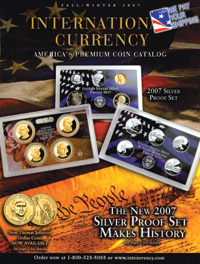
That said, International Currency’s catalog has room for improvement in several areas. For starters, it needs to simplify the catalog cover. It should feature one great product and highlight the free shipping offer without covering up the logo. Catalogers shouldn’t allocate the cover and page two to the same product — this real estate is too valuable.
International Currency should also invest in a logo, as the current logo just looks like a font. A professionally designed logo will help create a branded look, both in the catalog and on the Website.
Next I would reorganize the table of contents. It’s a good idea to create color-coded sections of interest within the book. International Currency might consider giving each category its own color story and page structure to improve pacing and shopability.
A good way to reinforce the catalog’s credibility would be to introduce the founder/president and include his picture. Portray him as a top-notch authority in this industry. Give the catalog his voice by sprinkling “insider” tips and recommendations from him throughout the book.
International Currency could also stand to make it easier to find gift merchandise. For example, it might appeal to gift shoppers and women by grouping like merchandise together; or, it could consider giving the jewelry a softer, more feminine treatment.
Also, the catalog’s design is overwhelmingly American. It should support the “International” identity by incorporating exotic photo backgrounds that relate to the products from other countries and grouping these products together in their own sections.
Keeping the number of typefaces and point sizes to a minimum would help clean up the presentation. The leading should also be tightened up, and long line-lists put on the Internet rather than in the catalog.
Each spread should tell a cohesive story, so the catalog should be designed by spread. This means background colors and styling must be consistent to hold spreads together. Well-written headline copy will set the stage for each spread or category intro page, while consistent color stories and cleaner background treatments will allow the product to jump off the page.
Limiting grid templates would also help keep the presentation fresh. International Currency should develop three or four page templates and pace them consistently throughout the catalog. The current grids look haphazard — as if each page were a design unto itself. Remember, the catalog must work as a whole to keep shoppers interested in turning pages.
The cataloger has an opportunity to exploit the collector mentality by suggesting add-ons that make logical sense and create desire. It could price add-ons strategically, making the leap to buying a little something extra easy.
While the format and paper are impressive, it’s expensive to produce such catalog. And if web printing, this format is inefficient. I strongly recommend testing a lower quality of paper.
To get noticed by novice numismatists, International Currency should consider a special outer wrap for the catalog aimed specifically at prospects. This, combined with a landing page on the Website for novice collectors, would provide a powerful road map to help potential hobbyists get started.
This “campaign of engagement” could include a special offer and a starter kit. Once a prospect has been converted to a customer, International Currency can suggest what to purchase to improve his or her collection.
To be enticing and engaging is important, but it’s also vital to retain existing customers. This means International Currency will have to strike a balance between the tried-and-true old style and a fresher, cleaner look that will appeal to new shoppers.
Updating the design and shopping environment, educating with authority, and leading shoppers on a well-crafted “treasure hunt” for collectible currency should keep International Currency in the money through today’s tough economic times — and for a long time to come.
MARK GILCHRIST
Collecting coins is all about the passion one feels when admiring a coin’s exquisite details, appreciating the rich history behind the raised image, or experiencing the sheer joy of owning something unique and, oftentimes, rare that can be passed down from one generation to the next. International Currency is missing a number of key opportunities to connect with its customers by evoking this passion for collecting.
The front cover and page 2 are two examples of those missed opportunities. The front cover states that this is a Fall/Winter catalog. What better way to spread the joy of collecting coins than to gift a child or grandchild with his or her own special set of coins for the holidays? This should be stated this on the front cover and on the inside.
Another cover suggestion is to promote how many new products are available, since the catalog is sent only to existing customers. Get them excited about new product offerings and encourage them to open the catalog right away. Then once inside, highlight the new coins by telling their stories and showcasing the artisans.
The front cover also exclaims “The New 2007 Silver Proof Set Makes History. See page 2 for details.” Yet when you turn the page, you see the new 2007 silver proof set taking up only a third of the page, and not really differentiated in any way from the other products on the spread.
At first glance, it is not even apparent what makes this set historic. Then, upon reading the very understated subhead, you discover that this is the “largest proof set ever.”
This would have been an opportunity to create a hero on the spread by allocating more space to the product, highlighting some of the coins’ details, discussing the significance of the set, and using a benefit-oriented headline to generate excitement and interest. And why not mention that this would be a perfect gift for an aspiring collector?
The rest of the spread is a mix of unrelated products, an approach that is often used to whet the interest of the reader as to what lies ahead. But this mix of merchandise is continued throughout the catalog, so the customer has nowhere to focus.
A more-thought-out pagination, perhaps with a theme per spread, would lessen the overwhelmed feeling you get when looking through so many different, yet similar, products. More white space and a better use of heroes throughout the book, not just on spread 2-3, would also improve the book’s readability.
And while I’m all for breaking the rules when there’s good reason, I found the choice to place the left-hand page numbers in the gutter of the book instead of to the outside of the page to be unnecessary and disorienting.
While the design of the book often misses the mark when it comes to evoking the customers’ love of collecting, the copy does connect with the audience. Woven throughout is a history of the coins and an appreciation of the artistry inherent in them.
You get the feeling that the copywriter has personally looked at, held and researched the coins, successfully grabbing the readers’ attention and making them want to add to their collections.
The catalog professes a strong belief in customer service, and the friendly opening letter gets the catalog off to a good start. But it could do a lot more.
I recommend a simple “for any questions, or for more information, please call” interspersed throughout the catalog. Let the audience know that they are welcome to call to discuss a question about a particular coin; think that the person on the other end of the line is there strictly to take orders.
Many of the products run in the hundreds of dollars, with some in the thousands. Before making such a huge investment, many customers will want to talk to a representative. If the customer service representatives are coin collectors themselves, all the better — and if so, play this up in the catalog!
And while the return policy is very strong, it is only mentioned once — in the P.S. of the letter. Repeating it wherever possible, perhaps on the back cover and the order form, would further emphasize International Currency’s commitment to customer service.