GOLD: Print Channel
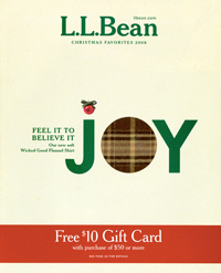
L.L. Bean, Christmas Favorites 2008
One word on the cover of this L.L. Bean holiday edition sums up this catalog: Joy. Better still, the “o” in joy is a die-cut circle that exposes a fabric swatch of Bean’s “Wicked Good” flannel shirt.
WHY IT WON A GOLD AWARD: The use of the fabric sample visible and touchable through the front cover is a differentiating factor, said one judge. Bean has been using the fabric sample for a few years, and it’s always a crowd pleaser.
“The cutout is an exceptional use of the ‘missing’ tactile element catalogs struggle with,” said a member of the panel.
Inside, the book’s product selection is familiar to the broadest audience, pointed out one panelist. “There is plenty of product for self-buying and gift-giving, appropriate to the season in a variety of locations.”
IDEA TO STEAL: Make your back cover work as hard as the front. This particular back cover, which promotes Bean’s fleece-lined hoodie jackets, “does a nice job of showing representative price points and repeating the offer,” said one judge. — MD
Director: Don Oakes
Designers: Erica Eysenbach, Andrea Kolpack
Creative directors: Jenna Klein Jonsson, Marcia Minter
Marketing director: Nancy Dynan-Fischman
Print/production director: Jason Kendeigh
Copywriter: Leslie Gomes
Copy manager: Craig Fessler
Art directors: Betty Fuller, Greg Gorman
Printer/color separator/prepress provider: Quad Graphics
List broker: Millard Group
Next Page: L.L. Bean
SILVER: Print Channel
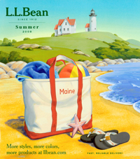
L.L. Bean, Summer 2008
If it’s something you’d need to be comfortable at home or outdoors in the summer, it’s here in this L.L. Bean summer catalog. “The merchandising is exquisite,” said one judge about the catalog. “A very well-executed overall assortment.”
WHY IT WON A SILVER AWARD: The front cover illustration of Bean’s signature canvas tote bag on the beach “screams warm summer day at the beach,” said one panelist. The artwork — as opposed to photography — “allows creative interpretation of the key elements of sun, sand, ocean and green grass, highlighted with key products,” said another judge.
One panelist cited the progression of merchandising as a strong point. “Spreads have a nice balance of related clothes,” the judge said, and the clear, descriptive copy tells a story “without going over the top.” What’s more, “the fonts are legible throughout.”
WHY IT DIDN’T WIN A GOLD AWARD: The judging panel had some minor quibbles with this book. The front cover lacks an inside page reference, for instance, and one panelist expected to see more actual gear for the season, such as boats or bikes. — MD
Director: Don Oakes
Designers: Erica Eysenbach, Andrea Kolpack
Creative directors: Jenna Klein Jonsson, Marcia Minter
Marketing director: Nancy Dynan-Fischman
Print/production director: Jason Kendeigh
Copywriter: Leslie Gomes
Copy manager: Craig Fessler
Art directors: Betty Fuller, Greg Gorman
Printer/color separator/prepress provider: Quad Graphics
List broker: Millard Group