
SILVER: Print Channel
Specialty Catalog Corp., Especially Yours, Fall 2008
Especially Yours has “the looks to be seen in now!” according to its tagline. This merchant of wigs, hairpieces and fashion apparel for black women also now has a Silver Award, thanks to this winning edition.
WHY IT WON A SILVER AWARD: The catalog does a great job of selling the two offers: wigs/hair and apparel, said one judge. The panelist also praised the “effective use of celebrity (singer Patti LaBelle) to introduce a collection; showing her in the various styles on the top border drives home the point.”
The catalog’s back cover clearly illustrates the other top merchandise offerings. Another judge cited the functional copy and the effective order form as strong points. “There’s lots of information on the form, and it encourages Website use for more assistance.”
WHY IT DIDN’T WIN A GOLD AWARD: Especially Yours could use a layout that guides the customer through the sale, according to one judge. “And the copy could be developed to reinforce the brand, tell more about the product and close the sale.” — JT
Designer: Julie Connor
Creative director: Gilda Horgan
Marketing director: Joan Abrams
Print/production director: Patty Phelps
Merchandiser: Colleen Cheney
Copywriter: Michelle Hardy
Printer: R.R. Donnelley
List manager/broker: Direct Media
Next Page: Vitacost.com

SILVER: Print Channel
Vitacost.com, Fall 2008
Vitamins and supplements aren’t the easiest products to sell in a catalog. But Vitacost.com deftly takes on the challenge and emerges victorious with a Silver Award.
WHY IT WON A SILVER AWARD: This isn’t the prettiest catalog the judges have ever seen. But as one panelist said, Vitacost “accurately targets its audience; the range of products gives credibility and authority.”
The cataloger sells a lot of product on each page, “but with good reference and organization,” said a panelist. It also helps that copy is “clear and helpful,” noted another.
The book offers a broad range of merchandise — vitamins, supplements and over-the-counter products, including its own Nutraceutical Sciences Institute (NSI) brand — that’s presented in an organized, easy-to-use manner.
WHY IT DIDN’T WIN A GOLD AWARD: “The front cover could do a better job reinforcing its brand positioning,” said one judge. The back cover is actually more effective in that “it reveals not only excellent pricing on a variety of products, but those products are also the private label brand.” — JT
Next Page: Ebags.com

GOLD: Web Channel
Ebags.com
You might think that a site selling more than 40,000 bags would be difficult and annoying to shop from. But that’s never the case with Ebags.com. The merchant has some of the most informative product pages in the e-commerce industry.
WHY IT WON A GOLD AWARD: The results speak for themselves — 1.6 million reviews and tons of video testimonials and product info. When one judge searched for a product, “It was clear and concise, and the guided choices and narrowing functions are particularly helpful for drilling down to a more precise item.”
The site loads quickly, which is a testament when you consider its more than 550 brands and 42,000 products. Despite the girth, Ebags.com is easy to browse, and merchandise search results are relevant. Recommendations and reviews are provided and can be located with ease; big buttons make it easy to add items to the cart and checkout.
IDEA TO STEAL: Customer reviews help sell product. Ebags.com’s copy seems to be generated from the manufacturers, so it depends on user-generated content from customer reviews to round up the product descriptions. — TP
Creative director: Peter Cobb
Marketing director: Jon Mellen
Webmaster: Dan Werling
Website designer: Jason Carncross
Merchandiser: Nancy Behrendt
Photographer/illustrator: Casey Brown
Next Page: Sheetmusicplus.com
Consumer Specialty Products
SILVER: Web Channel
Sheetmusicplus.com
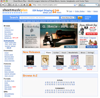
With more than 545,000 sheet music titles, SheetMusicPlus.com caters not only to the middle-school band director and the church organist, but to everyone from the 13-year-old Hannah Montana fan to the hard-rock guitar shredder.
WHY IT WON A SILVER AWARD: SheetMusicPlus.com has done a good job of dealing with a huge number of SKUs. The site is quick-loading and easy to navigate, reviews are easily found, and the large add-to-cart buttons scream for the sale.
Judges say the investments in multicurrency functionality (SheetMusicPlus.com has customers in 120 countries) and the subsites for teachers are terrific. The addition of audio clips is also a wonderful help in making a purchase decision.
“Overall, this is a good site for a specialty category,” a judge said. “They mark high for assortment, usability and site search.”
WHY IT DIDN’T WIN A GOLD AWARD: SheetMusicPlus.com needs to improve the left-hand navigation. It also uses a tiny type size that makes it hard for the consumer to click, though return judges have noticed an improvement here. — TP
Creative director/marketing director: Jennifer Silver
Webmaster: Phil Pitner
Website designers: Mary Brodie, Jennifer Silva
Search engine marketing: Marin Software
Merchandiser/copywriter: Amy Hopson
Photographer/illustrator: Darren Wong
Catalog: Anne Madsen
Next Page: Stewmac.com
SILVER: Web Channel
Stewmac.com
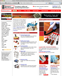
Talk about a tight niche: Stewart-MacDonald sells everything you could think of to build and repair string instruments. It’s not just violin knobs and guitar necks, but also books and videos on how to get the job done right.
WHY IT WON A SILVER AWARD: StewMac.com is a fast, clean, intuitive e-commerce site that offers the user clear branding and customer service attributes. The judges noted that Stewart-MacDonald understands its business and target market. It speaks to professionals as well as newbies, with short blocks of product detail copy that is easy for even the novice to understand.
But certain products show expanded content and instruction, which is quite useful to this audience. The company relays a strong customer service pledge throughout the site.
WHY IT DIDN’T WIN A GOLD AWARD: The site needs a more aggressive cross-sell and upsell functionality. “As it is now, I have to click on the ‘related items’ tab on the product page to see any suggested items,” said a judge. “Conversions and AOV would likely go up if these were more prominent.” — TP
Creative director: Tom Erlewine
Marketing director: Mark Hyatt
Webmaster: Mike Lindskold
Website designer: Summer Blevins
Search engine marketing: Kim Painley
Merchandiser: Jay Hostetler
Copywriter: Mike Watson
Photographer/illustrator: Suzanne Burkey
