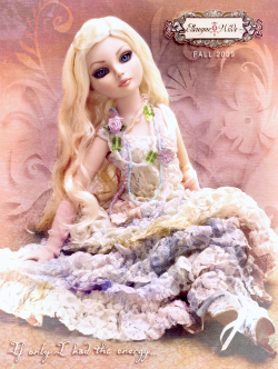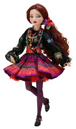
Wilde Imagination sells dolls, including the stylish Ellowyne Wilde and the gothic Ellowyne Ghastly. The dolls, which retail for about $139, are unusual and so is the catalog. Critiquers Mary Ann Kleinfelter, a catalog consultant based in Milford, NH, and Rob Palowitz, president/chief marketing officer of PALO Creative, an agency in Leetonia, OH, reviewed the Fall 2009 edition of the 32-page Ellowyne Wilde title. Here’s what they had to say.
MARY ANN KLEINFELTER
The front cover of the Wilde Imagination catalog, which depicts the Ellowyne Wilde doll, is pretty and wistful. Still, it’s not exactly clear what is for sale inside. I’d suggest adding a line that promotes the company’s high-quality, handmade dolls and their outfits and accessories.
There is no offer on the front cover to encourage the recipient to open the catalog. The single line of copy is, “If only I had the energy…” It’s not clear what this means! Worse yet, there is no company contact information.
The back cover shows a different, dark, gothic doll — Ellowyne Ghastly. Once again, there is no mention of what is inside or an offer to get the recipient to open the catalog. At least the back cover provides company contact information.
But the photo and background are so dark that it’s hard to see the attic armoire and the price of the doll — and that it’s a limited edition. The darkness of the back cover, the lightness of the front cover, and the differences in the products make this seem like two separate catalogs.
The opening spread continues to discuss — and define — ennui. That’s okay to set a mood and tone, but readers might want to see information about Wilde and the doll designer, not to mention some selling copy as to why they might want to purchase.
There is generally not enough information. For example, a product on page 6 includes a logo indicating that it’s a “doll of the year” winner. But the logo is tiny and hard to see. The award should also be better explained.
Along the same lines, the next page offers a Tonner 2009 Convention exclusive product with limited quantities available. What is this? Should it be larger and given more importance?
Wilde Imagination needs to take care to limit the variety of typefaces so that the catalog is easier to read. The cataloger also needs to avoid putting dark copy and products against dark backgrounds.
The trueness of the color is questionable in some places. For example, the copy for Baroque N Dreams says the doll has brown hair and green eyes; in the photo, however, the dolls seem to have black hair and blue eyes.
More important, the copy in this catalog is just too short overall. There is no selling, no sizes, no information about what these products made of, no indication whether they handmade or not, etc.
Pages 16 through 21 sell outfits for the dolls. The words “outfit only” on the products should be much larger. Then the catalog sells accessories on pages 22 through 25, and the Evangeline Ghastly products on pages 26 through 32. This book is complex and needs a simple table of contents on the opening spread.
In fact, when Evangeline Ghastly shows up, the catalog pages become rotated into a non-traditional orientation. There is no clear reason for or benefit from this change.
I recommend that the cataloger put the pages back into a traditional orientation and remove the dark background, so the recipient can more easily read the type. The lighter background will emphasize the dark products.
There is an order form that stands out in the middle of the catalog. It’s helpful, but needs to provide more product and service offerings, such as the Doll Hospital and the story of the founder.
Overall, this catalog needs more products in order for it to reach a wider audience; perhaps simply showing more products would help.
For example, the catalog mentions doll stands. Are there different doll stands? Are Wilde Imagination’s doll stands better than others? Why?
The biggest challenge for this catalog is to make it clearer who the audience is. If the target audience consists of doll collectors, the comments from collectors on page 23 should be at the front of the catalog.
Wilde Imagination might consider adding similar copy throughout the catalog to appeal to this audience. Copy should make it clear that this book is for collectors and include the WIIFM (what’s in it for me), or why they should buy.
ROB PALOWITZ
The Ellowyne Wilde doll collection appears to be targeted to a specific demographic profile — a doll collector, someone who appreciates fashion, or a maybe even a fan of an anime world.
One of the first items I saw on the front cover was a logo that is somewhat complex and hard to read, but appears to match the artistic feel of the product.
The next thing I noticed was a line of text at the bottom, “If only I had the energy …” That was surprising — it doesn’t exactly motivate the recipient to buy.
The back cover, I thought, looks like an ad for a Tim Burton movie. It is confusing as well, since there is a different logo and name of a company listed there.
I do commend Wilde Imagination for using the back cover properly, though. It is good use in the sense that it is revealing a “new” product, one with a higher price point than the standard product line inside.
The back cover is usually a good spot for that type of approach — to maximize exposure of something that is new or a great seller. And the catalog does have some sort of contact information on the back cover, which helps foster communication efforts from someone who may not be familiar with the brand or who may be a prospect.
The page 2/3 inside spread shows that the dolls are unique and larger in size than other brands. The creative treatment truly illustrates the fashion flair that these dolls have, as well as the designer influence from the creator, Robert Tonner.
What is interesting is the approach of making the dolls seem to be tangible, living people. Poems and stories of being at the “therapist” or talking about her life makes it seem like Ellowyne Wilde is a real, modern-day young woman — all dressed up with no place to go.
The inside back cover spread is a little detached from the rest of the catalog. It actually switches formatting and goes from being a portrait type layout to a landscape type layout.
I had to flip back a few pages to understand why. I believe Wilde Imagination wanted to make it a different layout to really showcase the new product line.
Continue on Page 2

I understand that, but I’m not certain it was necessary to take that approach. The catalog could have simply used that background and different font treatment with the existing page format. The current approach forces folks to page backwards into the catalog to see where that starts.
The detail in these dolls and their accessories seems to be topnotch, and the craftsmanship looks tremendous. The drama that is wrapped around some of the photos of these products is really something special.
The page 8/9 spread is one example — I am not crazy about the variety of colors on this spread, but I thought the photography stylization was pretty tight. It looks like you’re watching a photo shoot for designer-brand evening wear or a fashion show in New York. I can almost hear the fast techno music playing in my head!
I applaud the middle spread inclusion of a separate order form. It breaks up the catalog and provides another location to pull a buyer’s attention to another product line or new item, or to merchandise a product with a great margin.
I like the two-page spread approach to merchandise all the accessory items and the trunk itself. It illustrates all the products in a legible fashion that makes it easy to navigate by way of the alphabet.
The spread calls attention with description names, stock numbers and pricing. In a few places, “savings” are called out with a more bolded font. Also, this was a good spot for the cataloger to include customer service contact information, as well as for comments from collectors.
The next spread continues the theme with the accessory items that go together with the previous spread. It also ends the portrait landscape layout format and acts as a transition from the Ellowyne products to the Evangeline Ghastly line.
Overall, I would narrow down the color palette a wee bit more, to prevent the catalog from feeling like a circus advertisement. I would also change the headline font. You can still get that fashion, gothic feel with a more legible font treatment.
And I would do away with the forced justification of type in some locations. It breaks up sentences in a weird way with large spaces that end up looking like typos.
I can appreciate the artistic ingenuity, but this isn’t really a traditional catalog — the catalog sort of matches the dolls in that way. Wilde Imagination wants to grab its buyers and prospects and get them into the story of the dolls, the fashion and the uniqueness of the product.
The use of the sketches with most of the dolls makes the catalog interesting to look at as well. It makes you feel as if the founder wants the buyer to understand where the product style comes from and the creative aspect of it. Wilde Imagination really wants the buyers to connect with each and every doll in their own way. That’s an uncommon approach in today’s marketplace.
