ALLERGYBUYERSCLUB.COM
Spring is finally here, and for many people that means allergies are in full bloom. That’s bad news for the sufferers, good news for the AllergyBuyersClub.com catalog.
The merchant, which sells products such as air purifiers, vacuum cleaners, steam cleaners, dehumidifiers, bedding and other allergy relief merchandise, gamely stepped up for a critique. Reviewers Jeff Haggin, CEO/president of Haggin Marketing in Mill Valley, CA, and Bill Licata, president of LCH Direct in Santa Fe, looked over AllergyBuyersClub.com Winter 2008/2009 edition. Here’s what they had to say.
JEFF HAGGIN
Achoo! If you have allergies or know someone who does, the AllergyBuyersClub.com catalog is here to scratch that niche. Could the cataloger be more effective? Yes. Here’s where I see some room for improvement.
First off, there are too many choices in all categories in the AllergyBuyersClub.com catalog. Catalogs do well when they edit and recommend the best item in a category.
Or, if there are several items in a given category worth offering, smart merchants deploy a good/better/best strategy, or in other ways convey compare-and-contrast points to differentiate and accent key benefits and make shopping easy and clear. Not so here.
The catalog opens with seven pages of air purifiers of different sizes and shapes and colors, all competing for the allergy-sufferer’s dollar. The work required to wade through the assortment — even by a sneezing, suffering, motivated prospect — is daunting at best.
An air purifier shopping guide would help. A chart at the beginning of this section could provide various selection criteria and help the reader narrow his or her choices based on benefits and features that matter.
This catalog needs some set-up. Why buy from AllergyBuyersClub.com? Because the merchant stocks the highest quality products from the best brands? Does it have more choices than anybody else? The best service?
And by the way, is it a club? Are there benefits to being in the club? Does it cost something to join the club? What club? I found no explanation or reference to the “club” except in the name.
Interestingly, all products offered (except for accessories and add-ons, replacement filters and such) in the AllergyBuyersClub.com catalog are rated. Five stars is the best.
In the middle of the catalog, on page 25, the rating system is demystified: The staff rates the products. Approximately 90% of the items receive a four-star or higher rating. And 10% receive a three-star rating (nothing lower). Is this rating system helpful? To one skeptical critic, it smacks of subjectivity.
The catalog does achieve a strong page-unit hero product presentation treatment with the ratings system “category winner” designation. I imagine this is its saving grace, driving focus and sales in these key items.
A graphic icon conveys the award, and back on page 25 copy explains, “Sometimes a product stands out in its category.” Why? According to whom? Credibility is key, but where are the credentials?
To the point, the idea of using ratings can work, with either an advisory board comprising doctors, allergists and other professionals; or the purity of the populace in the aggregate (unadulterated customer ratings).
As for its message and voice, the AllergyBuyersClub.com catalog presents a workmanlike creative and production solution. It is dated, but it is what we expect as die-hard catalog shoppers, and we know how to navigate it.
Still-life photos are shot in situ. Overpropped but flatly lit, they show the product adequately. Most of these products are not purchased for aesthetic reasons, however, so the reader must be engaged.
But the copy is also workmanlike — it does the job, but puts out little to really help the cause. This catalog proposition is perfect for a problem-solution format, but it’s not here. These merchants and marketers need to get deeper and build credibility!
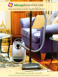
The catalog’s cover depicts a full-bleed image of a $1,200 vacuum cleaner. The pleasing, Pottery Barn-esque photo includes signature dappled, natural light, a sofa, Persian rug, cedar wood floors.
What’s the problem? The exact same image is presented on page 3, full bleed, with the requisite block of copy appended.
This is a sin, despite the co-op dollars the vacuum cleaner manufacturer, Miele, may be providing behind the scenes. First, the price point is off-putting, and no doubt a deterrent to sales. It establishes a first impression of “expensive.”
Second, a double impression of this product? The same image on the cover and the next right-hand page, same size? It’s not that good.
More important, it delivers no more information about the product to help a consumer make a more informed decision to buy. There are great product features and opportunities galore to communicate — differentiators, benefits, features — but none of that is done.
Oh, and where’s the offer? Is there any urgency, special price, promotion — any reason to pay attention here?
Good intentions win. This catalog lacks consistency in the way it delivers testimonials, promos and product call-outs. Even though there are at least five different ways that testimonials are visually articulated, at least Allergy Buyers Club.com is trying.
The articulation needs work, but the opportunity is real. Pass the Kleenex, please.
BILL LICATA
The AllergyBuyersClub.com catalog does a lot right
The photography is attractive, specific product testimonials are effective, and free shipping on many items is a nice incentive. Most important, the company has positioned itself as an expert in the field through its testing program, rating system, and category winners, and by assigning a personal “product expert” to each catalog recipient.
Continue on Page 2
But the catalog has several opportunities to make the book easier to use and to improve response and profits. It all begins with organization and catalog flow, which are now confusing, and often fail to position bestsellers in the catalog “hot spots.”
Since the back cover contains the mailing address and is usually left face up in the mailbox, it is the first impression one gets of the catalog and can be the strongest selling page. Unfortunately, this back cover uses only slightly more than a third of the page to sell a single product — a new tabletop room air sanitizer. With a rating of only three and a half stars, this is not the best choice to introduce this catalog.
A proven bestseller or category winner with a top rating of five stars would be more effective. Better yet, adding more selling space and another product or two to both improve sales and to introduce a second or even third product category would make more efficient use of the strong sales potential of the back cover.
The address area (which will have to move to the top in the next catalog to meet new postal regulations) mentions that the catalog is printed with environmentally friendly ink and reminds people to recycle it when done — both good for image and marketing purposes.
Moreover, the inkjet message introduces “David” as my assigned product expert, provides his phone extension, and offers free shipping on orders over $150. These are strong sales messages, but unfortunately they are buried in the inkjet and are easy to overlook. The back cover will work a lot harder if these messages are also printed prominently elsewhere on the page.
The front cover presents the second opportunity to connect with your customers and to entice them to open the catalog. The large cover image dwarfs the company name at the top and free shipping at the bottom. Making these elements more prominent in relation to the image will help drive people inside.
Next is the image itself. It is a pretty, lifestyle picture of a vacuum cleaner, and since the product is sold on page 3, it is probably a good seller. But is it the best image for the cover?
A more effective cover may be a composite of the product categories found inside, especially since there is no opening description of the products on page 2 or 3. All we have to go on now is the listing on the back cover of products available online, and that is easy to overlook.
Another cover option would be a magazine type headline describing products inside, as well as free shipping and the assigned product specialist.
Going inside the book, the organization is confusing and invites the browser to overlook key products. Pages 2 and 3 jump right into product, so we know immediately that air purifiers and vacuums are sold in this catalog.
But we have to go to page 18 before seeing anything other than these two product categories. And pages 18 to 21 sell steam cleaners that at first look like vacuums.
So it’s really not until page 22 in the catalog that we see anything looking different. And by that time, some readers will have closed the book to shop elsewhere.
I’d recommend that page 2 contain a visual reference of the different product categories in the catalog. In fact, the catalog has such a reference, but not until page 25, which is too late.
I’d also recommend that a positioning statement and the description of the rating system, testing and other valuable information now shown on page 25 be moved up to page 2 to help draw the reader further into the catalog.
Another disjointed presentation is the bedding products. Pages 22 and 23 sell mattress and pillow covers. Then there is a section on humidifiers before we come to pages 30 to 33 for comforters, pillows and other bedding.
Why the gap? To simplify shopping, all the bedding products should be positioned together.
Similarly, page 37 sells a vacuum cleaner, air purifier and steam cleaner that seem to be positioned for pet owners. That’s a good idea, but there seems to be no reference to these three products within their actual category space. That’s an invitation for them to be overlooked.
More important, at least two of these three products don’t appear to be the best solutions for pets. Instead, page 9 sells an air purifier called “The Pet Machine,” and page 17 sells a vacuum called “The Pet Hair Vacuum.” Why aren’t these sold as the pet solutions?
Finally, the back of the book, especially the inside back spread, is a hot spot. But judging by the number of products currently sold on these pages (six per page), they are not bestsellers. In fact, they are labeled as products from a sister site.
If they are not bestsellers, they do not belong in such a strong selling location. Moving these products toward the catalog center and placing top sellers in the prime real estate will increase sales and profits.
The copy does an adequate job of describing features and benefits, but for a company of allergy experts it seems less than inspired. It certainly doesn’t sound like this copy was written by anyone who tested the products, was passionate about them — or even suffered from allergies.
Overall, the technical quality of the photography is quite good. But photo after photo of vacuum cleaners or air purifiers standing in front of a chair is not the most effective presentation. More insets or illustrations that demonstrate specific benefits of individual products would help the shopper choose between the wide selection of items in most categories.
The AllergyBuyersClub.com catalog does do a good job in several areas. But in the end, it leaves us wanting more information about the products, better organization and better positioning to capitalize on bestsellers.
-
The catalog’s cover features a pleasing, Pottery Barn-esque photo and includes signature dappled, natural light, a sofa, Persian rug, cedar wood floors. What’s the problem? The exact same image is presented on page 3. And where’s the offer? Is there any urgency, special price, promotion — any reason to pay attention here?
— JEFF HAGGIN
Continue on Page 3
-
The large cover image dwarfs the company name at the top and free shipping at the bottom. Making these elements more prominent in relation to the image will help drive people inside.
— BILL LICATA -
Still-life photos are shot in situ. Over-propped but flatly lit, they show the product adequately. But most of these products are not purchased for aesthetic reasons, so the reader must be engaged.
— JEFF HAGGIN -
The technical quality of the photography is quite good, but photo after photo of vacuum cleaners or air purifiers standing in front of a chair is not the most effective presentation. More insets such as those on page 15 (shown at right) or illustrations that demonstrate specific benefits of individual products would help the shopper choose between the wide selection of items in most categories.
— BILL LICATA -
Since the back cover contains the mailing address and is usually left face up in the mailbox, it is the first impression one gets of the catalog and can be the strongest selling page. Unfortunately, this back cover uses about a third of the page to sell a new air sanitizer — which is probably not the best product choice to introduce the catalog. A proven bestseller or category winner with a top rating of five stars would be more effective. Better yet, add more selling space and another product or two to improve sales. Moreover, the inkjet message introduces “David” as my assigned product expert, provides his phone extension and offers free shipping on orders over $150. These are strong sales messages, but unfortunately they are buried in the inkjet and are easy to overlook.
— BILL LICATA