GOLD: Print Channel
L.L. Bean, Christmas 2008
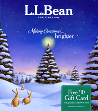
How do you get customers to start their holiday shopping? A big, fat gift card promotion (that’s also tastefully done) on the cover will get their attention. So will vivid photos, concise and informative copy, and a fantastic selection of merchandise.
WHY IT WON A GOLD AWARD: As one judge said, this catalog is “true to its brand, the king of weekend and comfort wear.” From the benefit-driven copy to the outstanding design, “it’s difficult to fault any aspect of the catalog,” said one panelist.
Another judge was wowed by the merchandising. “The range is impressive: After looking at one section, I recognize L.L. Bean as the definitive expert on parkas.”
The catalog’s photography and general design are show stopping. Citing one spread selling bedroom slippers, one judge noted that “It is hard to believe that you could make a more beautiful spread. The photography is so excellent that you can feel the slippers. It is easy to see why this catalog is so responsive.”
IDEA TO STEAL: If you can, perfect bind your catalog. “Perfect bound gives it a long shelf life, plus heft and substance,” one judge said. — JT
Director: Don Oakes
Designers: Andrea Kolpack, Erica Eysenbach
Creative directors: Jenna Klein Jonsson, Marcia Minter
Marketing director: Nancy Dynan-Fischman
Print/production director: Jason Kendeigh
Merchandiser: Amy Steenstra
Copywriter: Leslie Gomes
Art directors: Betty Fuller, Greg Gorman
Printer/color separator/prepress provider: Quad Graphics
List broker: Millard Group
Next Page: Harry & David

SILVER: Print Channel
Harry & David, Holiday Preview 2008
How do you make an already luscious pear look even more delicious? If you’re Harry & David, you might slice it, pour some carmel sauce over it, and sprinkle with berries. That’s a recipe for a winning cover shot and, no doubt, a ton of orders for its signature Royal Riviera pears.
WHY IT WON A SILVER AWARD: Exquisite photography, topnotch food styling and fantastic copy are three key reasons why this catalog secured the Silver Award. The copy, for instance, combines the necessary details — such as what exactly is in the gift box or basket — and benefit selling, one judge noted. Both covers are “compelling, tasteful — but clearly designed to sell,” said one judge. Judges also raved about the huge merchandise selection, including new products with wine.
WHY IT DIDN’T WIN A GOLD AWARD: The subheads under the product names can be hard to read due to mixed type styles, said one judge. And the sidebars are informative and lighthearted, “but sometimes create too much conflicting eye flow.” — JT
Director: Neal Schuler
Designers: Kelly Barton, David Holman, Tucker Whitson
Creative director: Michelle Jovanovic
Marketing director: Melissa Watson
Print/production director: Lisa Chang
Copywriter: Marcus Smith
Photographer/illustrator: Ron Anderson, Brian Prechtel, Jim Bowie
Printer: R.R. Donnelley
Color separator/prepress provider: Schawk-Seattle
List broker: American List Counsel