GOLD: Print Channel
New Pig Corp., The Big Pigalog Buying Guide 2009
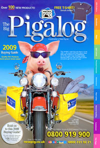
Starting from the cover of this high-scoring catalog, it’s clear that New Pig is on a roll. This little piggy drives a Harley and he’s packing pigs (the absorbent sock kind), mats, rags, skimmers and just about anything else you can think of to clean up an industrial spill; and he’s got safety supplies as well.
WHY IT WON A GOLD AWARD: The cataloger uses all the organization techniques for a large business-to-business mailer, said one judge, including an index, table of contents, color-coded sections and more. “Lots of great ‘in use’ product shots show how items are utilized, conveying immediately to the customer what they need,” the judge noted.
The selling copy is quite strong, said a panelist. “Good use of benefit headlines, product premise statements, and callouts” using its cartoon pig mascot, Sparky. Indeed, said another panelist, “New Pig has never been shy about shouting the benefits and spelling it out clearly.”
IDEA TO STEAL: You can have a fun front cover that also works hard. New Pig’s includes a foldout panel to promote institutional info to help customers shop. — MD
Directors: Doug Hershey, Nino Vella
Creative director: Beth Love
Product director: Dan Silver
Project manager: Lonna Frye
Creative team: New Pig Creative
Photographer: McManus Studios
Printer: Quad Graphics
Next Page: Edmund Optics, Optics and Optical Instruments

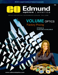
Edmund Optics boasts the world’s largest inventory of optical components. And it manages to keep the catalog presentation of this highly focused product line both clear and compelling.
WHY IT WON A SILVER AWARD: The catalog’s impressive assortment of merchandise is one reason. “The selection seems deep and broad,” said one judge.
The copy, which starts with the functional benefit of the product, is also a high point. “The voice speaks with authority and uses technical vocabulary that’s appropriate for the market,” noted a panelist.
In all Edmund does a superb job of keeping a lot of highly detailed information clear, clean and concise, though the personality “is a little dry.”
WHY IT DIDN’T WIN A GOLD AWARD: The judges were divided on the effectiveness of the dark front cover with images of floating prisms. But they agreed that the use of the model — a woman who appears to be serving up some psychedelic-looking filters, did not work. In a word, said one judge, “the model shot is hideous.” — MD
Director/print/production: Gretchen Morris
Designer: Dawn Kozarski
Creative team: Nicole Koenitzer, Joe Skodinski, Joori Song
Marketing director: Marisa Edmund
Photographer/illustrator: Gary Mattie Studios
Printer: Dingley Press
List broker: MeritDirect


