SILVER: Print Channel
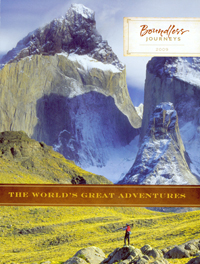
Boundless Journeys, The World’s Great Adventures 2008
Adventure travel isn’t for everybody. But one look at the Boundlesss Journeys catalog will have you considering a more exciting vacation. The magnificent cover shot shows a lone hiker among the captivating granite mountains of Torres del Paine in Patagonia, Chile. The message is, this could be you.
WHY IT WON A SILVER AWARD: The scenic photography from the cover carries throughout the book. “Gorgeous, it made me want to pack my bags,” one judge said.
You can’t sell exotic trips with just pretty pictures, however. Copy is well done and “very evocative,” said another judge, with “lots of good information and salesmanship. A treasure to read and reread.” Overall, the book is “visually rich, yet detailed and easy to navigate. Great job and well executed. Sets the standard for travel catalogs.”
WHY IT DIDN’T WIN A GOLD AWARD: There wasn’t much for the judges to criticize, but some questioned the air and land costs. “It is a bit confusing and it’s all part of the same journey, so if there is an advantage to the customer, it should be explained,” one panelist said. Added another: “I would have liked to see the prospect letter have more branding so it visually connects with the high-end appeal of the catalog.” — JT
Director: Karen Cleary
Designer: Digital Flannel
Creative director: John Turner
Marketing director: Matt Holmes
Print/production director: Karen Cleary
Copywriters: Karen Cleary, Matt Holmes, Sharon Huntley
Printer/color separator/prepress provider: JS McCarthy Printers
Next Page: Fetch Enterprises

SILVER: Print Channel
Fetch Enterprises, Fetchdog, Ho Ho Holiday 2008
Unless you’re made of stone (or just really, really hate cute dogs), you simply can’t resist Fetchdog’s adorable front cover. The fluffy white dog wearing a Santa hat immediately attracts the reader; once inside, dog owners won’t be able to put this catalog down. That’s in part how Fetchdog fetched the Silver Award.
WHY IT WON A SILVER AWARD: “It is about as much fun as you will find in a pet catalog,” one judge said. Besides its great photography — which truly captures why people love their pets — this catalog earned praise for its merchandise selection, copy, design and marketing.
“I really enjoyed the fun voice of the copy,” said one judge. “It made reading through the catalog a very entertaining experience. I loved the ‘meet the tester’ pet profile components.”
WHY IT DIDN’T WIN A GOLD AWARD: The stray items running through the center of the spread “just made the pages look cluttered,” said one judge. The catalog’s organization also needs some work, said a judge. “Why put the dog beds with leashes?” — JT
Director: Gretchen Kruysman
Designer/creative director: David Puelle
Copywriters: Dan Edwards, Jeff Ryan
Photographer/illustrator: Dennis Welsh, Macomber Studio
Printer/color separator/prepress provider: R.R. Donnelley
List broker: Millard Group
Consultant: The Mark Lee Group
