GOLD: Print Channel
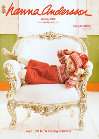
Hanna Andersson, Holiday 2009
Parents want their children’s clothes to be fun and functional. By featuring beguiling photos alongside detailed copy, Hanna Andersson’s Christmas 2009 catalog, like the apparel it sells, manages to be both.
WHY IT WON A GOLD AWARD: Hanna Andersson specializes in brightly colored clothes for kids, and thanks to wonderful photography and topnotch production, “the colors pop off the page,” to quote a judge. Silhouetted product shots are interspersed with lifestyle photos of laughing, smiling, running, crawling kids modeling the wares.
The product copy describes how many buttons and other fasteners each item has. The copy calls out benefits as well, such as “wonderfully washable”; “lightweight, non-bulky warmth”; and “socks that really stay on baby feet!”
IDEA TO STEAL: One of the pages selling footwear includes a size chart with instructions on how to accurately measure a child’s foot. Not only is this useful to include, but placing it in the same section as the shoes to which it relates makes shopping easier. — Sherry Chiger
SILVER: Print Channel
Chasing Fireflies, Autumn 2009
For kids, Halloween is the second most important holiday of the year. In its Autumn 2009 catalog, which was devoted to Halloween, Chasing Fireflies promotes its costumes and accessories by capturing children’s delight in the festivities.
WHY IT WON A SILVER AWARD: The judges singled out two attributes in particular — the visuals and the merchandise selection. The joy that the models took in showing off the elaborate costumes was apparent from their grins and poses. “I loved the whole playful concept throughout,” summed up one judge. The panel praised the breadth, depth and uniqueness of the product selection. For kids who turned up their noses at the standard costumes — and for the adults who were willing to pay as much as $98 for an ensemble — Chasing Fireflies was clearly the go-to source.
WHY IT DIDN’T WIN A GOLD: The front cover, with its photo of a child slumbering amid autumn leaves, provided no indication of what was inside. “There was no carry-through from the front cover to the opening spread at all,” noted one judge, while another decried the lack of coverlines and even a phone number or URL. — SC
SILVER: Web Channel
OneStepAhead.com
Baby products merchant One Step Ahead has carved out a solid business selling unique products, and guarantees that its customers can shop with confidence in its e-commerce site. The MCM Awards judges clearly felt that confidence.
WHY IT WON A SILVER AWARD: “The home page packs a lot of information in a clear, brand-consistent way,” a judge said. “Promotions are strong, as are key seasonal categories and features.”
OneStepAhead.com‘s cross-merchandising is logical and well done, according to the judging panel. For example, the suggested items for a child’s rocking chair were other bedroom accessories: a sling bookshelf with storage bins, a collapsible toy box and pillow covers.
The site offers plenty of user-generated content like ratings and reviews — One Step Ahead has one of the better implementations of Power Reviews, a judge said. And its smart search returned relevant items by keyword and not just product type.
WHY IT DIDN’T WIN A GOLD: The copy is good for a catalog, but it’s not written for the Web, plus the page titles are weak from an SEO perspective. For Web copy, “it’s marginal at best,” a judge said. “There are no headlines, subheads, captions, quick facts, or other things that the online user prefers.” — TP


