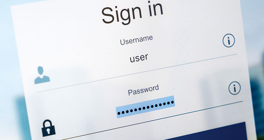
How is your login box doing? Is it a welcoming touchpoint or a chokepoint for visitors and returning customers?
Every culture has its rules surrounding hospitality. There are centuries-old traditions and subtle expectations that everyone instinctively knows, despite never having been taught them.
Obviously, technology has reshaped how we interact with each other — and not just on an interpersonal level. It has irrevocably reshaped the world of commerce by allowing consumers to shop without leaving their homes. But the importance of being welcoming and hospitable remains true in your online environment, and retailers are still trying to achieve this in their login box.
Bouncer or Ambassador?
Obviously, you can’t replicate the warmth of a person-to-person welcome. And, unlike in a store, your ecommerce website can’t let just anyone through the door. Sifting legitimate customers from would-be attackers requires a level of finesse.
Your login box should be like an associate at your favorite retailer, gregariously welcoming you to the store. But with far too many retailers, it feels like a stern-faced bouncer on the other side of the nightclub’s velvet rope, meticulously eyeing up customers before granting them entry.
It’s easy to understand why. In the hierarchy of priorities, security has historically trumped user experience (UX). Nobody ever got fined for having a clunky, unfriendly login flow. Falling afoul of GDPR or opening the system to a breach, on the other hand, is an entirely different matter.
Nobody who has ever found their private information splashed onto the Dark Web has ever said, “Well, at least their website looked nice.”
But here’s the thing: A strong, protective login page doesn’t need to be unwelcoming. You can have something that defends your customers and reputation, but is also genuinely nice to use.
Cutting the UX Cost of Security
When measuring the UX credentials of your registration page, it’s important to look at a few metrics. Arguably the most important is time. And the longer it takes for someone to complete a task, or the more effort involved, the worse the UX.
This understanding is especially pertinent when it comes to identity because nobody comes to a website purely to login. Authentication is a necessary evil, a friction point between the customer and checkout.
However, many businesses aren’t accounting for the time it takes to login. According to a recent Okta study 52% of CMOs and CDOs said it takes over a minute for a new customer to create an account. Astonishingly, 4% said it took more than 10 minutes, way too long and a direct impact on customer retention.
In fact, when asked whether they believed their sign-up processes contributed to cart abandonment, (58%) said yes.
A Bouncer with a Smiling Face
Okay, so now the question is: “How do we reconcile security with UX to help reduce cart abandonment?”
The first step is to eliminate passwords. This dramatically reduces the risk your company faces from outside threats.
The risk of passwords starts with consumers. According to the Identity Theft Resource Center, 85% of consumers admit reusing passwords across different websites, applications and platforms. That’s a scary prospect because it makes their login credentials an easier target for cybercriminals. Credential stuffing (where an attacker reuses account details obtained from other security breaches) now accounts for half of all successful breaches. Naturally, threat actors are commonly looking to retail sites to obtain those credentials. Although passwords served their purpose, they’re now more hassle than they’re worth. So, how do we eliminate them?
The good news is, there are a lot of customer identity tools at our disposal. Social login is the best example. Instead of creating an account for each retailer’s website, a consumer can simply register or authenticate using their existing social profiles.
From a security perspective, this eliminates the risk of password reuse by removing the worry about securely storing and managing user credentials. But it has obvious UX advantages too.
If a consumer logs in to a website using their Facebook account, for example, they don’t have to type anything in but just click a button, a few seconds and they’re in. When getting ready to checkout, the website can pre-populate many of the normal sign-up forms with the details already shared with the social provider, saving the shopper more time and reducing cart abandonment.
Another tool at our disposal is password-less login. Here, a customer authenticates by clicking a unique link or “magic link.” Websites typically send these one-time links, valid for a short time, via email or text. Like social login, this approach gives consumers a level of friction-free immediacy. The temporary, single-use nature of the link creates a small window of opportunity for cybercriminals to attack.
Taking Advantage of Tools
Unfortunately, many businesses haven’t taken the steps to improving their login experience. Okta found just 37% of CMOs and CDOs said they allow for social login. When it comes to password-less authentication and biometric authentication, adoption rates were 26% and 21% respectively.
We get it. Identity is complicated and a high-stakes game. Most retailers would rather focus their attention on building the killer app, with features that win customers and differentiate them from the competition.
Features like social login normally take weeks of dedicated engineering time to build, but it doesn’t have to be that time intensive. A Customer Identity and Access Management (CIAM) system lets you easily access integrations that improve the login box experience in a few simple clicks. Now customers aren’t looking at a virtual stern-faced bouncer but a welcoming assistant, not only reducing cart abandonment but improving brand loyalty.
Kerry Ok is SVP of Product Marketing and Customer Identity at Okta

