
Mobile payment solutions have never been more important, with an estimated 70% of all ecommerce sales to come from mobile payments by 2022. If you run an ecommerce business and haven’t explored the latest mobile payment software solutions, it’s time to start.
However, simply implementing mobile payment options isn’t enough. It’s crucial to make the mobile payment experience as seamless as possible for your customers. The less effort your customers have to put into the payment process, the more likely it is that they’ll finish checking out.
Here are 5 of the most effective ways to improve the mobile payment experience.
Provide As Many Payment Options as Possible
Especially when it comes to ecommerce, customers usually have a very wide range of payment preferences. If your business doesn’t support their preferred option of mobile payment, there’s a good chance you could lose the sale altogether.
This is due to a few factors, including customers’ increasing focus on privacy and security as well as a simple desire to have to sign in to as few websites as possible. Regardless, the easier you make it for your customer to pay you, the more sales you’ll get.
As a result, ensuring your website is compatible with as many payment options as possible is crucial. Some of the most important payment options to include on your site are:
- Credit cards
- Debit cards
- PayPal
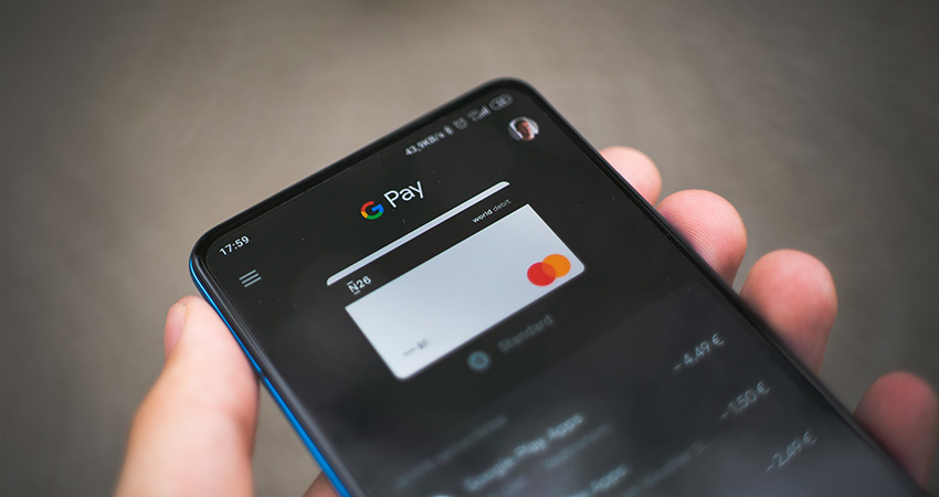
- Apple Pay, Google Pay and Samsung Pay
- Venmo, Stripe and other online payment platforms
Don’t Force Customers to Create an Account Before Paying
Encouraging your customers to create an account on your ecommerce site is indeed a great way to promote sales and collect their information. On the other hand, forcing first-time customers who may not have full trust in your brand to create an account can scare many new buyers away.
Customers prefer to only create accounts with brands they have experience with. Not only does it force them to remember another username and password, but they are also highly wary of receiving excessive marketing emails.
Allowing guest checkout is a great way to ensure your customers can make purchases as easily as possible.
Make the Checkout Design Seamless
According to Baymard, the main reason that consumers abandon a cart is due to checkout design and flow. Whether it’s due to overall confusion, too many fields or long loading times, checkout design has a huge impact on conversion rates.
Since many customers make impulse buys, the more streamlined the checkout process is the better. If possible, reduce the number of checkout steps and keep form fields to a minimum.
Checkout page design also has a significant impact on customers’ likelihood to complete their purchase. Create a smooth transition from cart to checkout by using similar design elements like fonts, colors and images. Place important information where it’s easily visible and guide your customer through checkout with prominent buttons and order summaries.
Provide Security and Privacy Assurances
Consumers are more concerned than ever about the privacy and security of their information. Since checkout pages handle sensitive information like credit card numbers, they’re especially sensitive to perceived security violations in this area.
Improving the perceived security of your checkout page is one of the most important things you can do to drive more conversions. In addition to improving the security of your payment processing software, you can also make design choices that improve the perceived security of certain parts of a page, especially the credit card fields.
When it comes to design choices, encapsulate the credit card form fills with unique design elements that stand out from the rest of the page. Simply adding a different background color or a border can increase user confidence drastically.
Secondly, placing an image that denotes some level of security is another way to make your customers feel more secure. Whether it’s a seal that signifies SSL encryption, third-party verification or a simple padlock that has no actual deeper meaning, seals improve user trust significantly.
Use Clear Calls to Action (CTAs)
No matter how high your website traffic is, your revenue will stay low if your customers don’t make it to the checkout page. That’s why it’s important to use CTAs clearly, prominently, and frequently.
CTA buttons should be large (but not too large), bright, and short. Testing is the only way to determine what button design works best for your business, but there are a few general guidelines to remember when using them:
- They should stand out from each other and from surrounding design elements
- Text should be short and contain active verbs like “try,” “get,” “checkout” and “download”
- Button color matters: Orange and green are safe choices
- Create a sense of urgency with words like “now” or “today only”
- Use plenty of white space
Conclusion
Don’t neglect your customers’ mobile payment experience. Be sure to offer multiple payment platform options, streamline payment pages, use clear and expressive CTAs, and create a sense of user security. With these tips, you can drastically improve your users’ mobile payment experience and ensure a higher conversion rate.
William Dawsey is VP of Finance and Payments at Chetu Inc.